
This had been a pivotal week for the Covid-19 epidemic in Kentucky, but the incomplete and delayed reporting for the days bracketing Labor Day leave us with insufficient information to predict with any confidence the direction Kentucky is going. Beginning with the simultaneous Memorial Day opening of our summer season and relaxing of public health restrictions which accelerated with the July openings of bars, stadiums, and further loosening of public health “recommendations;” Kentucky experienced a (predictable?) surge of cases and deaths that has not yet demonstrably turned the corner. Last week gave us both record or near record numbers of new cases, deaths, and even tests. Below is an abbreviated discussion of the results.
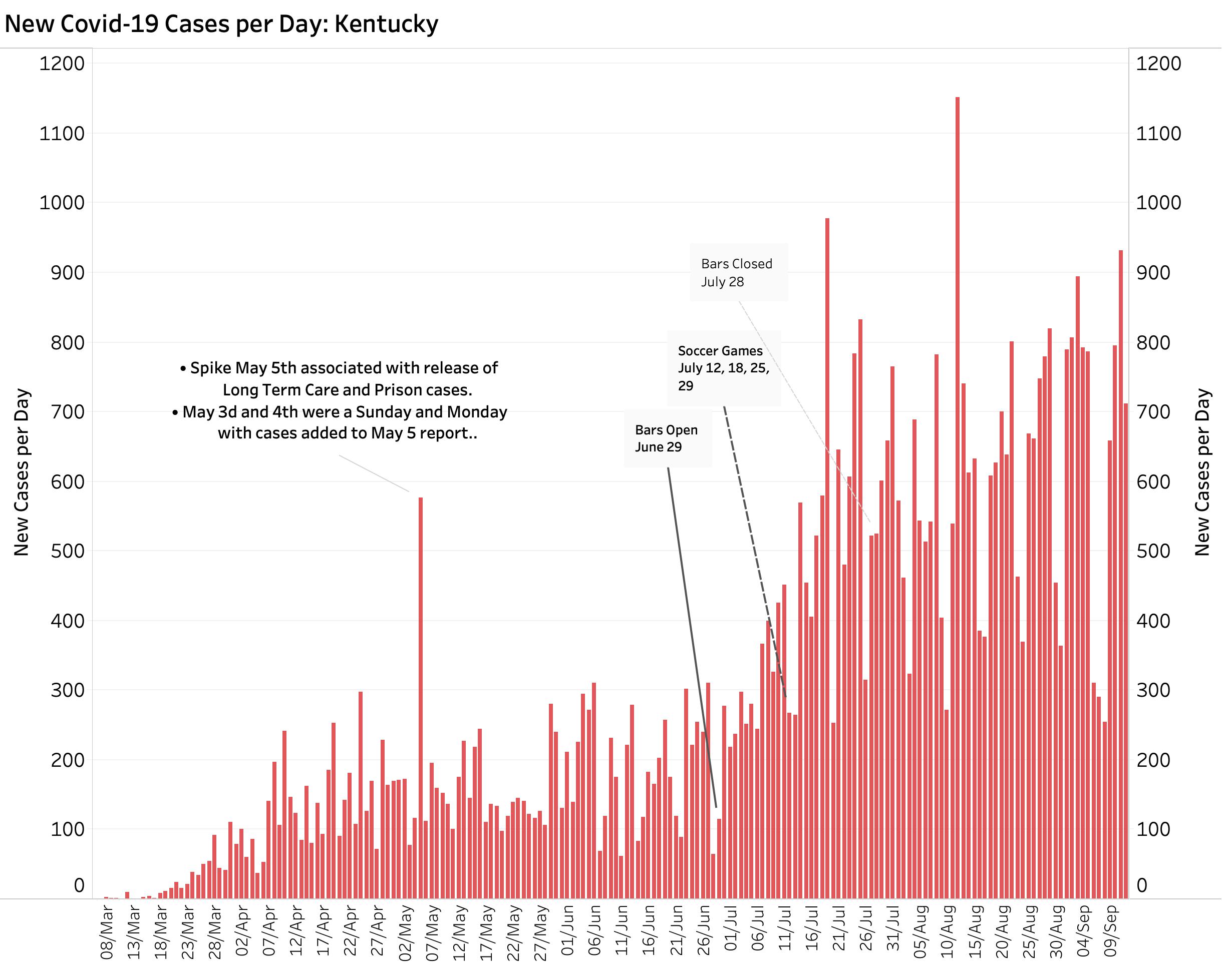
New cases plotted.
The bar graph below plots the raw daily count of new cases. The long three-day hiatus in reporting generated corresponding high catch-up reporting days through yesterday. The highly variable daily counts were too much even for the 7-day and 14-day rolling averages to smooth out. It will take another week of data to draw meaningful conclusions about where we are going. The September opening of schools, colleges, and related additional sporting events presents us with additional new challenges, as does the relative explosions of new cases in some non-urban Kentucky counties.
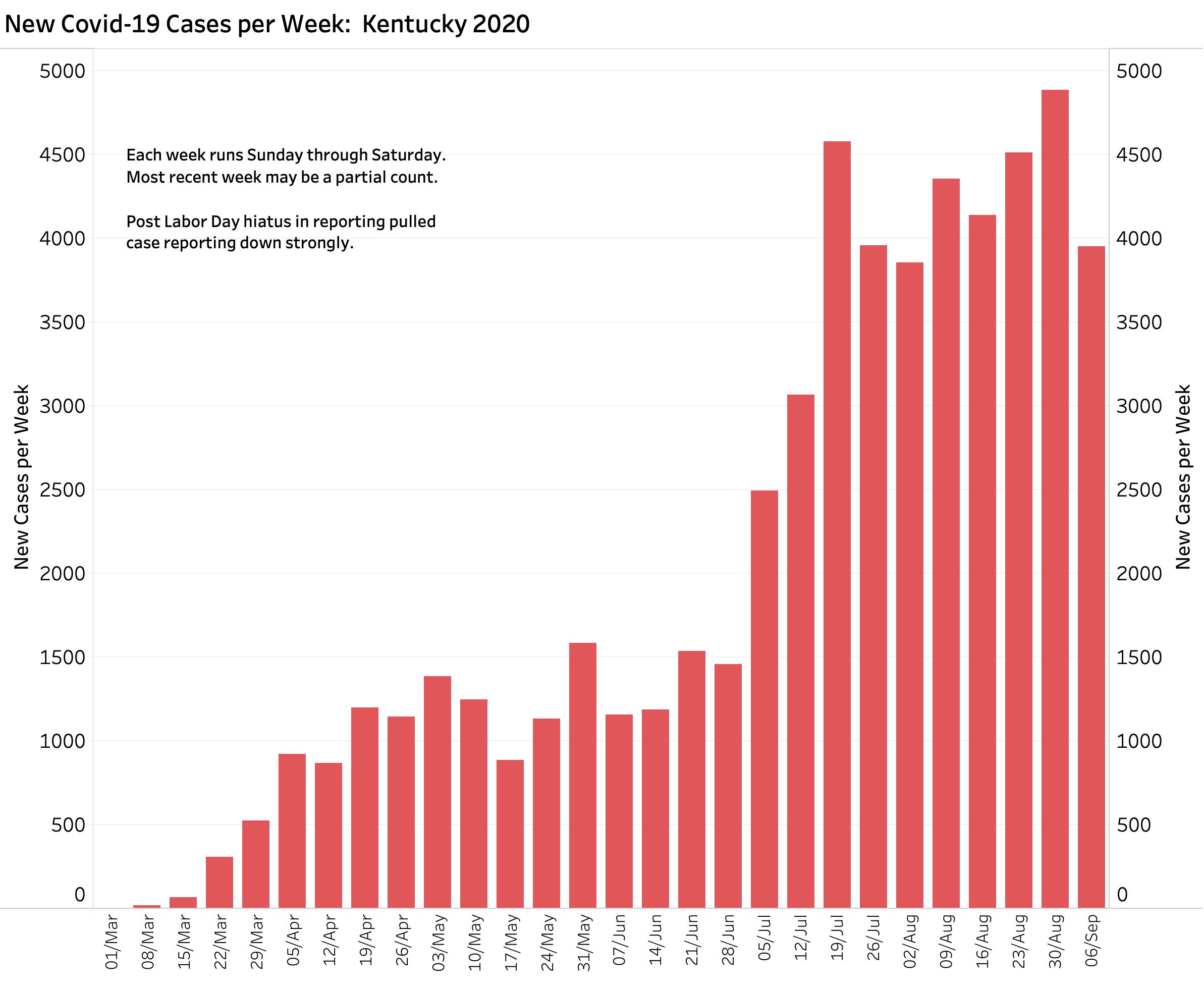
As snapshots of where we were as of September 12, here are the weekly summaries of Cases, Deaths, and Tests. Here are weekly new cases. Last week’s total was less than 4000. Have we caught up with counts or not?
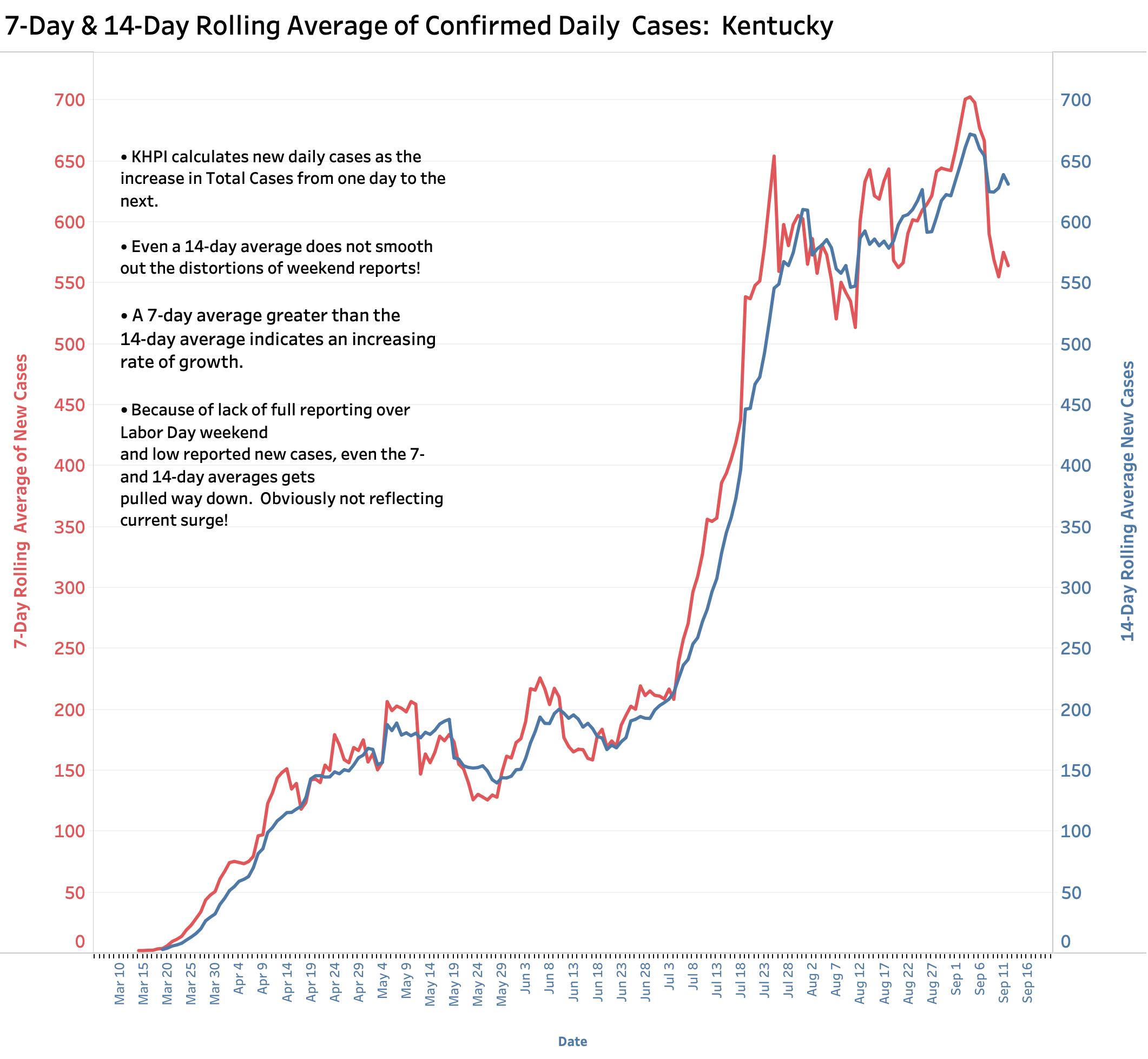
Here is a plot of 7-day and 14-day new cases. Does this help us predict what will happen next week? Not so much I think.
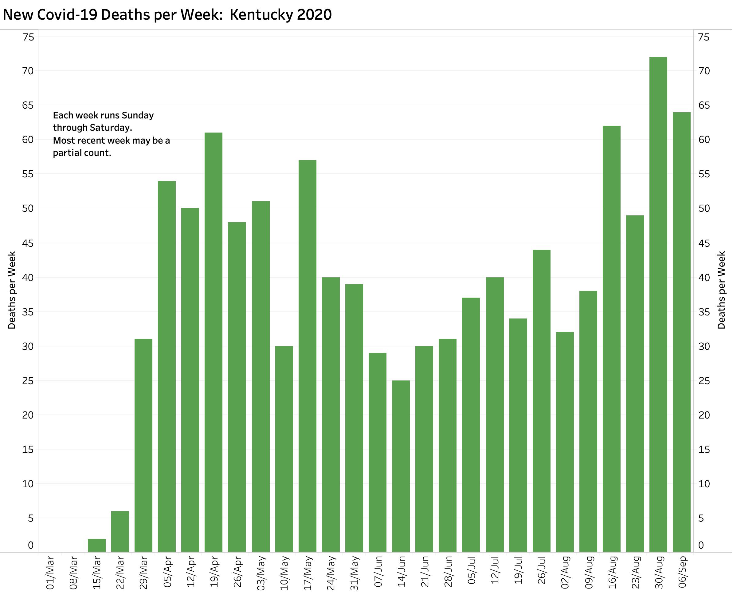
Below are weekly deaths.
Last week included three days with the highest total daily deaths since the beginning, but also 3 days with the lowest. Where are we going from here?
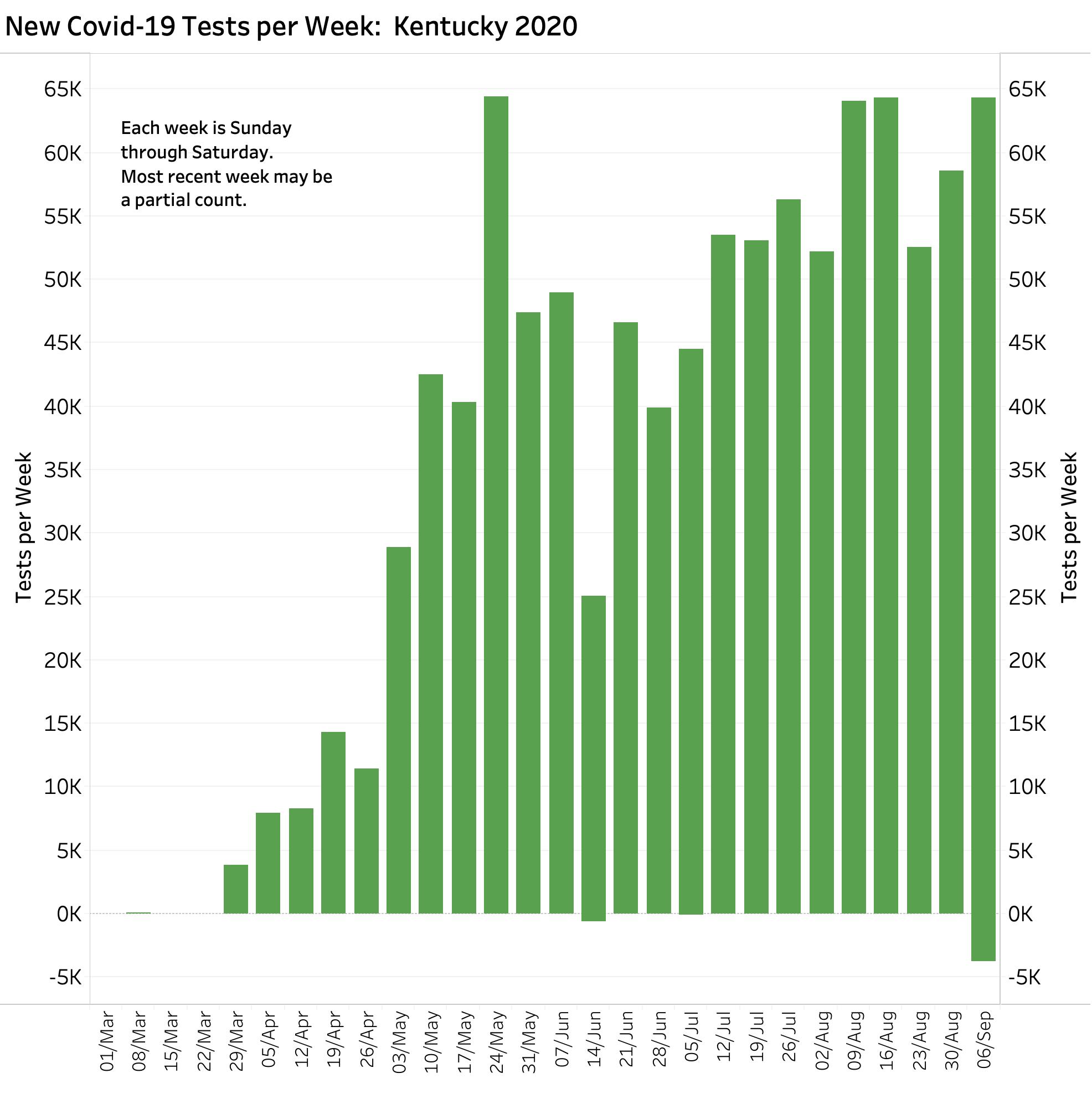
About Tests:
Below are plotted the number of weekly tests (of any sort). What does it mean to have a day with a negative count? I assume a correction was made. (I have seen these corrections memorialized in the databases of national data aggregators.) It is clear that the access to and timely reporting of Covid-19 related tests is again becoming a major national problem. The variously computed Percent Tests Positive statistic is based fundamentally on the number of tests performed and reported. Viral RNA and various antibody and antigen tests are being commingled even though the accuracy and reporting requirements of the different tests is very different. I will have more to write about Percent Tests Positive in later days. I need to understand better how the PTP statistic is being calculated in different venues.
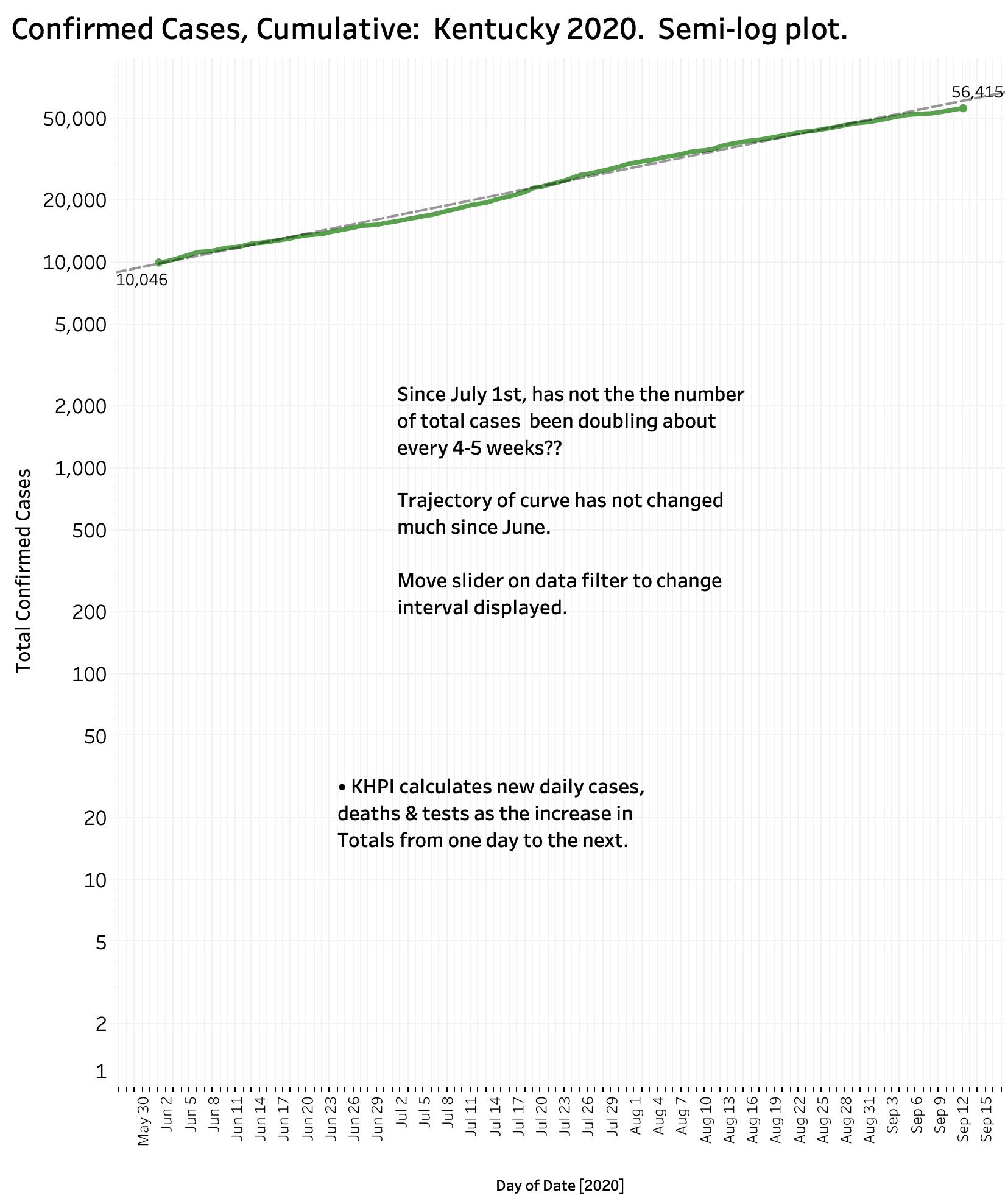
Various averages and weekly counts. Necessary but not sufficient. Where we were going before was not so hot. There is still a place for plotting aggregate total cases and deaths. Total cases have been accumulating at a slowly increasing exponential rate, doubling every 4-5 weeks. (You can interactively explore how things have been changing with the data visualizations on KHPI’s Public Tableau Website. The data on which all the visualizations are based is also available there.)
Plot of Total Cases:
When a graph on a semi-log plot like the one below is a straight line going up, it means the numbers are rising exponentially. (Think compound interest.) The steeper the slope of the line, the faster the (in this case) epidemic is expanding. Slow and steady is how I would characterize the expansion of our Kentucky epidemic. When the trend line becomes absolutely horizontal over a meaningful interval, we will be adding no additional new cases to the total! (We are not there yet.) Is the little dip over the past week meaningful? It is fair to say that for the state as a whole we are not in a runaway phase of the epidemic and can claim some success in our public health measures. For individual counties, the same cannot be said. You can vary the interval analyzed for both total cases and new cases on the KHPI Tableau Public website
Where are we heading?
I am holding my breath and hoping for the best. No more shall I offer at this time!
Peter Hasselbacher, MD
Emeritus Professor of Medicine, UofL
President, KHPI
13 September 2020
[Addendum 9-17-20: I edited my comments related to the last figure above of cumulative Covid-19 cases and the significance of a horizontal trend line. We would not hope to see a descending trend line in this plot as we would in a plot of daily new cases. I extracted the wrong figure from the panel of visualizations. Sorry! An earlier article here outlines my process of self-education.]