
New cases declining sharply, but reported daily deaths remain at a high plateau if not increasing.
New Cases.
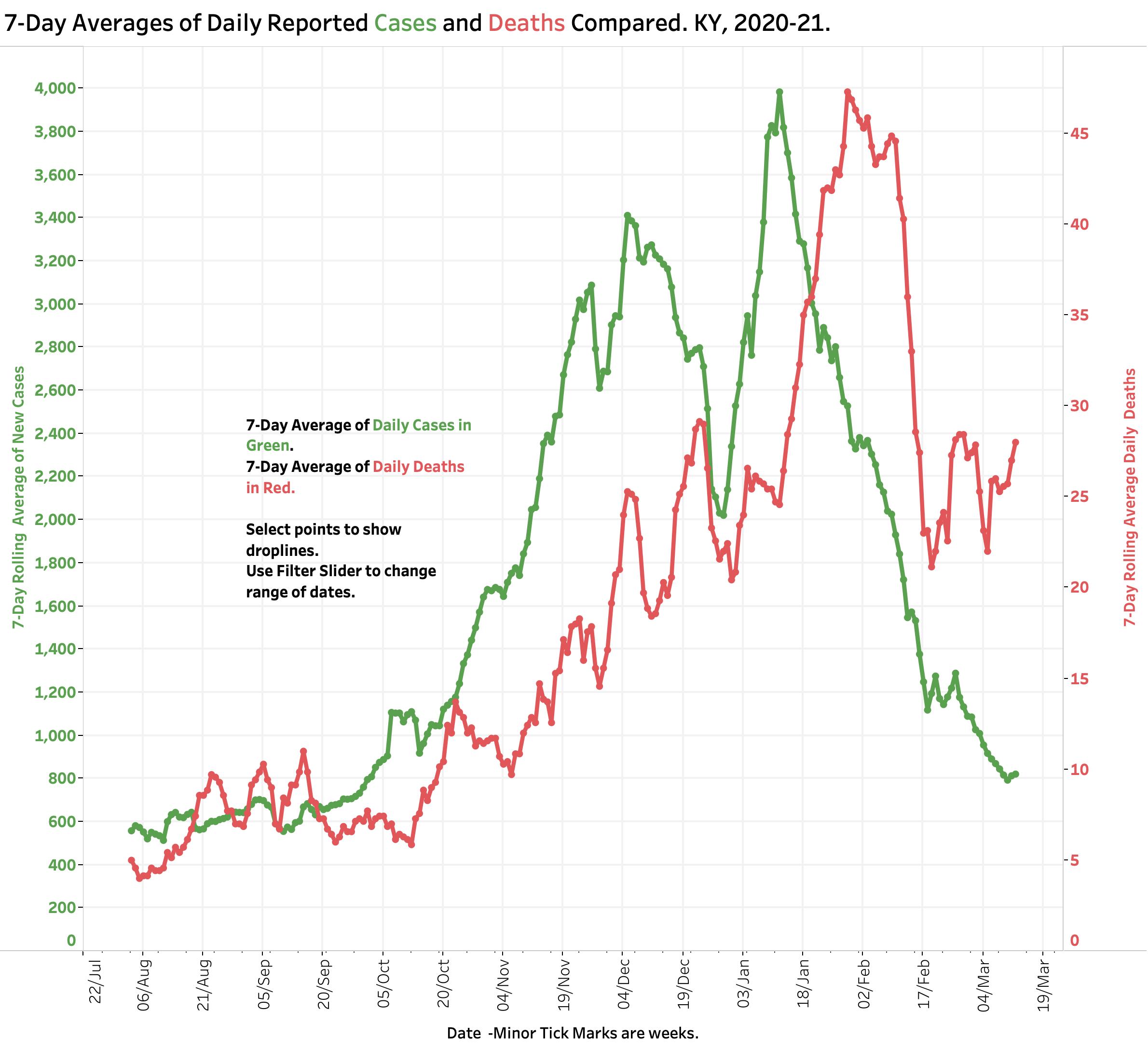
Since its peak in the second week in January, the number of reported daily new cases of Covid-19 has been falling dramatically. There is still much variation in daily counts, but yesterday’s 7-Day rolling average of 821 cases rolls us back to the numbers of early October 2020, just before the massive midwinter surge of the epidemic. Weekly case counts have been dropping for the last 9 consecutive weeks. The drop in new cases has been accompanied by decreases of comparable magnitude in utilization of hospital and ICU beds, and the use of mechanical ventilators. This is very good news! No doubt this sea -change can be attributed in part related to implementation of vaccinations for the elderly and high risk, but my guess is that the community of Kentucky finally got scared enough to follow national and state recommendations for non-medicinal public health practices. I certainly am seeing more people on the streets and elsewhere who are wearing masks.
Deaths.
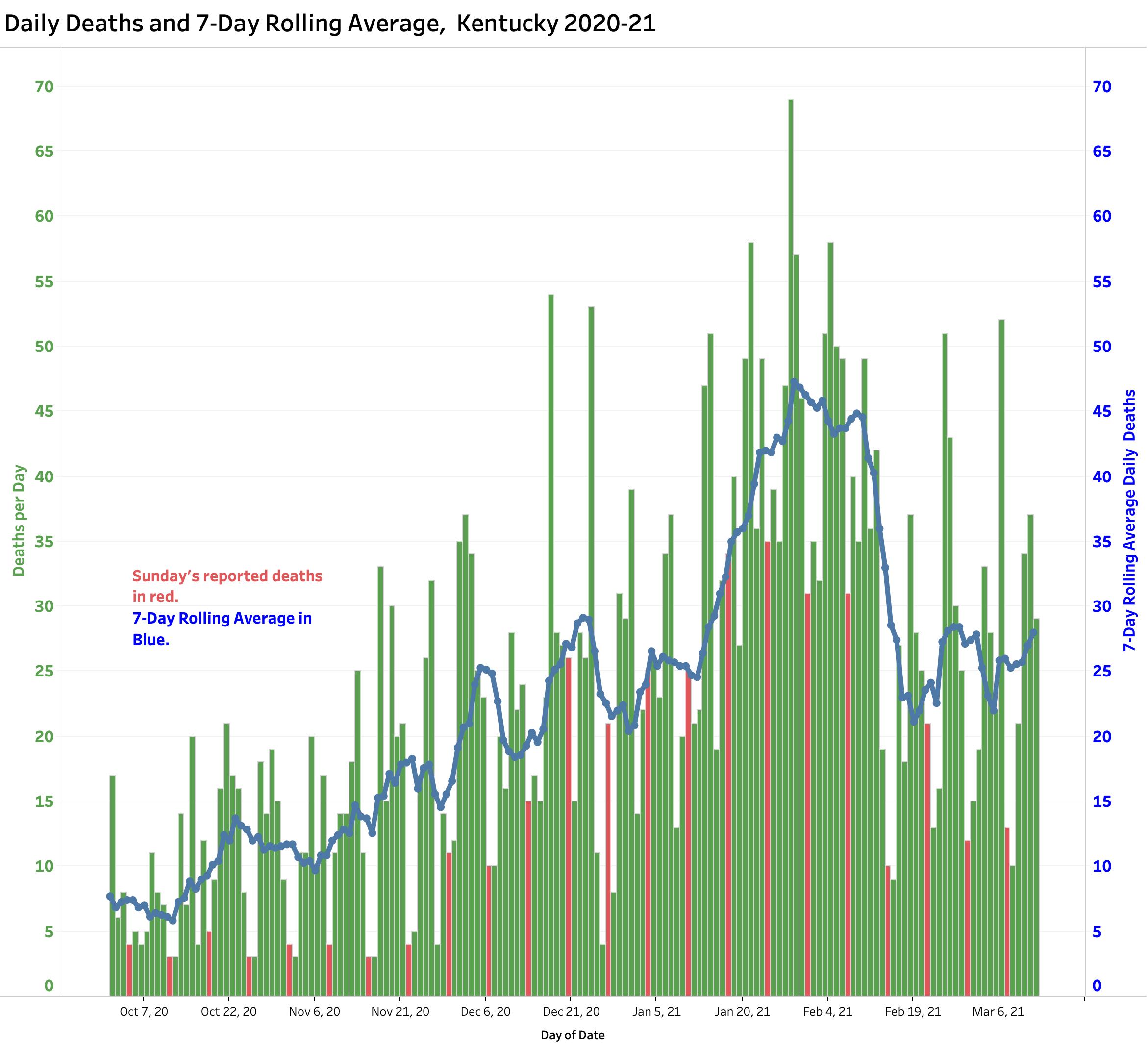
The number of daily reported deaths has stalled and has actually been rising since February 19th. The current 7-Day rolling average of 29 is comparable to averages reported in mid-December. I do not believe this “failure to fall” can be attributed to the predictable time-lag between initial viral infection, illness onset, and death as the natural history of Covid-19 disease unravels. Indeed, it is clear that there have been problems identifying, adjudicating, and reporting Covid-related deaths that may have been ongoing well back into 2020. The full details of the duration and magnitude of this early underreporting are unknown to me. Any reporting gap would be superimposed on the global reality that that reported Covid deaths represent only a fraction of actual number even within good public health reporting structures.
How will we notice more virulent viral strains?
SARS-CoV-2 is the official name of the virus that causes the disease Covid-19. Given that new, more infectious, and probably even more deadly strains of this SARS relative are now spreading globally and in Kentucky, we need to be confident that we have accurate and timely handles on the numbers of new cases and deaths to guide both our individual and community behaviors. If there are mismatches between cases, hospital utilization, and deaths, we need to understand why. As European nations currently enforce new restrictions and even lockdowns, the stakes for us are as high as ever.
What is happening to case-mortality rates?
From the earliest days of Kentucky’s epidemic I plotted a traditional epidemiological measure of observed case fatality rate (CFR) using aggregate numbers. (This is not the same as a “disease fatality rate” which will only become fully apparent as the epidemic runs its fuller course.) Using the raw total number of cases and deaths announced daily by Frankfort, I divided the latter by the former to calculate the percent of recognized cases of Covid-19 that died of their disease at that point in time. In the early days of last spring when testing was limited and identifying a death was more likely than than an asymptomatic case, this simplistic calculationvaried a great deal and to high levels. On some days before July 2020, the daily CFR was higher than 14%. As testing ramped up and under the averaging pressure of larger numbers of preceding cases, the aggregate observed CFR gradually declined to a more representative 1%. I placed this plot at the end of my data visualization portfolio and rather ignored it without comment.
Last February I noticed that the aggregate CMR was starting to trend upwards puling the mass of data behind it in that direction. A rise in aggregate CFR by this measure is apparent even using a 14-Day average.
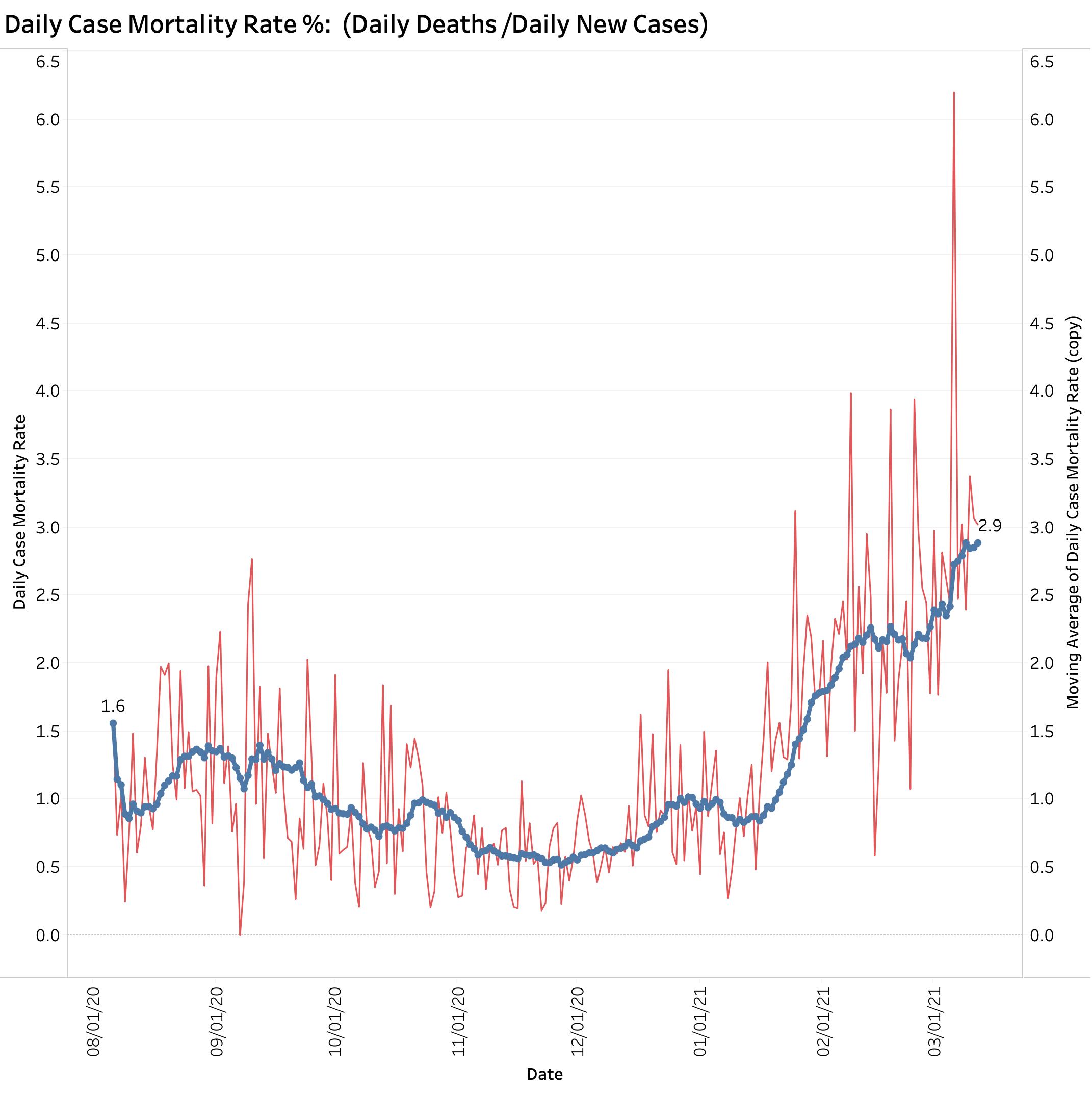
In a setting where there may be a mismatch between cases and deaths and when new viral strains are present, I believe it is important to understand what we are looking at. This is especially true given that deaths from Covid-19 in individuals from congregate living situations is falling sharply due to programs of aggressive vaccination. Why are deaths not falling more rapidly? I currently suspect that the calculated CFR I have been using is artifactualy high due to structural issues of data collection and reporting. Such issues are not unknown in America’s public health systems. An alternative to being an artifact of data collection and reporting might be that our brand of Covid-19 disease is expressing itself with greater virulence or mortality rate. There is concern that this latter is happening in other countries. We need to know if this is the case here at home. I do not have access to Kentucky-specific data to speculate further.
Does Kentucky’s version of Test Positivity Rate help us?
Yesterday’s reported 7-Day average Test Positivity Rate of 3.88% was the lowest seen yet. That seems reassuring on the face of it! This number is one of those being used to guide the relaxing of restrictive public health measures in in Kentucky and has been advanced as a way of judging that the number of tests being performed is adequate. Imaging my surprise then when Becker’s Hospital Review on March 10 using “authoritative” data from Johns Hopkins Coronavirus Resource Center ranked Kentucky as 11th highest in the nation with a “Covid-19 Test Positivity Rate” of 9.5! (For comparison, the rate for North Carolina was lowest at 1.1, Kansas was highest at 28.6, and adjacent Indiana was 2.5.) I am not going to try to repeat the analysis. I have considerable doubts that the reports aggregated from individual states are strictly comparable. I maintain that the CDC should have the responsibility to ensure that data are collected and reported using the same definitions and procedures and that this data is made available to all interested parties.
If Kentucky’s Test Positivity Rate is calculated on a daily basis using total new tests (including both PCR-RNA and antigen tests) the result is chaotic to a degree much greater than for daily cases or deaths. Some sort of averaging is essential, but probably not sufficient. Serial testing of the same individuals is occurring in some settings such as schools and workplaces. The proportion of RNA and antigen testing varies. We have seen backlogs of test reporting and even negative corrections entered into the state’s reports. I personally experienced a breakdown in the electronic reporting system of a major test vendor to the state when I was tested. Test numbers are no longer even reported on Sundays. To be able to extract some sense from the volatility of the numbers the state rationally settled on a more predictable calculation that includes only PCR-RNA tests (from respiratory tract swabs?) and only those results that are reported to the state electronically. This parameter is reported as a rolling 7-Day Average and is plotted serially here along with 7-Day average of new cases.
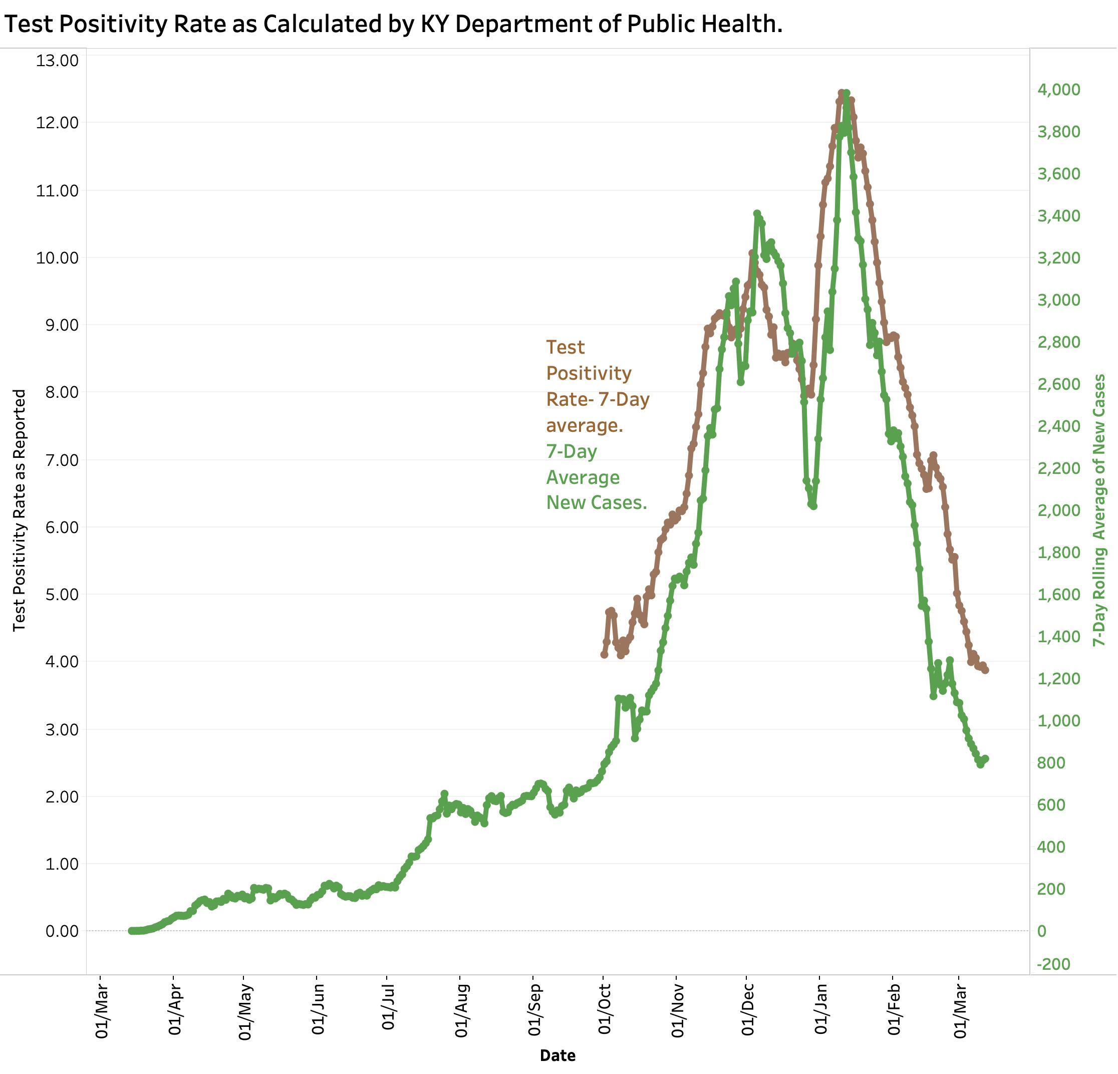
The question I would raise is what does this number tell us that the raw number of new cases does not, especially since a “case” is defined by a positive test. We expect the two to correlate. (Complicating the matter is that the number of reported total tests has been decreasing.) If the 7-Day averages of New Cases is plotted against the Test Positivity Rate (TPR) as calculated by the state, the result is a highly statistically significant correlation between the two.
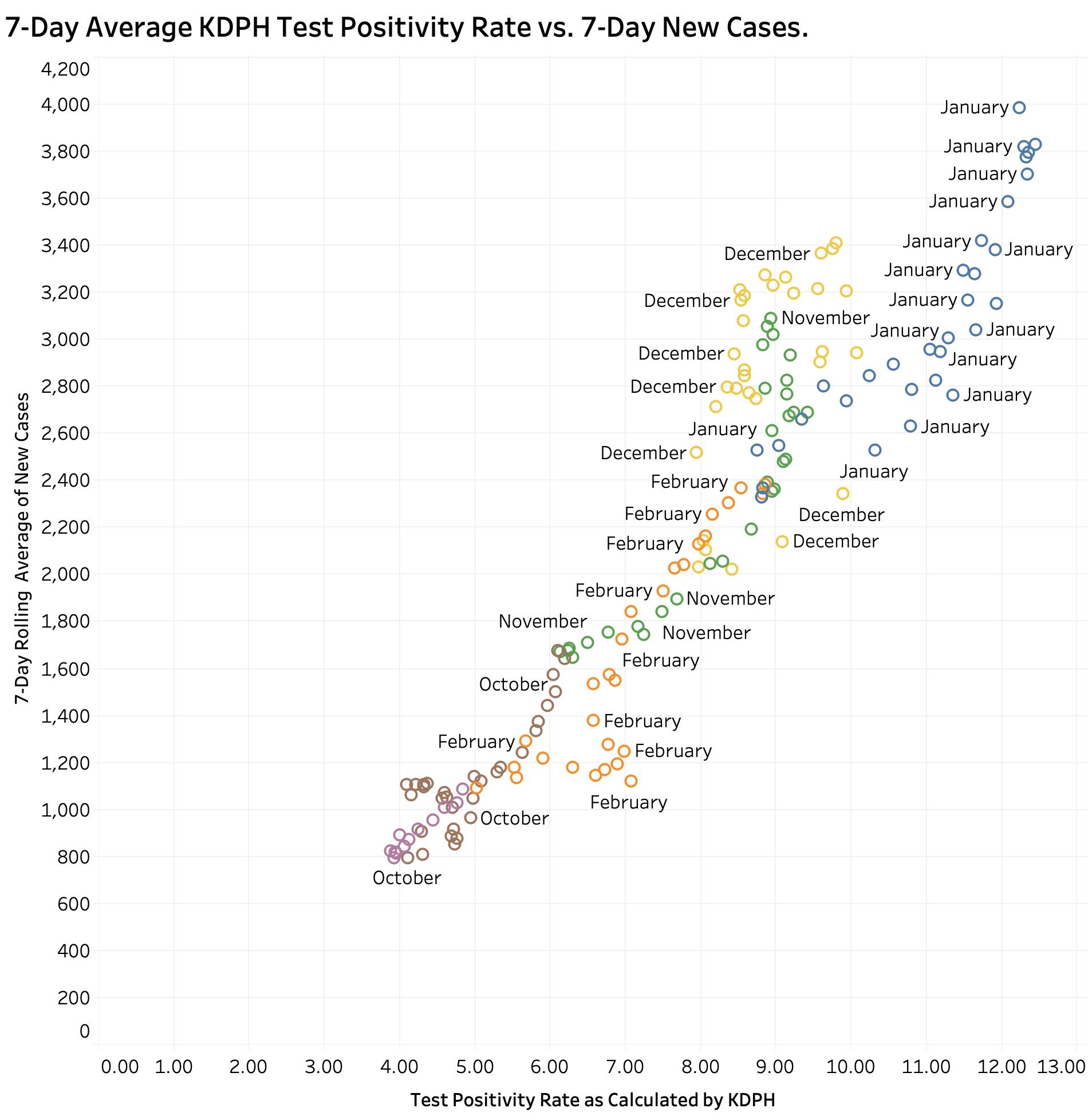
Both were highest in midwinter January and lowest in October and March. A similar correlation can be demonstrated between TPR and “Currently In Hospital” as reported. (These plots can be dissected by month on KHPI’s Tableau Public website.) Neither do I believe it can be conclusively said that a rising in TPR precedes new case identification. It may be that adjusting for the proportion of confirmed cases vs. probable cases, or PCR tests vs other tests might clarify their effect on test positivity ratios, but those historical data are not available to me in a usable format from the state. I still believe that our best current handle on where we are in the epidemic remains with accurate, comprehensive and timely reporting of cases and deaths with a focus on where and how those cases are acquired and the actual dates of death as opposed to the date of the report.
The over-numerous but interactive data visualizations that underlie the discussion in this series of Covid updates can be viewed here. The user can vary the range of dates displayed, the days of the weeks, and other parameters for a full year’s worth of Kentucky’s data. The pull-down menu on the left end of the header is a convenient way to navigate quickly but I also recommend clicking one’s way along the header for a sense of the internal logic of the presentations. There are other portfolios under the “My Profile” button that are relevant if not completely up to date.
I believe the state is credibly doing the best it can given the resources it inherited or became available, in the face of irresponsible political resistance, and with a less than fully-cooperative community response. We got over the mid-winter third surge because we listened better as a body-politic to more responsible state and federal public health experts. Where we go from here remains to be seen but it is not over yet.
Peter Hasselbacher, MD
Emeritus Professor of Medicine, UofL
12 March 2021