
This appears to be the case in Ohio.
Summary:
Cities and towns in Ohio in which medical professionals write opioid prescriptions to Medicare beneficiaries at the very highest rate per inhabitant are co-located in counties with the highest per-capita consumption of prescription opioids overall and those with problems of prescription drug abuse in general. In Ohio these areas are in southern Ohio and the I-77 corridor in eastern Ohio. These observations link by association the number of prescriptions by providers listed in the Medicare Part-D database, to opioid utilization and abuse in the general population.
The 25 providers who wrote the largest number of opioid prescriptions to Medicare beneficiaries in 2013 practice for the most part in the big cities, especially near Cincinnati. In contrast, Columbus has a surprisingly low opioid prescription rate for Medicare patients– a difference that begs to be understood.
Introduction.
One of the potential shortcomings of the Medicare Part-D prescription database is that by definition, it tracks only prescriptions to Medicare beneficiaries over 65 or disabled. The current data for calendar year 2013 is getting out of date. Additionally, because the data tracks where the prescriber works and not where the patient lives, small towns that do not have a healthcare professional licensed to prescribe scheduled drugs will not show up in the data at all. Conversely, doctor-heavy cities may be over-represented for their populations. While there is little reason to doubt that observations derived from the Medicare population are for the most part generalizable to the population as a whole, I have been searching for a way to demonstrate a useful correlation in a more robust way. Some of the advantages of the Medicare database are that it contains nation-wide data for all prescription drugs and identifies the prescriber by name, provider number, and specialty. I am aware of no other public, or for that matter private database available to match it. If I am mistaken, please let me know and help me obtain access!
Some systems not set up to track prescribers.
A major barrier to attempting to make the strongest possible statistical correlation, especially for controlled substances, is that some state opioid tracking systems like Kentucky’s KASPER originally had statutory prohibitions prohibiting the disclosure of the identity of individual providers– even to licensure or law enforcement organizations– unless some independent complaint had been lodged. These restrictions, the result of lobbying by provider groups, have in the past prohibited regulatory, law enforcement, or quality-assurance entities such as the the Cabinet for Health and Family Services from looking at dispensing data in a proactive way. KASPER was originally set up to identify patients who were doctor-shopping or otherwise abusing controlled substances, not prescribers. Recent changes in the law allow the Cabinet and law enforcement to proactively look for geographic areas of high prescribing, but I am not aware they can do a whole lot more than that. I find it ironic that anybody can drill down to the individual prescriber level within the Medicare data.
Preliminary evidence of correlation is fairly good.
So far, using prescription of opioid analgesics as a model, I am feeling more confident that the Medicare data usefully reflect the situation on the ground. For example, when I looked at the town of Austin, Indiana, the locus of a striking epidemic of prescription drug abuse, it was not a surprise to find that several small cities and towns around Austin lead the state in the prescription of Austin’s drug of choice– Opana. Breakdowns of opioid prescriptions to Medicare patients by city appear to correspond to general public perceptions of the extent of drug abuse and diversion in Kentucky, Indiana, and Ohio. My recent profile of opioid prescription in Ohio affirms more robustly a correlation of Medicare prescriptions with opioid abuse in the general Ohio population.
Methods.
In grappling with its own problem of prescription opioid and heroin use, Ohio constructed its “Automated RX Reporting System” and makes much information available to the public including a variety of thematic maps displaying county-specific information. I borrowed one such map showing the number of opioid doses per capita by county and overlaid it with Ohio data I derived from the Medicare database. [Click map see a full sized version.]
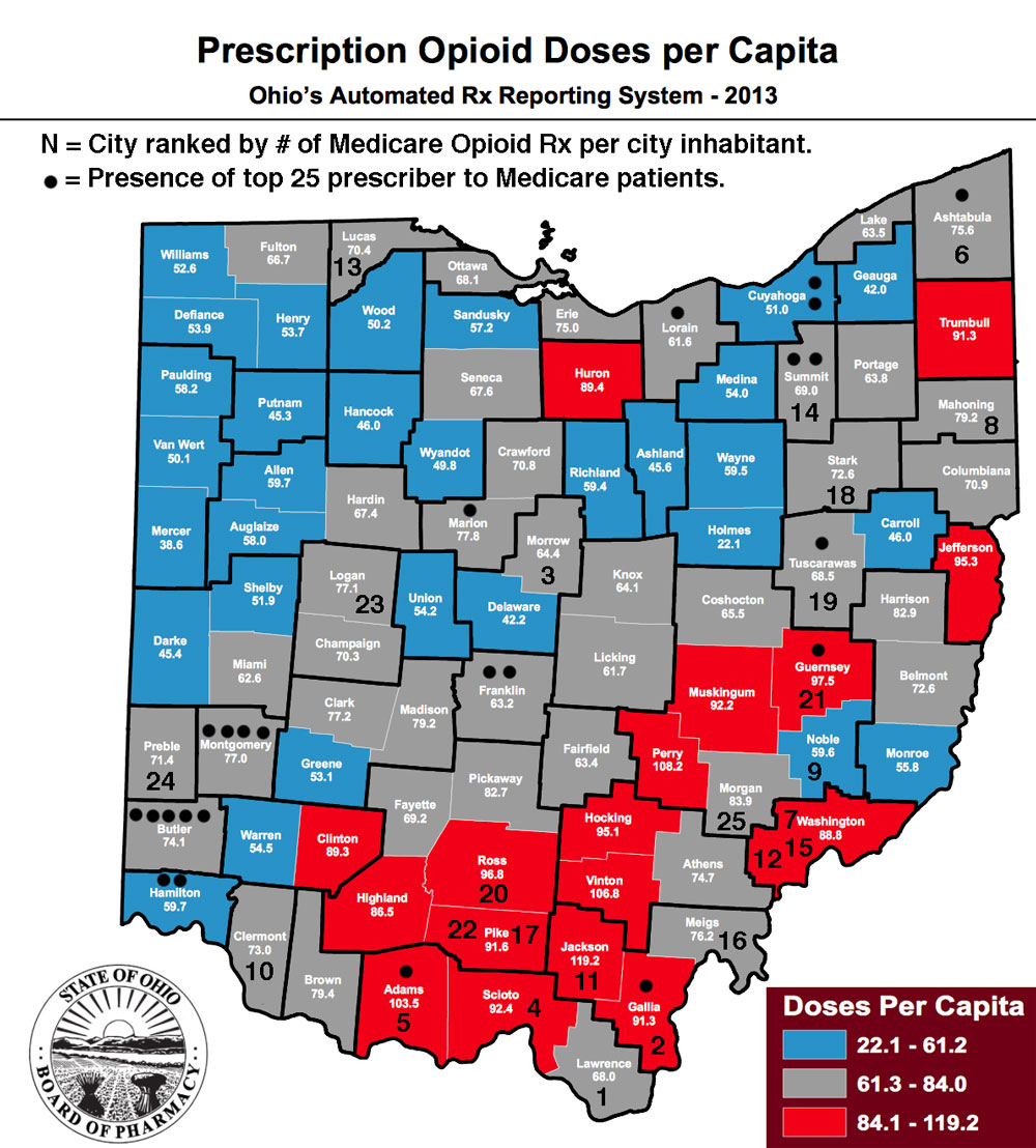
Numerals from 1 to 25 are placed in counties containing cities or towns with the highest rates of city-specific opioid prescriptions per capita. The methodology and limitations of this approach are described in an earlier article. Thus the numeral ‘1’ in Lawrence county in southern-most Ohio represents the village of Proctorville which in 2013 had the highest Medicare prescription rate in the state at 6.4 prescriptions per city inhabitant.
Additionally, I placed one or more black dots in each county containing the business addresses of the 25 highest prescribers of opioids in Ohio as also defined elsewhere.
Results.
Twenty-four of my 25 Medicare “hot-spot” cities are co-located in the red or grey-shaded counties identifying those counties with the highest numbers of doses per capita. Only a single one of my hot-spot cities lies in a blue-shaded county with the lowest range of opioid doses per capita– Noble County. Of note, that small county is situated right in the heart of Ohio’s worst area of prescription drug abuse and is surrounded by hot-spot cities and towns with active prescribers of opioids. Both my Medicare data and Ohio’s own data identify southern Ohio and along the I-77 corridor in eastern Ohio as the areas in which opioids are most extensively prescribed. This would not be a surprise to Ohio’s law enforcement and public health authorities.
Highest prescribers.
The black dots representing the highest individual prescribers lie in counties with the largest cities or in their heavily populated neighboring counties such as those north of Cincinnati. The greater Cincinnati area alone contains 11 of the 25 such highest prescribers! A handful of others are located in southern and eastern, mostly rural Ohio. Of interest is the observation that the urban areas containing the most “highest-prescribers” did not themselves have a hot-spot city as identified by my Medicare criteria. Recognize though, that people in non-urban areas most certainly go to the big cities to get many of their prescriptions. Nonetheless, cities like Cincinnati, Dayton, Youngstown, and Canton have Medicare prescription rates much higher than the average (0.36) or mean (0.26) rates of prescriptions per person. For example, the average rate in Cincinnati is 0.79 and Dayton 0.67 Rx/person. With their large populations, the absolute number of prescriptions in the big cities cities adds up fast.
Curiously, Columbus, the state’s largest city with double the population of Cincinnati, has a below-average and below-median Medicare prescription rate of 0.19 Rx/person. Even Cleveland, the second largest city, has a below-average rate of 0.31 Rx/person. Unravelling the noteworthy differences in the large cities will help define the utility of the Medicare prescription database.
Middletown is in the heart of it after all.
My interest in Ohio was sparked by the publicized heroin overdose of a young woman from Middletown. I was not able to categorize Middletown itself as a hot-spot city, but that city spans Butler and Warren Counties which contain the largest number of highest-prescribers in the state.
Conclusion.
The geographic correlations I describe above are not amenable to formal statistical analysis. However, the overall overlap of these indicators of Medicare prescribing with population-based utilization is in my opinion good enough to proceed with a working assumption that Medicare data provides a useful indicator to the broader use of pharmaceutical products in general provider and patient populations.
Next look– Kentucky.
Clearly, digging more deeply into Kentucky’s experience is what I must do next. Since at least 2011, Kentucky has been publishing Quarterly Trend Reports derived from its KASPER system. The reports include both number of doses and per capita use– by county and 3-digit zip code– for the most commonly abused opioids. I will ask if annual data for all opioids combined are available. Otherwise I will do a comparison of KASPER and Medicare data drug by drug. When I am even more confident that Medicare data reflects state-wide all-patient prescribing, it will be defensible to include the names of top prescribers in future analyses. Frankly, such names are already in the public domain. It will also be necessary to examine correlations with classes of drugs other than narcotics, but this will require the kinds of extensive drug-utilization databases that only the pharmaceutical companies themselves or large insurance companies seem to have access to! We will have to be creative. Any ideas out there?
Peter Hasselbacher, MD
President, KHPI
Emeritus Professor of Medicine, UofL
September 20, 2015
Number of Part-D Beneficiaries per State.
Medicare publishes a list of the number of Medicare beneficiaries that utilize Part-D in each state. A utilizer is defined as a unique beneficiary who fills at least one prescription for any drug, in this case in CY 2013.
Unique Beneficiaries
Kentucky 585,244
Indiana 756,179
Ohio 1,505,883
Of note, Kentucky has 77.4% the number of beneficiaries as Indiana and only 38.9% the number in Ohio.
I ran this article by folks in Ohio who had knowledge of their state’s efforts to come to grips with prescription opioid use and abuse. I am reminded that “specialty” designation is often more in the mind of the provider than either a state’s medical licensure board, or for that matter Medicare, which to my knowledge has to use more than one way to come to judgement about an individual provider’s specialty. Certainly here in Kentucky, the first “pain doctors” on the block were generalists or anesthesiologists emphasizing a new focus. As a rheumatologist and internist I often functioned as a pain doctor myself. One of my major conclusions so far is that in attempts to understand and appropriately control the use of opioids, specialty is immaterial.
One of the shortcomings of the Medicare Part-D database that potentially limits the generalizability of conclusions drawn from it is that by definition, it only records prescriptions to Medicare beneficiaries. I am now enlightened that in 2013 Ohio, 18.3% of prescriptions for the kinds of opioids I am writing about were written for Medicare patients. I do not know offhand whether this is more or less than I should expect. Medicare includes older folks like me with their associated old-age ailments– including cancer– and also the disabled. For the elderly, when I was card-carrying geriatrician, I was told to use opioids and other narcotics with great discretion. (We tend to fall down a lot and get confused more easily.) Of the disabled, many have had some bad things happen and may be justifiable candidates for the most effective analgesic– whatever that may be. However it is also true that often in our broken disability system, opioids fuel the process of application for disability and prolong its duration.
I think I have been up-front all along about the limitations of using the Medicare Part-D database to understand the pharmaceutical world around us. Right now it is the only tool I have! I consider its appearance as “an experiment of nature” from which to derive as much information as possible. After all, isn’t that why the Centers for Medicare and Medicaid Services put it out there?