
A higher than expected observed mortality rate does not accurately reflect overall case mortality. There are other things to worry about at this point- like some folks selfishly ignoring the prohibition of large group meetings!
[Addendum April 10, 2020: Governor Beshear announced this evening 90 new deaths, the largest in a single day by far.]
Since my article of April 3, the number of tallies of daily cases and deaths has increased. The figure below reflects the numbers released last evening on April 6 by Governor Andy Beshear. Click on the graphic to enlarge it. [An interactive graphic with updated data and alternate visualizations can be accessed here.]
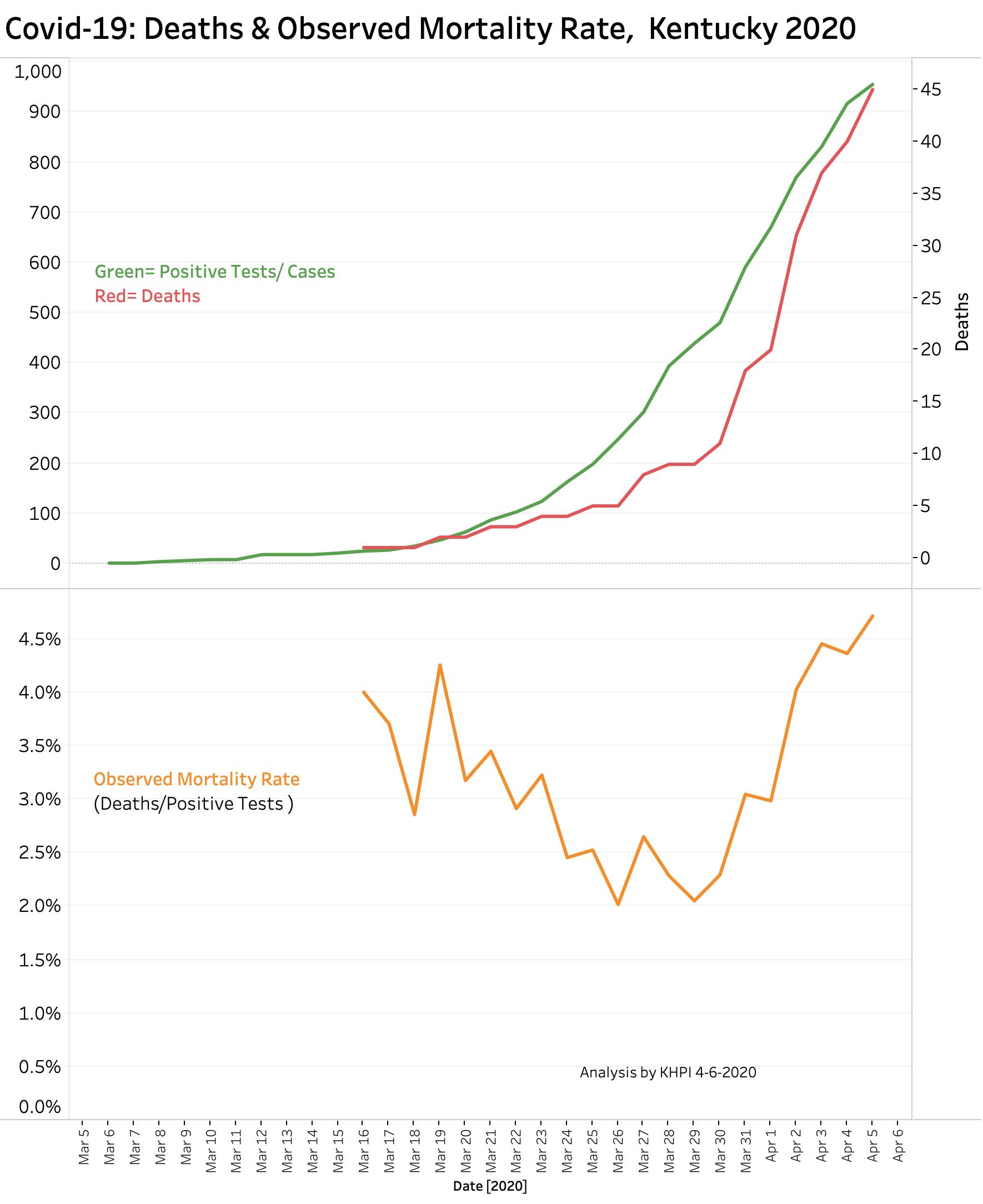
The data underlying this figure can be viewed on my Tableau Public Website using the interactive link above. The data I present are the unchanged numbers as announced at the end of each day at the Governor’s public briefings. It should be noted that these announced counts have been continuously subject to adjustment by the Commonwealth to correct for duplications, late entries due to weekends, or other minor edits, but remain reasonably accurate as we go day to day.
It would be nice to believe that the slight downturn in the green “Positive Tests/Cases” line reflects the “flattening of the curve” that we are all working for. Things should become more apparent over the next few days. Recognize however, that Kentucky is testing many more people for viral infection. Yesterdays announcement noted that some 18,000 people had tests, compared to 2,556 just one week ago! The lesson here is “Seek and ye shall find.” There has always been– and still are– many more infected people in the community than we knew of. Many if not most of these have no or minimal symptoms. We should expect to see the number of new cases go up, especially if the new testing contract with Gravity Diagnostics works as hoped. A continuing increase in new cases should not be used to justify backing off from our efforts to protect each other from ourselves!
The Observed Mortality Rate depicted in the red line above represents the known number of deaths up to that day as a percent of the total number of known positive tests for virus at that time. The fact that this calculated mortality rate is still rising– indeed higher than the mortality rate in places whose epidemics have been running longer– is actually expected and should not cause disproportionate alarm at this point. Because of the lack of earlier testing, the true number of community infections was much underestimated. Only the most severe cases were identified and we expect a higher mortality in this subset of patients.
Recall too that the symptom-free incubation period between exposure and symptoms can range from 2 to 14 days. Similarly, infected people who eventually die do not generally do so on the first day of their symptoms. In a sense then, the Observed Mortality Rate curve is catching up with the number of unrecognized infections that occurred at a time of low testing. This observed mortality rate is surely higher than the actual case mortality rate which is a measure of how many infected people eventually die of their Coronavirus infection. What I expect to occur is that the Observed Mortality Rate will in near weeks begin to decline and level off at a considerably lower level. Epidemiologists all over the world are waiting to see what that level will be and who is most vulnerable.
I would like to have seen a more dramatic decline in numbers nationally, but we were as a country late to the game and it shows. My hometown of New York City, where I learned to be a physician and know its hospitals, is taking a terrible beating. In Kentucky we learned from the experiences of other nations, cities, and institutions and made the hard decisions early. I give our Public Health Department and the Governor’s offices much credit. I am following their advice and you should too.
Peter Hasselbacher, MD
Emeritus Professor of Medicine, UofL
April 7, 2020
If I have made an error in math or terminology or understanding, please help me correct it.
This evening’s updates added 242 new cases for a total of 1,693, and 11 new deaths for a running total of 90 deaths overall. Although some of the case increases likely represent catching up with reporting delays and confirmations, the number of new cases per day is the highest so far. The number of new deaths remains high, but not exponentially so.
Help wanted from a better mathematician than I. On the my Tableau Public visualization of this data, I added a semi-log plot. What are we to make of the observation that the plot of the number of new cases and deaths both seem to be falling from their previous nearly straight line? If this apparent trend continues, can we use these observations to say that our public health interventions are having an effect– that the new numbers are not as bad as predicted based on the previous weeks?
Peter
As of Wednesday evening April 8, cases and deaths still rising sharply. Reports elsewhere indicate we are doing better than adjacent states like Indiana and Tennessee. I remain hopeful things stay that way. See my Tableau Public data visualization for details updated daily .
https://public.tableau.com/profile/peter.hasselbacher#!/vizhome/EarlyCovid-19inKY/Overview
Peter