
New cases exploding in smaller and rural counties along with much of the rest of the Midwest.
Readers of this series of Covid-19 articles will have noticed my bewailing of an easily accessible database of case and death numbers at the county level since the beginning of our share of the 2020 pandemic. Frankfort recent made available copies of its individual daily reports since June that include county-specific counts, but these cannot easily be joined together for analysis. As a matter of political policy, the CDC has been standing on the sidelines shifting many of its national responsibilities to the states.
The New York Times filed a freedom of information request to the CDC to get such information, but along with other private entities, has been collecting county-specific case counts the hard way directly from the states. I was able to download the publicly available Times historical database, extracted the numbers for Kentucky, and prepared interactive data visualizations and tables that allow anyone to look specifically at the historical Covid-19 experiences of individual Kentucky counties and the state as a whole. This new panel of visualizations is available here. I make the data supporting these figures available to anyone as an Excel file of some 15,895 rows of data for your own additional analysis.
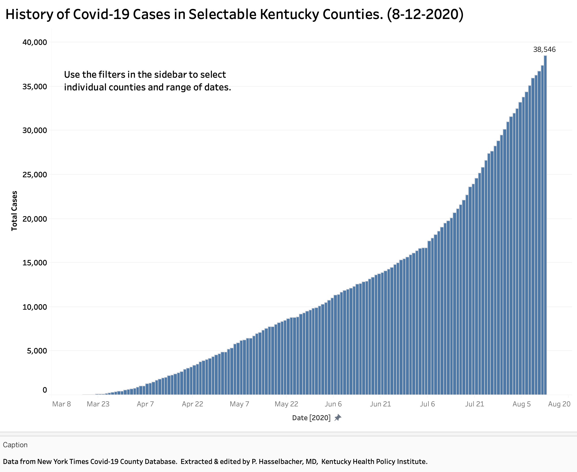
The following figure shows a typical bar chart of the epidemiolocal curve for Kentucky as a whole. (Click to enlarge these.) The aggregate number of cases in the Times database of 38,546 is more than the 36,945 reported as Total Cases by Frankfort on the evening of August 12. I cannot at this time identify definitively the reason(s) for this discrepancy. They likely result from things like changing CDC requirements for what is required to be reported, different reporting daily time cut-offs, the addition of different definitions of “cases”, different kinds of tests allowed, the inclusion of “probable” cases, multiple tests per unique individual human being, and the like. The national and state data collection and testing structures have been changing if not flawed since the beginning. Nonetheless, the Times data, like that of Johns Hopkins, The Atlantic, or the Covid Tracking Project which emphasize different things are widely used as the best that we have available. I do not see a diminution in the rate of growth of new cases in this chart of Kentucky’s experience as a state.
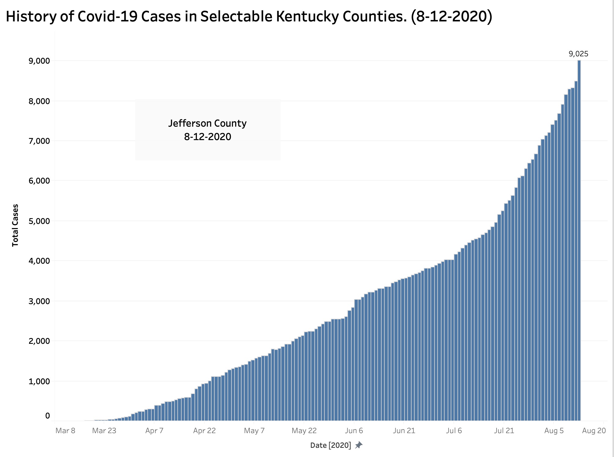
Neither do I see a decrease in the expansion of cases in Jefferson county. If anything, growth appears to be accelerating. I worry much about this as we embark on a season of mass public events like schools opening, soccer and football games, the Kentucky Derby season, and our ongoing public protest demonstrations. People living in states from which Kentuckians must quarantine themselves following a visit will presumably visit us freely for such activities. Folks from various Kentucky counties will visit other counties. I do not believe we can declare that any of the above activities are demonstrably “safe” or at least safe enough as there is no such thing as zero risk. Testing ability and case tracking are stumbling nationally and I personally have no knowledge that we are in a better position in Kentucky.
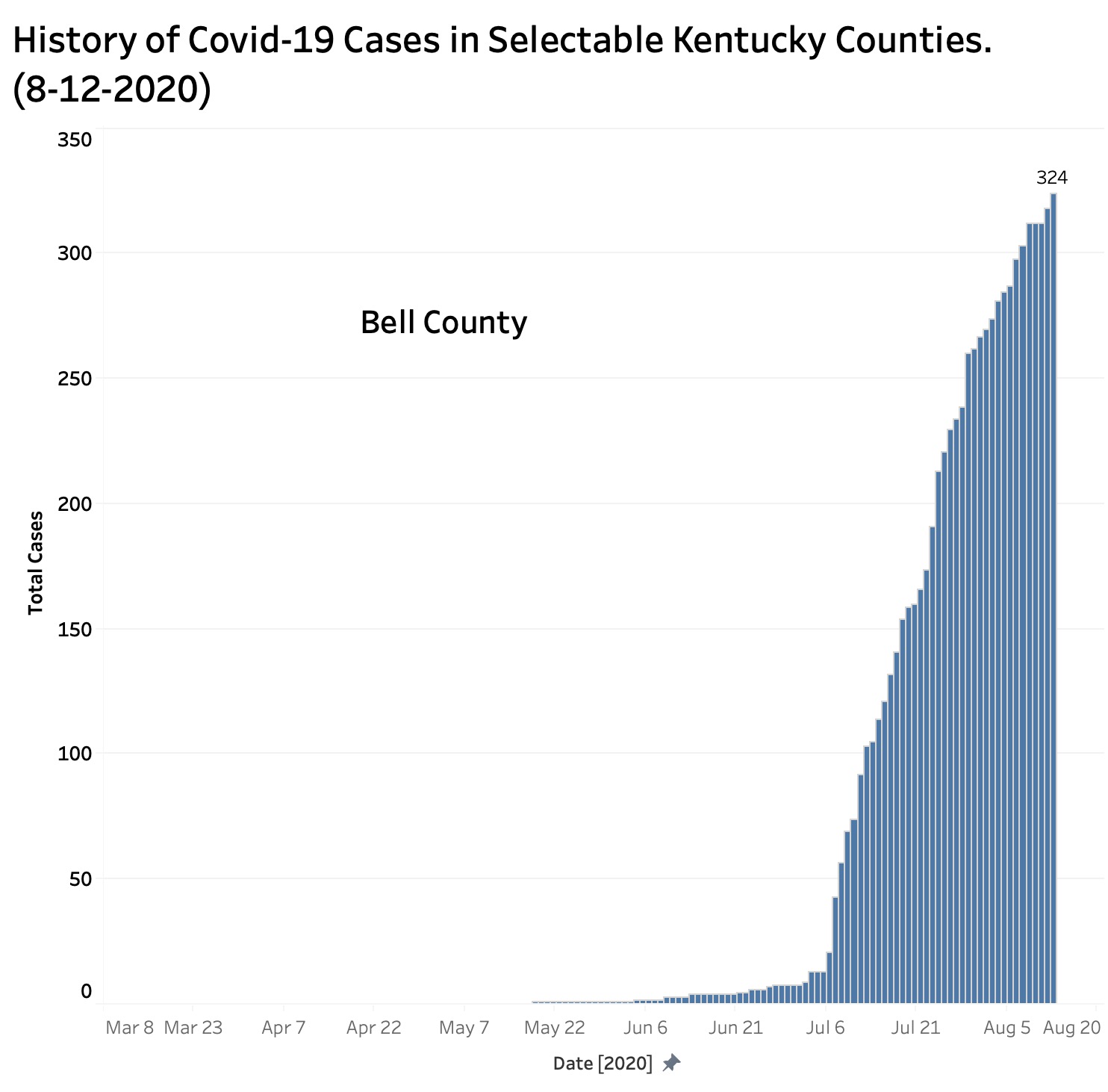
What really blew me away were the histories in many if not most of our smaller and less populated counties where case numbers only began to grow in early July. Some of these counties are frankly still in their explosive exponential growth phase. For example, here is the randomly selected epidemiology curve for Bell County. There are many like it. Click through each of the 120 counties for yourselves. Given the recent glitches in Kentucky’s reporting, I cannot determine whether things are stabilizing or not.
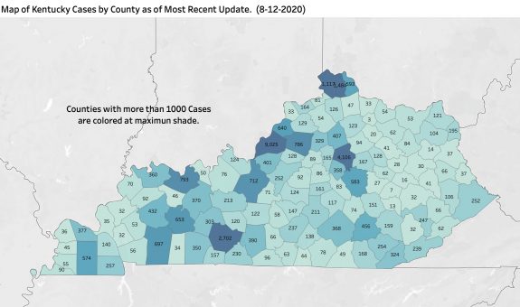
I generated an initial map of raw case counts. This framework can be used to look at population-corrected cases or different time intervals.
There is always more to be said, but I wanted to get the county data out there for your reaction and advice.
Peter Hasselbacher, MD
Kentucky Health Policy Institute
August 13, 2020