
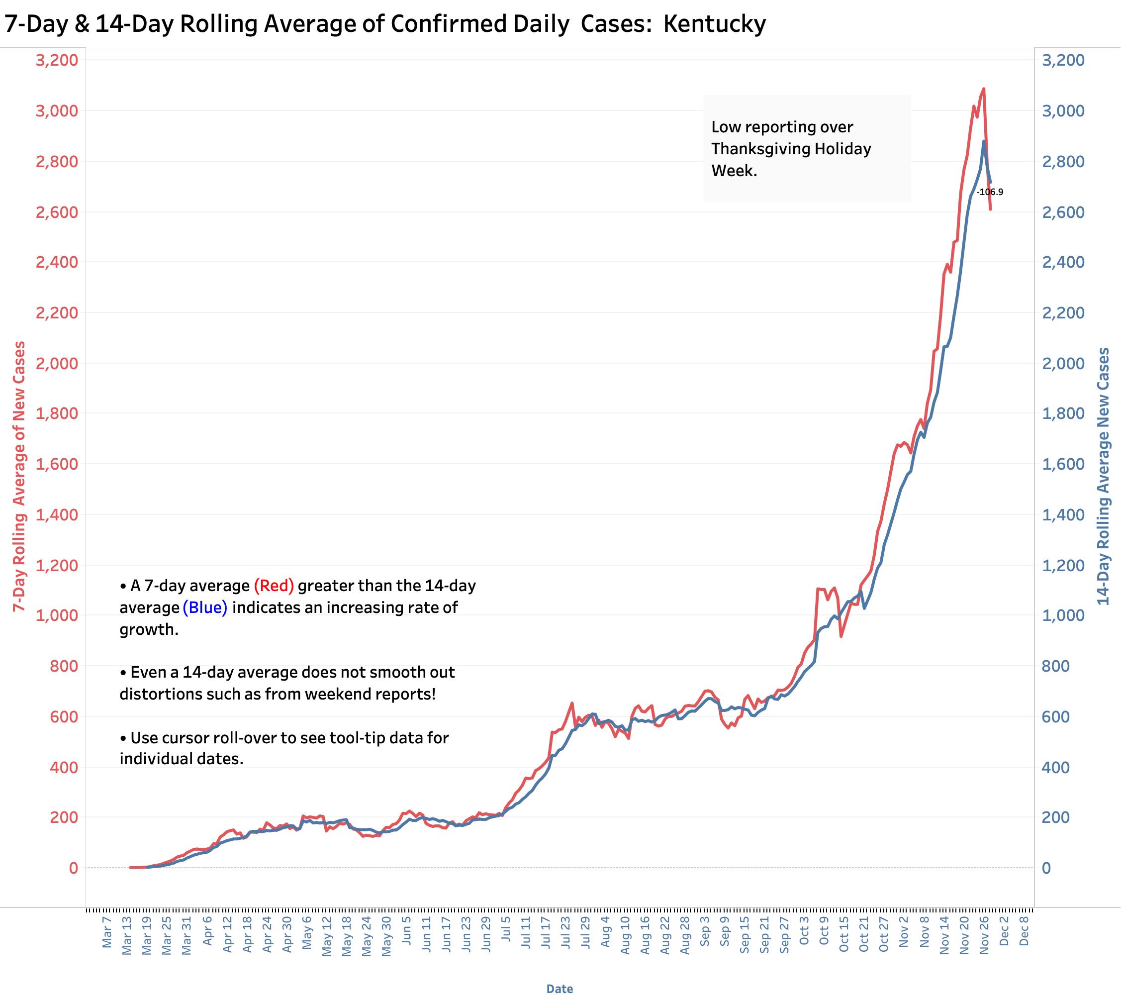
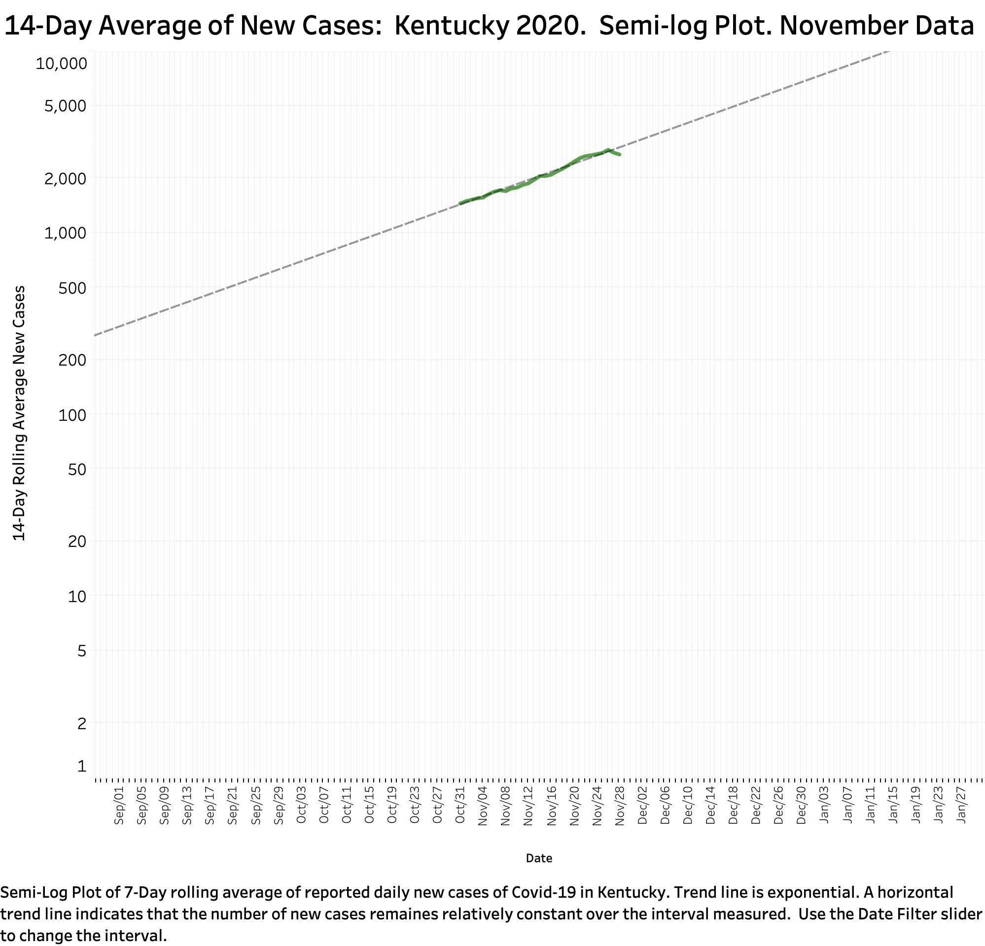
Reported Covid-19 data last week were obviously underreported both in Kentucky and in the United States as a whole. We have come expect that a normal weekend administrative schedule underreports cases and deaths on Sundays and Mondays with corresponding catch-up reporting over the next few days. Bracketed between two weekends, with Thanksgiving holidays in the middle, this artifact was magnified. Even 7- and 14-Day averages of new cases were unable to smooth out the trajectory of Kentucky’s epidemic. New Kentucky cases and deaths for the week were both modestly down from the week before. However, even with two days of reporting left to go for the month of November, the respective monthly tallies tell the troubling tale. Total new cases in Kentucky rose 75% from 38,379 in October to 66,963 in November. Deaths rose 29% over the same period from 311 to 400. Sunday’s preliminary counts of cases and deaths suggest catch-up already occurring. Based only on November’s data so far, at the current 14-Day average rate, we remain on-track to double new cases every 3-4 weeks with a possible 5000 new cases daily by mid-December. Given that travel by car and plane last week reached highest levels by far since the epidemic began, and that Target’s St. Matthews Black Friday parking lot looked like Christmas; it is almost certain that our rate of epidemic expansion will increase further. Hospital and ICU occupancy remain at record levels. The full updated panel of Kentucky’s data visualizations is available at KHPI’s Tableau Public website.
Although Kentucky’s experience with the epidemic has been favorable compared to other states, we are subject to the same problems with data collection and reporting, and also facing the same pressures of Coronavirus fatigue and political push-back. While waiting for Kentucky’s numbers to settle into something more representative, I looked at National data and found that what has been happening in Kentucky pretty much mirrors the combined experience of other states in form if not degree. I will use the rest of this article to replicate the data visualizations I have been using for Kentucky using national data. It must be noted up-front that left to their own devices, states and other geographical units report different categories of data, using different definitions and reporting schedules. Recognizing that there are apples, oranges, and pears in the fruit basket, comparisons among states must be done with caution. Nonetheless, I found it noteworthy that the data visualizations looked much the same, representing experiences similar to our own and therefore useful. For the graphs below, I used the data assembled by the COVID Tracking Project of The Atlantic magazine.
New Cases, Both Confirmed and Probable:
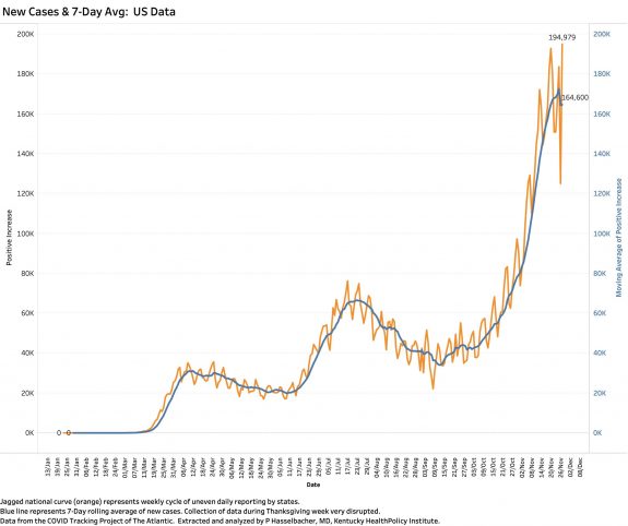
The weekly cycle of case reporting is evident with increasingly large recent swings. Even the 7-Day rolling average curve is abruptly interrupted by the artifact of Thanksgiving week reporting! No one should interpret this to suggest that the epidemic on the ground is getting better! The other major take-away is that the curve replicates the three “waves” or “surges” in new case numbers beginning in March, rising again in the summer, and taking off in October. I will think about some more quantitative way to compare, but to my eye it looks like Kentucky had things under better control in the beginning, did not have quite so prominent a second wave, but shared in the explosive growth in the fall as the epidemic spread out to less urban parts of the states and folks let down their guard.
Hospital Utilization.
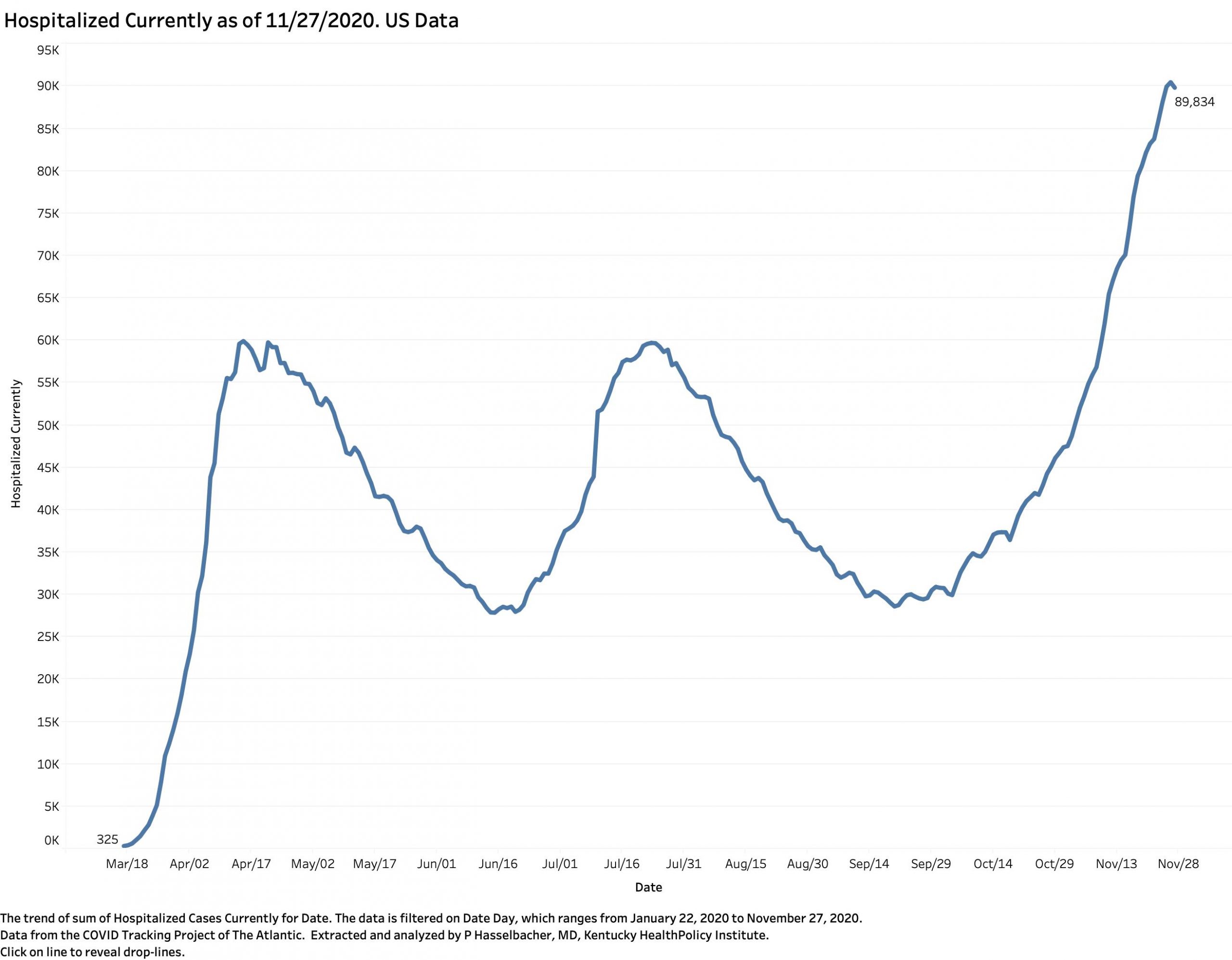
Not surprisingly, overall hospitalization nationally tracked the peaks of the surges. The national ICU utilization curve was nearly identical in shape to that of this ‘currently hospitalized’ curve. One might expect that peak hospital or ICU utilization would lag new cases, but given the different systems of reporting hospital use, it might make more sense to compare these curves on a state-by-state basis. (A task for another slow-data day!) These curves on their face belie the hypothesis that the rise in cases is due to increased testing. It would be hard to fake so many hospital and ICU admissions! In fact, the recent increases in cases has made access to testing and timely reporting limiting once again.
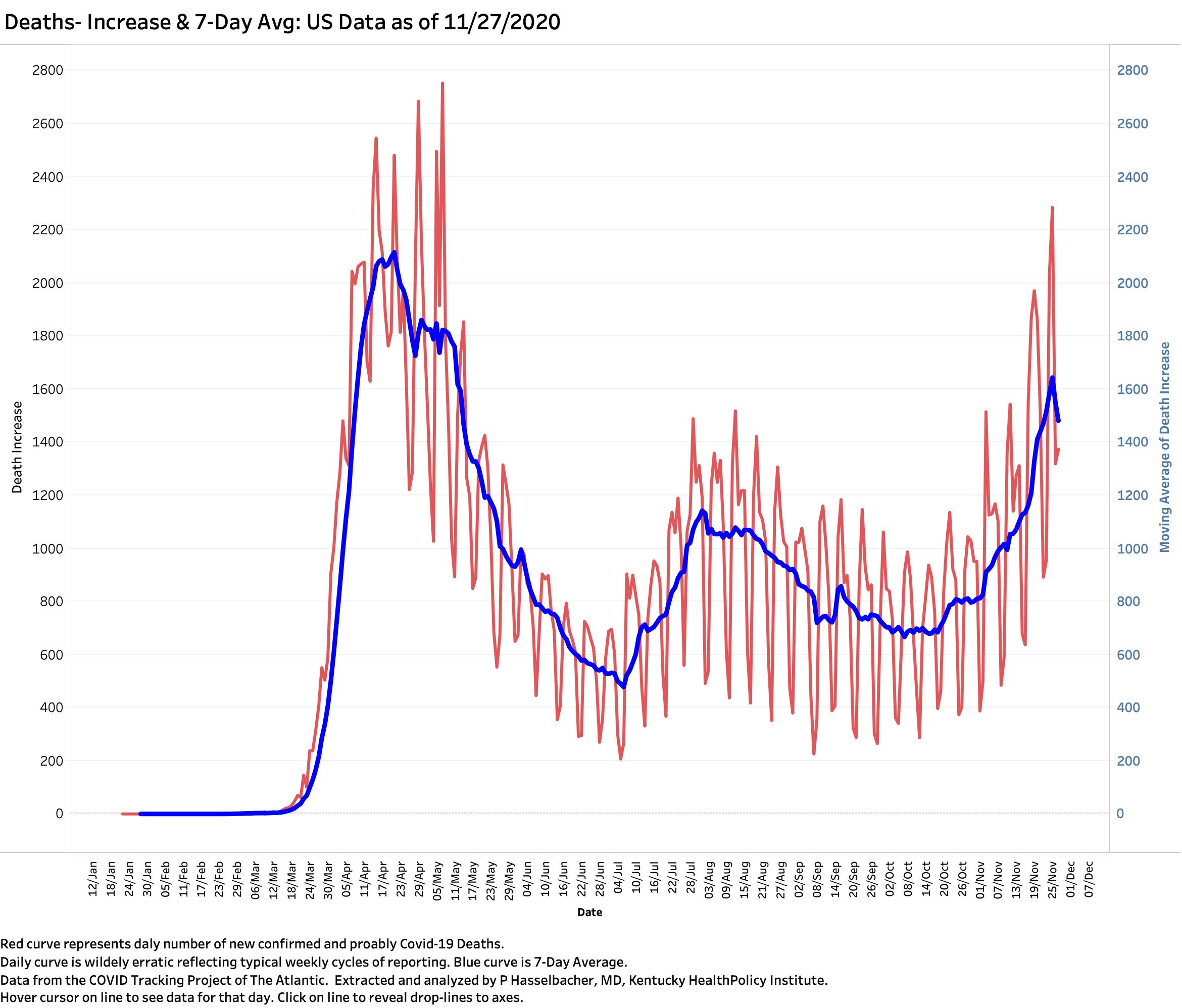
Deaths:
My takeaways from the following plot of newly reported deaths include that the weekly swings in reporting are even greater than those of new case reporting, and that (pending future reporting) a given newly diagnosed case of Covid-19 stands a better chance of surviving now than earlier in the year. Public health scientists will have a better shot of sorting out what is happening as experience is gained. One possible reason and probably a correct explanation is that healthcare providers are smarter about how they take care of these patients. As more is being learned about the pathophysiology of the disease, new approaches to treatment are being used. I suspect this is not due solely or even in large measure to new drugs, but the realization that ICUs and ventilators are not always the best or even a necessary approach, that the disease is more than just lung injury, and that old fashioned steroids and anticoagulants are helpful to reduce run-away systematic inflammation and associated activation of the complement and blood clotting systems. Who would have guessed that simply putting a patient on their belly was a better and safer alternative to intubating them and putting them on a ventilator! There are of course other possible reasons more people are surviving. For one thing, the trend has been that younger people are making up a larger share of the infected. They are intrinsically less likely to die than us oldsters. They are not immune however to the sequala of this multi-system inflammatory disease that can shorten or spoil their lives in other ways.
Where do we go from here?
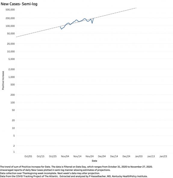
I have placed a full portfolio of the national data on KHPI’s Tableau Public website so you can explore and manipulate the data for yourselves. There is a limit on how reliable it is to extrapolate from past and current history into the future. When I took a quick-and-dirty look by plotting the raw numbers of new national cases for the month of November, a truly catastrophic possibility emerged– and not that far into the future. From a current something-less than 200,000 new cases per day, at the current monthly rate, we could hit 500,000 daily cases by the end of the year. National cases are doubling at a rate faster than in Kentucky. If we discount the slight fall below the trend line of the past week, it could get even worse.
That is enough for now. Later today, Governor Beshear and his Public Health staff will release Sunday’s full report and Monday’s. I expect the numbers of cases and deaths will be bad. Our hospitals have already filled their traditional ICU beds. Testing is not rising with new cases. Our rural counties will be leading the charge as the share of new cases from Louisville and Lexington continues to diminish. I am not the only observer fearing that the darker times have yet to visit us. I applaud our Governor for behaving more like a doctor than a politician. He deserves support rather than self-serving opposition as he seeks both to protect the public health and to find ways to support those of us who are being asked to do hard things.
Peter Hasselbacher, MD
Emeritus Professor of Medicine, UofL
Kentucky Health Policy Institute
29 November 2020
Other Related Portfolios on KHPI Tableau Public:
Covid-19 Data by County for Every State and Date with State County Maps:
I imported the New York Times County data, the only source I know about and available that gives case and death data by county. These visualizations are fully interactive with selectable state and dates.
Animated Map Displays of Statewide Spread Over Time For Every State:
Using the New York Times data above, I prepared a series of visualizations that includes an animated map that scrolls through the distribution of cases among the counties of selectable states by individual date since the beginning of their epidemics. The “slide show” function is going to be too slow for most on-line viewing, but the viewer can manually jump from date to date to watch the spread of infection across the state. I had already posted a Kentucky-specific animated map that scrolls forward week to week that can be view in real time. In theory I can provide the same accelerated viewing experience for any state.
Deeper Dive into Kentucky Data by County:
This visualization has been up for a while and needs to be updated a week, but allows Kentucky Counties to be looked and compared at in a variety of ways. For a starter, look at Lee County. When should local authorities have known that something was going on? When was appropriate action taken? Look at Oldham County where local resistance to public health measures is strong, and rates of infection high.