
Some Hospitals Get the Triple Whammy.
It can’t be easy to be a hospital administrator nowadays. It probably never was. It has always been a delicate balance to juggle dealing with the feelings and physical needs of the sick and their families, courting professional staff members, the business priorities of the community, the never ending march of new technologies, the ever-present possibility of malpractice suits, labor and staffing issues, competition from other hospitals, the spiraling costs of healthcare, and more recently the expanding expectation of transparency and measurable outcomes. There are few industries subject to as much regulation and oversight as the hospital industry. With the authority of the federal government behind it, Medicare– whose lead is followed by much of the private-payer world– is arguably the regulator-in-chief and is increasingly more willing to use its control of the purse strings to advance public health policy priorities. Highly visible in the last three years are Medicare programs that seek to change the metric for payment of hospitals from paying for volume and procedures to quality, value, and desirable health outcomes. Measurement of these latter is now being tied to Medicare hospital payments.
I recently wrote about Medicare’s Hospital Acquired Condition (HAC) Reduction Program in which acute care hospitals in the prospective-payment system with the worst quartile of scores had their total Medicare payments reduced by 1%. As it happens, two other major Medicare programs with attached penalties have also just come into further maturity— the Readmission Reduction Program, and the Value Based Purchasing Program (VBP). These latter two expose hospitals to even higher potential financial penalties in FY 2015 than the HAC program. Hospitals now face a triple-threat to their bottom lines totaling as much as 5.5% of their Medicare payments, potentially wiping away much or all of their Medicare profits!
Readmission Reduction Program.
It has been no secret that as many as 20% of Medicare patients discharged from the hospital are readmitted within 30 days. Some if not the majority of these admissions are unavoidable. Sick people with chronic diseases will remain sick. Many have no other place to go for healthcare. Non-medical determinants of health such as poverty are a massive factor. On the premise that at least some of these readmissions are preventable, and that too many readmissions are a measure of undesirable quality, federal law mandates a financial penalty for hospitals with “too many” readmissions. What is too many and how is the penalty assessed? As with the HAC program– it is complicated. I am still learning and plan to write more later. The program began modestly two or three years ago looking only at 30-day unplanned readmissions for heart failure and pneumonia, but the number of diagnoses covered is expanding to include total joint replacements, stroke, and chronic obstructive pulmonary disease. The maximum penalty has risen to a painful 3% of total Medicare payments within the prospective payment (DRG) system.
Value Based Purchasing (VPB) Program.
This program is based on four basic domains that are thought to reflect on hospital quality: the Clinical Process of Care Domain, the Patient Experience of Care domain, the Outcome domain, and the Efficiency domain. (Yes, it is complicated!) You can learn as much as I know here. The Clinical Process of Care includes a mostly self-reported subset of process measures from the current core of the Medicare’s Hospital Compare program such as “are heart-failure patients given discharge instructions?” The Patient Experience domain comes from a standardized survey (HCAHPS) asking about their experiences during a recent hospital stay such as “did you get the bedpan in time.” The outcome domain is thought to record objective observations and outcomes such as 30-day mortality rates for certain diseases, but it also includes the Central-line infection rate and the AHRQ PSI-90 panel of measures that make up almost all of the HAC score. (Talk about double indemnity!) The Efficiency domain tallies Medicare payments to a hospital for 3 days before and 30 days after admission for a single episode of care for a given patient. As was true for the HAC program, the completion of data collection varies widely among hospitals. For FY 2015 the maximum VPB penalty (or bonus) is 1.5%, rising to 2% in FY 2017
Unlike the HAC and the Readmission programs, hospitals may actually receive a bonus for good performance in the VBP. The program is structured such that approximately half the hospitals get a penalty, and half get a bonus. For all three programs, hospitals will always be chasing their tail, perpetually vulnerable to penalties. The three current maximal penalties of 1%, 3%, and 1.5% amount to a total of 5.5%. This is more than the Medicare profit margin for Medicare patients for many if not the majority of hospitals!
Not surprisingly, various hospital lobbies and allied organizations such as the medical school lobby are protesting that these quality-evaluation systems are unfair to them. It is claimed that teaching hospitals, urban public hospitals, or hospitals serving large populations of disadvantaged patients are at an unfair disadvantage despite efforts to apply risk adjustments for severity of illness. This is in my opinion not an unreasonable hypothesis, but like all hypotheses, it needs to be proven. I will address this issue further below with examples from Kentucky, but first, I believe it is instructive to see how Kentucky hospitals fared for FY 2015. I abstracted and organized information related to the three penalty programs from Medicare’s website for Kentucky Hospitals.
A Preliminary View.
The first table summarizes the three penalties and is ranked in order of the magnitude of the combined penalties. A rank of 1 in a given category indicates the highest penalty– in this table, Saint Joseph East with a combined total penalty of 3.82%. Other hospitals with a total penalty of 3% or more include Hazard ARH Regional, Jennie Stuart, and Whitesburg ARH. Sixty-three of the 65 hospitals at risk received at lest one penalty even though 8 hospitals received a net bonus as high as 0.5%.
Penalty No.
>3% 4
2-3% 14
1-2% 14
0-1% 24
Bonus 8
It is clear that the size of the 3% readmission penalty caused the most pain this year. Hospitals that did not do well in this category largely populated the most heavily penalized half of the list. It is also clear that the three penalties did not correlate well with each other. Hospitals that did not do well in one category did not necessarily do badly in the others. For example, Harlan Appalachian with the 5th highest total penalty was spared the HAC penalty and actually received a bonus for VBP. It was pulled down by its readmission experience. Jewish & St. Mary’s had a respectable readmission rate, but was hit hard by the HAC and the VBP. Memorial Hospital, which received the second highest VBP bonus was knocked down to the 16th overall highest penalty solely due to its 3% readmission penalty. Georgetown had one of the highest VBP penalties but was saved by its nearly perfect HAC and readmission showings.
Much to sort out.
I will attempt to correlate further the various penalties with each other and with a variety of other hospital characteristics (such as size, location, teaching status, Medicaid, charity care, etc.) in a later article. Are large urban teaching hospitals being treated unfairly? Both our Kentucky university teaching hospitals had low readmission rates. In fact, University of Louisville Hospital had one of the lowest readmission penalties in the state! The University of Kentucky Hospital actually got a VBP bonus! Is Baptist Health Louisville— which serves a low percentage of Medicaid or uninsured patients, and which was without penalty— advantaged, a high-quality hospital, or both?
Differences can be demonstrated.
Different categories of hospitals do get different penalties. For example, among hospitals nationally, there was not much difference between the total HAC scores of large urban hospitals (LURBAN) compared to other urban hospitals (OURBAN) (5.5 vs 5.4). However, hospitals designated as Rural had an average HAC score of 4.8. These differences were magnified in Kentucky where the average HAC score for our 9 large urban hospitals was 6.8, for our 15 other urban hospitals was 5.0, and for our 41 rural hospitals was 4.5. Of our 9 large urban hospitals, a disproportionate 5 were tagged with the 1% HAC penalty! I am beginning to have the feeling that if you have seen one hospital in its community setting, you have seen one hospital in its community setting.
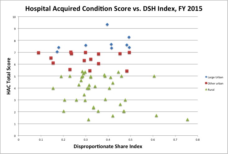
To look at HAC scores from another perspective, consider the following chart of HAC score plotted against the DSH index for Kentucky hospitals by category of Medicare hospital. The Disproportionate Share Index (DSH) is Medicare’s traditional proxy to estimate the amount of care provided to disadvantaged patients. It measures the percent of all patients who are Medicaid or Medicare/Medicaid dual beneficiaries. Note that irrespective of the DSH index, large urban hospitals had higher (worse) HAC scores than did other urban hospitals, which in turn had higher scores than rural hospitals. The separation of the categories is striking! Do these differences reflect hospital safety and quality, do they reflect some other differences in patient populations, are they an artifact of the data collection process, or something else altogether?
A quick look at teaching hospitals.
Among teaching hospitals nationally, large differences in HAC penalty can also be observed. By enjoining Medicare’s Hospital Impact File, it is possible to link the penalty tables with a wide range of other hospital physical and operating characteristics as I did in the chart above. For example, I compared the Total HAC scores of the top 200 most teaching-intensive hospitals (as judged by the number of residents per bed) with the lowest 200. The average HAC scores were 6.89 vs. 5.68 respectively. This translates into 107 of the most teaching-intensive hospitals receiving the 1% penalty compared to 52 of the lowest 200. There are likely other characteristics that differentiate these hospitals, including hospital size. Sorting things out may stretch my statistical savvy and software, but I will try some more.
All for some, and some for all.
It should not be overlooked that many hospitals are not subject to these quality programs, including Medicare Critical Access hospitals or specialty hospitals. Additionally, data is only collected on traditional “fee-for-service” Medicare patients in those hospitals and the penalties applied only to payments for that subset of Inpatient Prospective Payment Medicare patients. These quality programs by no means include all Medicare inpatients even in a given hospital. Nationally, the 30% of Medicare beneficiaries who are enrolled in Part-C Medicare Advantage plans (24% in Kentucky) are completely out of the loop in terms of data reporting or financial penalties related to their hospitalizations. Hospitals or regions with high Medicare Advantage penetration will have a financial advantage and relative shelter from penalties.
Medicare pays a higher premium per patient for Medicare Advantage (managed-care) enrollees despite a concern that they are less sick than traditional Medicare patients. (A manifest triumph of the health insurance lobby.) The fact that there are so many hospitals and patient populations excluded from these quality surveillance programs is troubling to me. These programs are incredibly complicated and expensive to manage at all levels. They are only getting more so with higher penalties. If the results are supposed to be good for public health, than all the public should be included.
Obviously there is much room for analysis. Frankly I like playing with the numbers, but much is at stake. These are expensive and time-consuming programs. Hospital administrators must be having nightmares involving data-munching monsters. My own head reels at the already-present staggering demands on the healthcare system let alone the planned additions already on the table. If this is what it takes, than so be it. I must say however, that I am personally not yet sure in which direction the risk-to-benefit-ratio of this vast public experiment leans.
Peter Hasselbacher, MD
President, KHPI
Emeritus Professor of Medicine, UofL
January 10, 2015
Additional Downloads:
Here is the Table of Penalties above presented differently:
Ranked by Total HAC Score.
Ranked by Readmission Penalty.
Ranked by VBP Penalty.
Or if you want to play with an Excel Spreadsheet.
If I have made an error manipulating the tables, or if there is a view you would like to see, please contact me.