
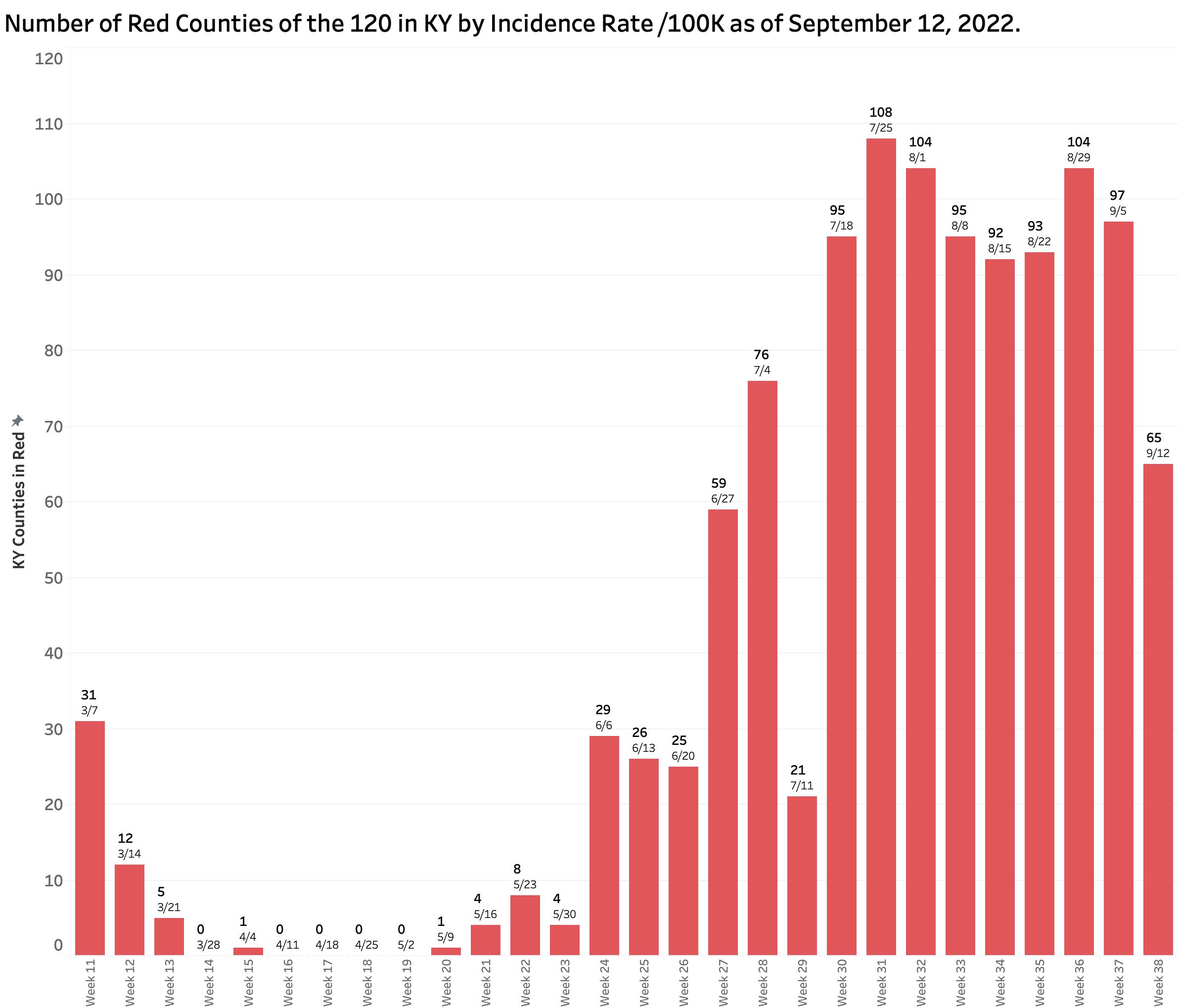
Yesterday’s COVID-19 update from Frankfort reported a considerable drop in the number of new cases which is necessarily reflected in a decrease in the overall incidence rate. However, the September 12 report spans Labor Day weekend and the subsequent following week. The drop in identified and reported cases was not matched by a decrease in hospitalizations, ICU/ventilator utilization, or deaths. The number of Kentucky counties mapping as red (high) with current incidence rates of greater than 25 per 100K also fell substantially from 97 to 65 counties, but this measure is also dependent the number of cases identified within the previous 7 days. While providing a glimmer of good news, confirmation of any downward trend needs to be confirmed over the next few weeks. Previous experience in Kentucky’s pandemic demonstrated the impact of holidays and weekends on the state’s ability to provide timely and complete numbers– the Achilles heel of Kentucky’s public heath enterprise constrained as it has been by legislative restriction.
Other independant updates not as prromising.
The New York Times continues to collect and analyze a more extensive set of data. Currently, the nation as a whole is in the middle of a gradual decline in new cases. The Times’ assessment of the pandemic in Kentucky reveals a devastating picture. Among all 50 states, DC, and the territories, and as of the beginning of this week, Kentucky is reported to have by far the highest case incidence rate at 70 per 100K followed by West Virginia with 42. Our statewide hospitalization rates are the fifth highest, and deaths the third. With respect to case incidence rates, among all the individual counties in the nation, five of the 10 highest and nine of the 20 highest are in Kentucky. I have no way to resolve the discrepancy between the Times’ numbers and our own, but it remains indisputable that Kentucky’s weekly report does not include very large numbers of cases. For example, the number of PCR tests done in the last week was 27% fewer than the previous week. I present illustrative charts below that led me to a conclusion that it is not yet time to declare success.
New Cases Identified and Reported:
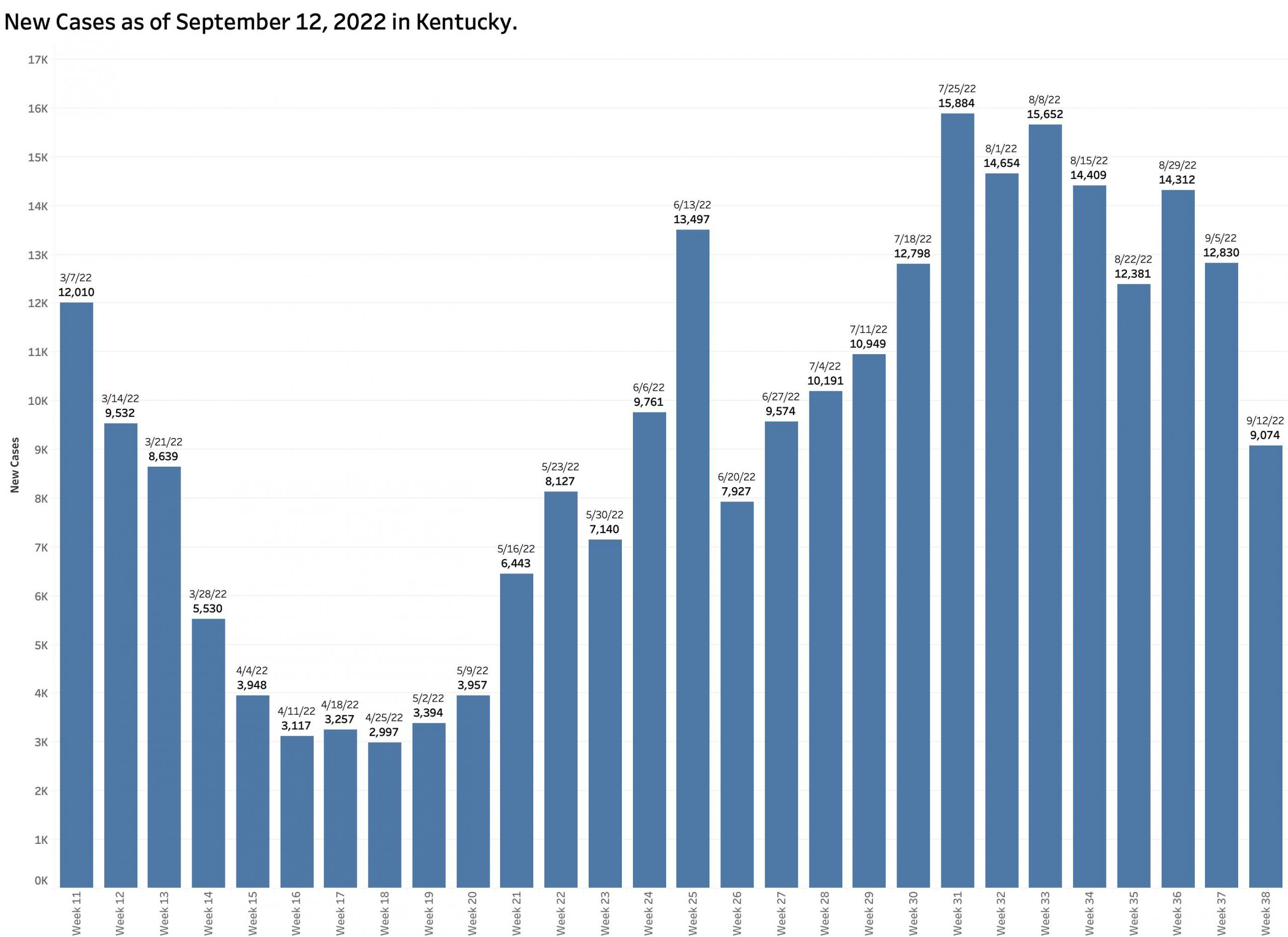
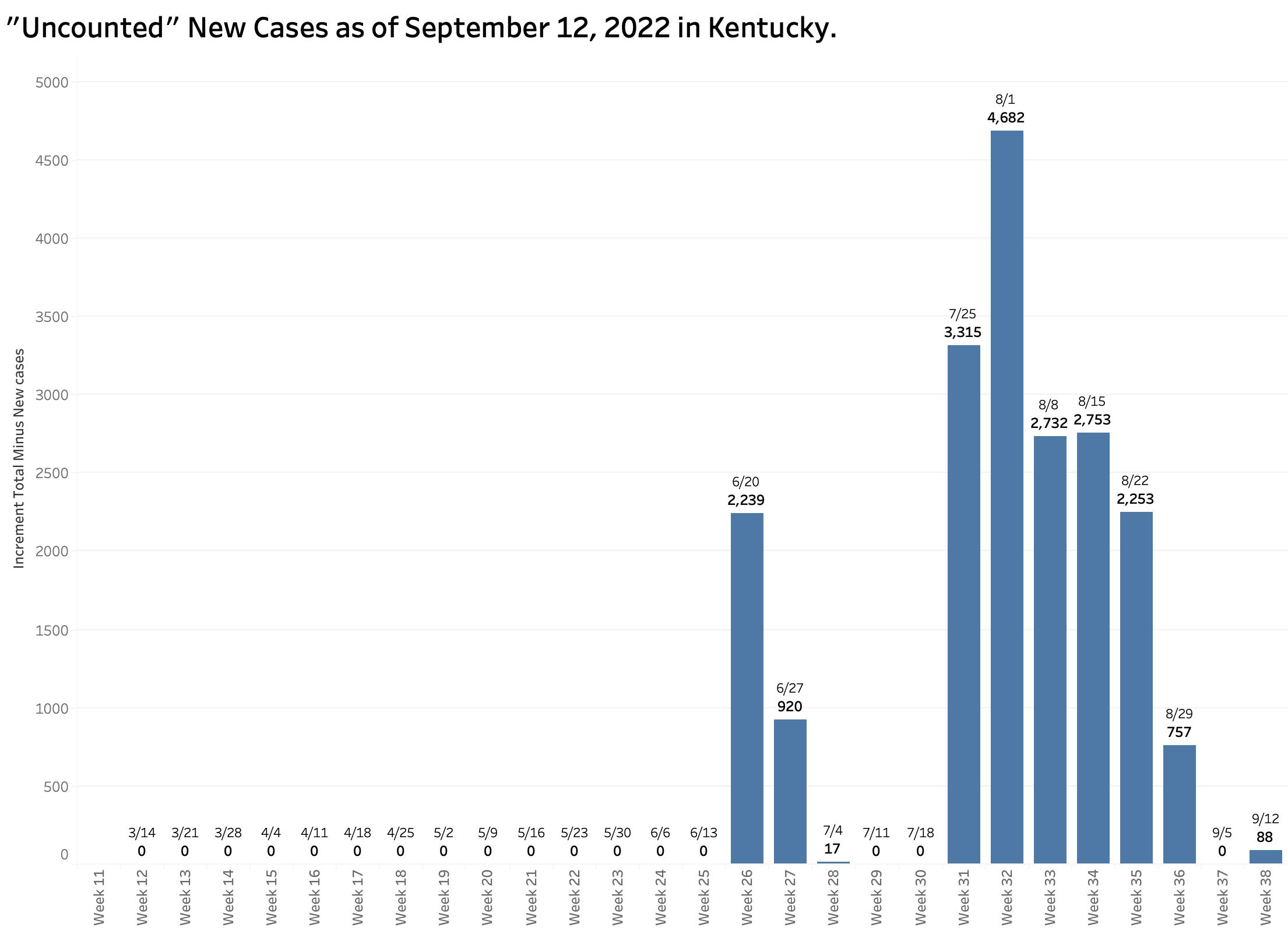
The chart above shows the raw counts of new cases identified within a predetermined earlier period. This is clearly an undercount. The following chart shows the difference between each week’s reported “new” cases and the weekly increment in the aggregate total number of cases. Thousands of cases are identified too late to be reported in a timely way.
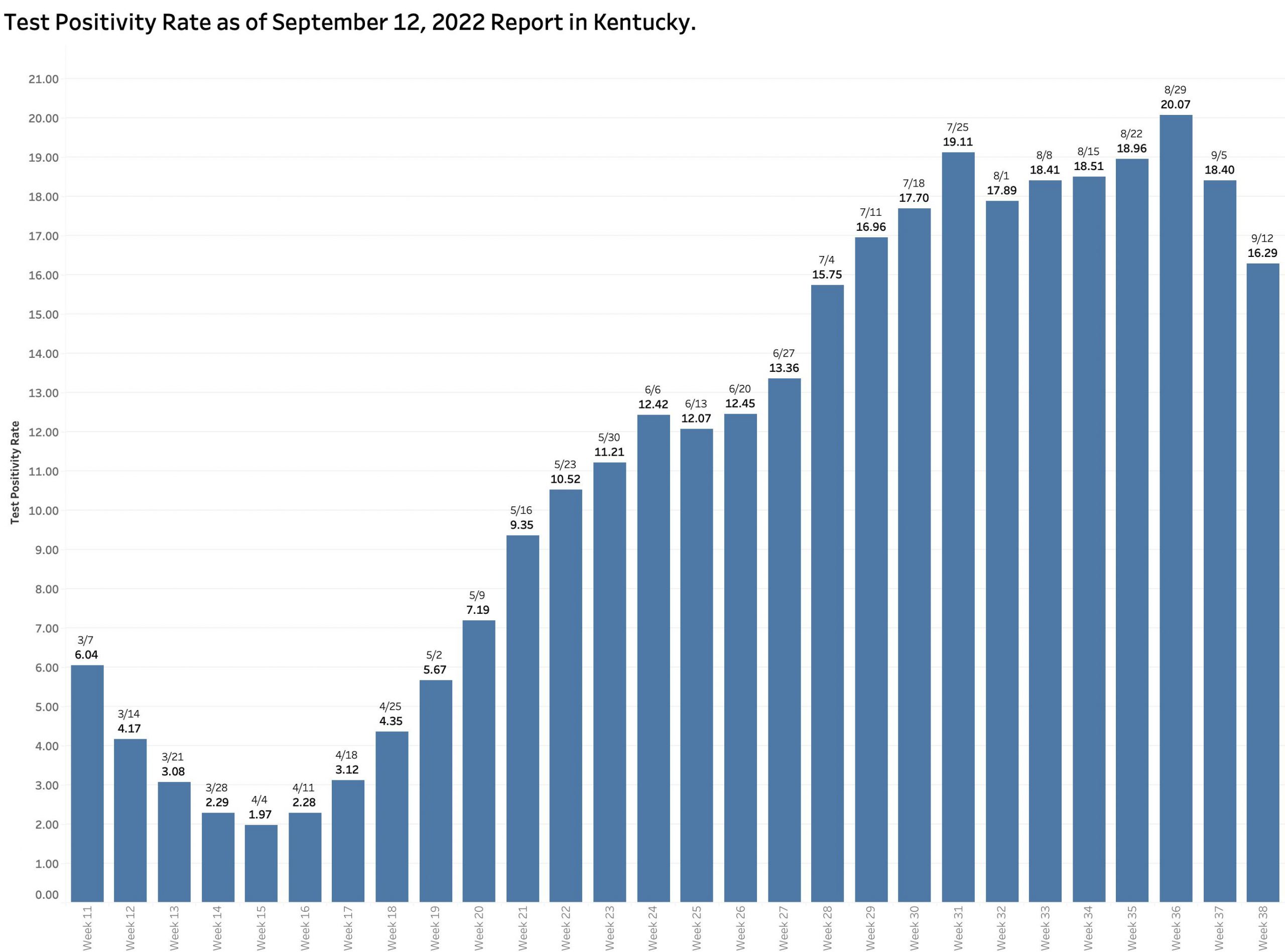
As expected, the state-wide overall incidence rate pretty much tracks the number of new cases. The differences between counties reman considerable. As has been the case for some time, a major hot-spot in the nation for Covid-19 infection is the Appalachian parts of Kentucky, West Virginia, Virginia, Tennessee, and North Carolina.

The Test Positivity Rate decreased a more modest 11.5% from the previous week to 16.3%. The last time the TPR was lower than this in the report of July 4, another national holiday.
The number of PCR viral RNA tests performed from which the TPR is calculated dropped a considerable 26.5%.
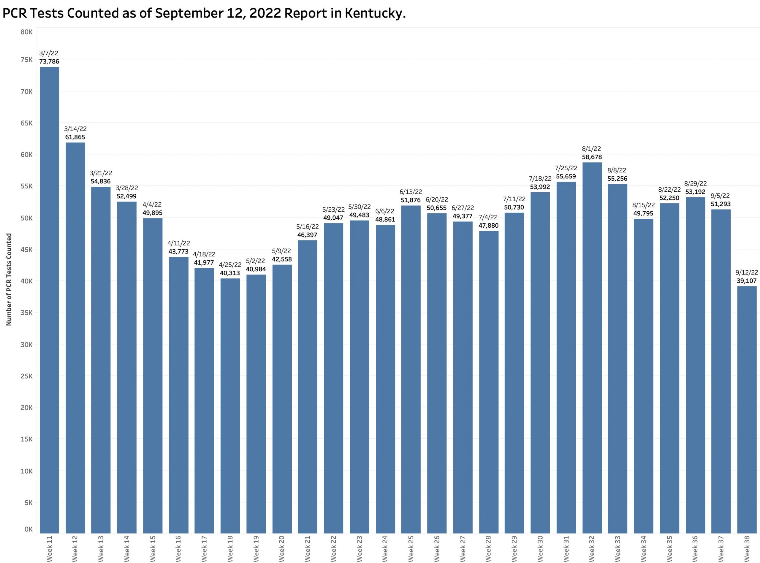
In recent months, some 70% of new cases have been regularly identified using PCR testing. [Home testing and antigen testing are not being accounted for separately at all, but likely are in number used more than PCR tests.] Surely the reported number of new cases is lower in part due to fewer tests being done. One does not find what one is not looking for!
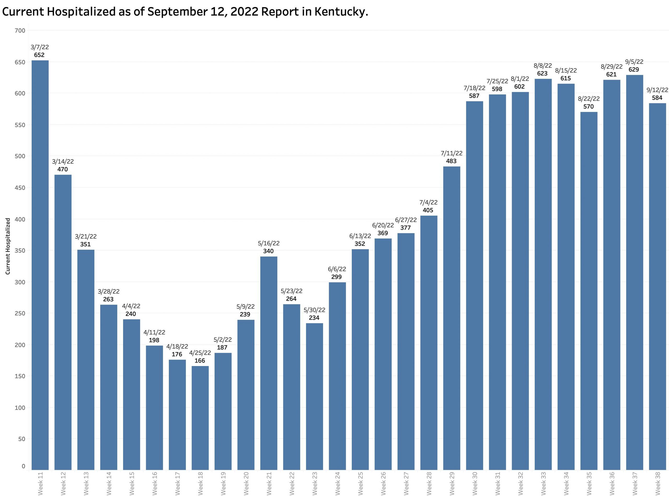
The current hospital census is reported as 584 showing little change over the previous 8 weeks. The charts for ICU and Ventilator utilization look pretty much the same.
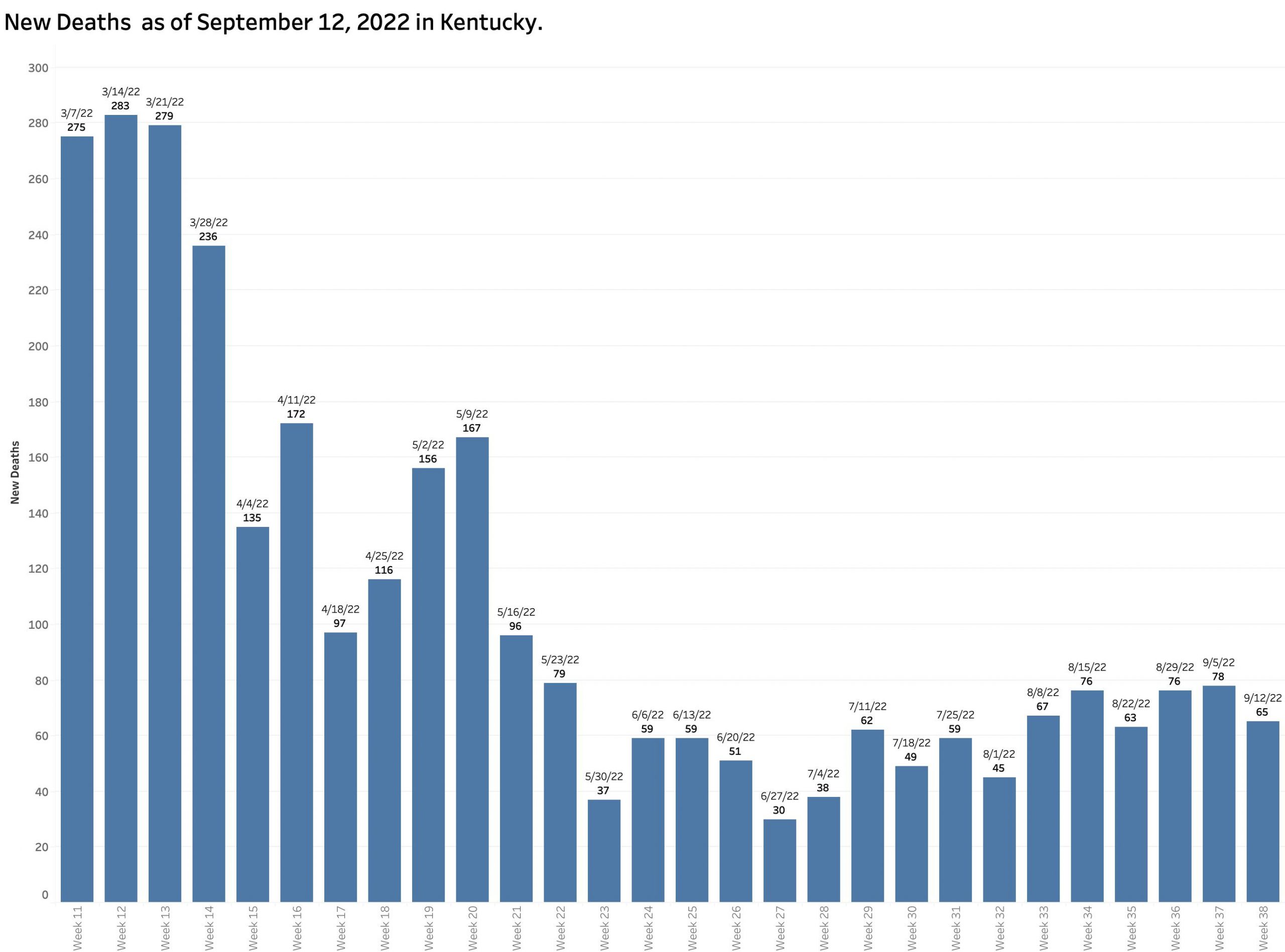
The number of new reported deaths has not changed much. We expect hospital utilization and deaths to lag the number of new cases. Given that the objective our current national strategy of pandemic management is to limit these complications, victory cannot be claimed until these sequelae of coronavirus infection are acceptable. I do not think they are now.
Community Activity vs. Case Incidence Rates.
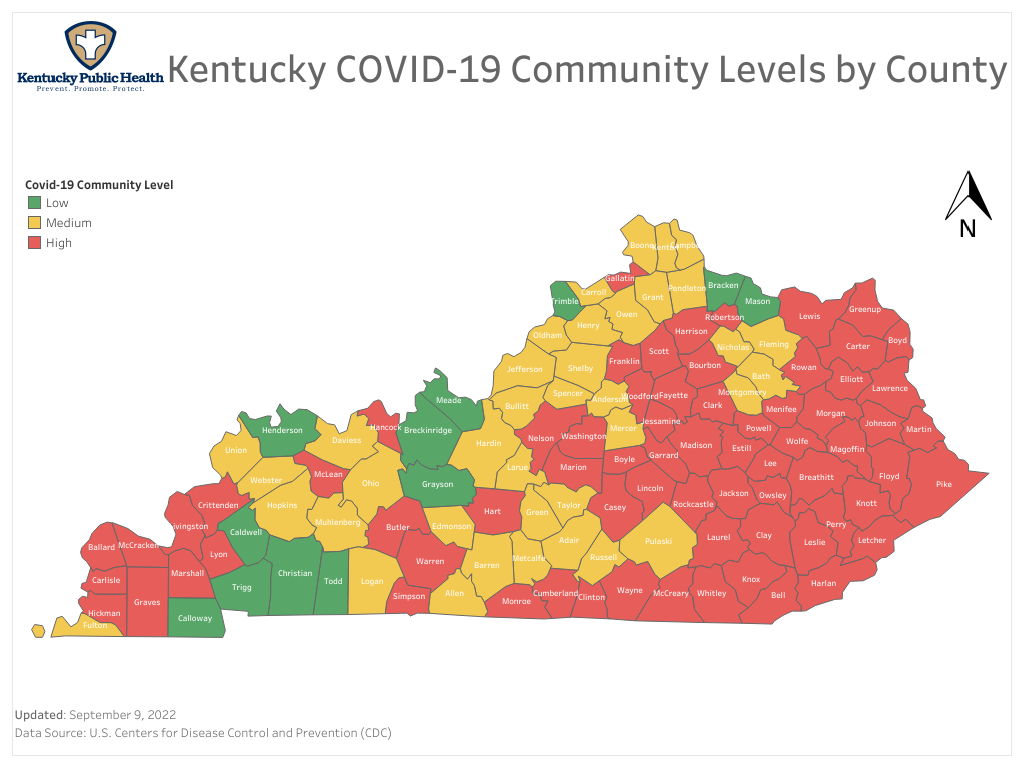
The most recent Community Activity Level map shows many yellow and even some green Kentucky Counties. A recent one-week change in Jefferson County from red to yellow is being used as a justification to eliminate a mask mandate in public schools. (I hope this is not premature as individuals 18 years and younger have recently made up as much 38% of all new reported cases statewide!) The community level is calculated using data and a formula not available to me but takes into account case incidence rates, and hospital utilization within service areas associated with hospitals outside our state line in states with overall incidence rates that are lower than Kentucky’s. If our incidence rates are artifactually low, so will be the assessment of our Community Levels.

Having had Covid-19 myself at least twice, no one wants this epidemic to fade into more of a manageable endemic infectious illness than I. I do not see that we are there yet. I will get the new bivalent booster as soon as it becomes available and urge the people I care about do the same. I will continue to wear a mask in public spaces. I do not think that makes me a bad person!
Peter Hasselbacher, MD
Emeritus Professor of Medicine, UofL
13 September 2022