
How can we tell if we are winning?
Omicron variant is still expanding in Kentucky.
I have put off reporting on whether we have turned the corner with respect to the current overwhelming Omicron spike of Covid-19 cases that is once again disrupting our social and economic lives in Kentucky. Epidemic-related case, death, testing, and hospital numbers have been exhibiting more than their usual weekday volatility since the Omicron flair began in December, amplified by reporting delays related to three long holiday weekends and epic natural disasters. The experience with Omicron in other countries and a few American states that hosted the strain early enabled, an optimistic view that Omicron would come and go as “icepick” spike in the epidemic curve rather than the prolonged mountainous bulges that characterized the summer surges of the Alpha and Delta strains of 2020-21. The record high numbers of new cases reported yesterday make it clear that we have not yet felt the worst of Omicron’s epidemic expansion.
More pictures than words follow.
The Omicron strain of the Coronavirus that is currently swirling around the world is the same basic virus that launched this epidemic ship but which has evolved genetically along with some significant changes in potential human host populations. We are still learning what these differences are. There is no doubt that the strain is much more infectious than previous ones with the ability to reinfect individuals who were infected by earlier strains, and many who have been vaccinated. Some of the previous effective treatments of early infection are ineffective against Omicron. It is also clear that vaccination protects against the most severe complications such as hospitalization and death. Much remains to be sorted out. How early and how long does an exposed or infected person with- or without symptoms remain contagious? Are more children or younger people getting in trouble? What are the long-term consequences of infection? Has the sensitivity or specify of current tests changed? The answers to these and other important questions will take a while to work out. We must expect that recommendations to healthcare professionals and to the public will change as we learn more. This is not “flip-flopping.” We are dealing with an enhanced pathogen in a human population that is different both biologically and socially than before the current Coronavirus plague. The purpose of this article is not to give a survey of current knowledge about the virus. I will address below how we might interpret the limited timely epidemic data available to us in Kentucky.
How can we tell if things we are doing are working or not?
In the three previous major surges in Kentucky, the combination of basic public health measures and vaccination turned exponential growth into partial recoveries. The same process is likely to occur with the Omicron surge. In the meantime, our duty as citizens is to minimize, or at least manage, the damage to us physically, economically, and socially. I have been tracking several basic epidemic metrics since the beginning of our epidemic in March of 2020. These include the number of new cases and deaths and the increments to their respective totals. I tracked hospital, ICU, and ventilator utilization since these numbers were first made available. I tallied the both the number of tests reported daily as well as the percent of tests reported as positive using both raw daily counts and (since October of 2021) the Test Positivity Rate devised by the Kentucky Public Health Department (KPHD) which is based on consistent electronically-reported tests. All these data can be manipulated mathematically or visualized graphically in several ways. In the comments to follow I will display the ways that the data has spoken to me and why I think some of them can be useful to identify when we start winning again. Spoiler alert! We haven’t turned the corner yet.
New Cases of Covid-19.
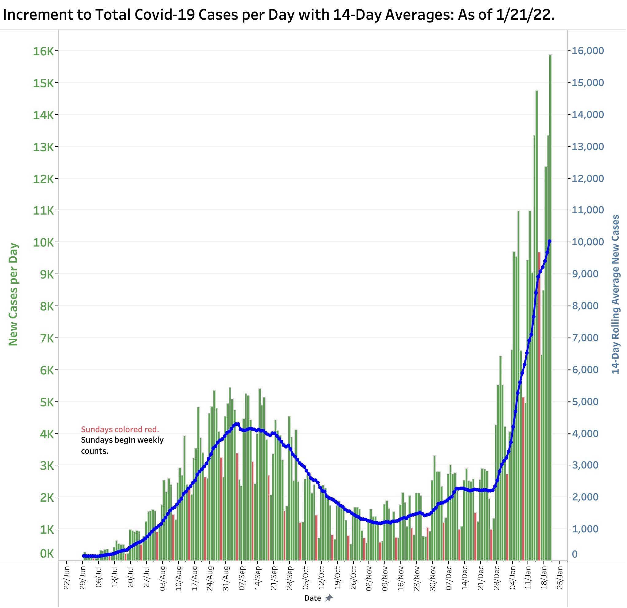
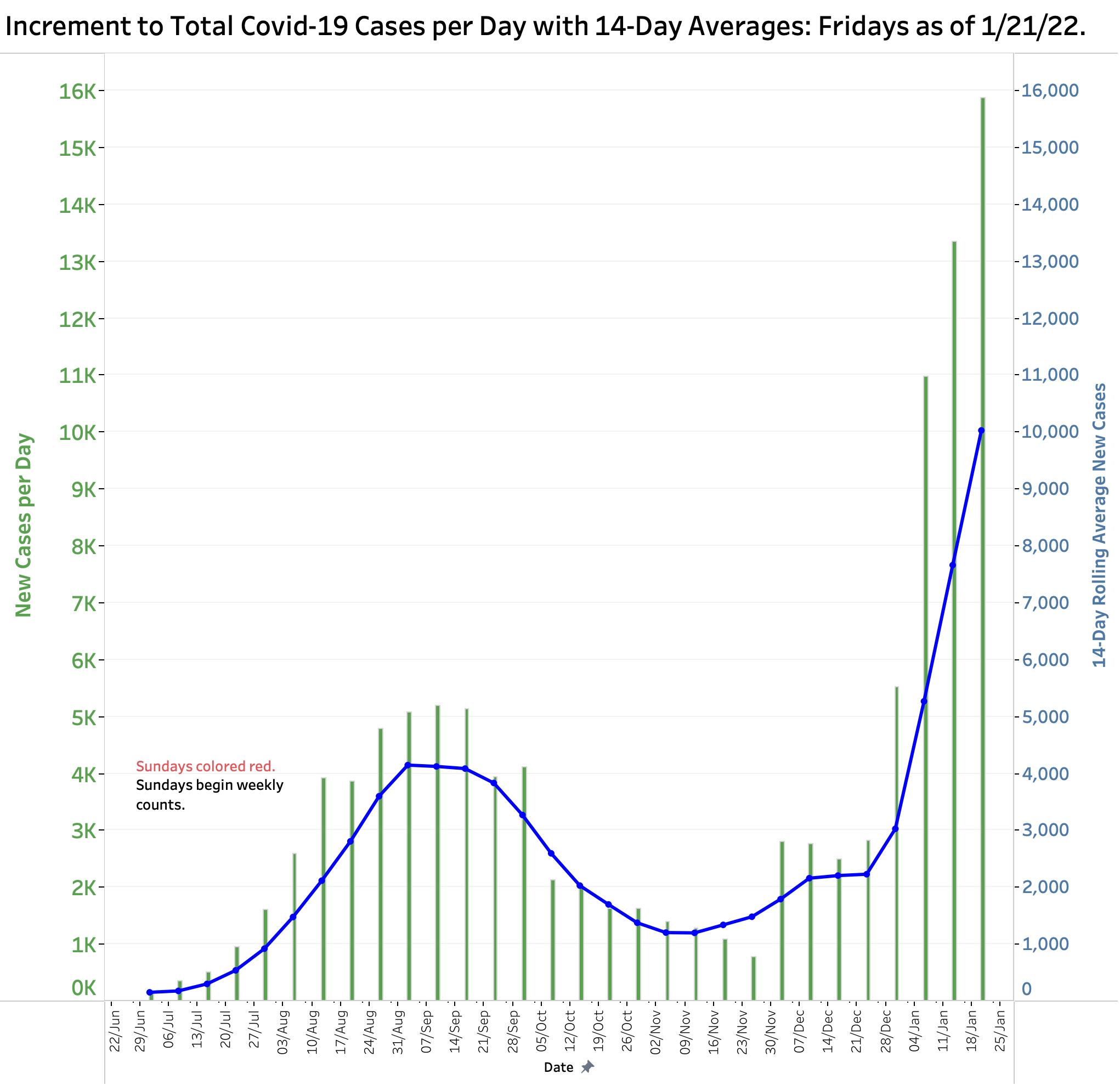
You may be reading that counting cases should not be the most important priority right now but rather might be measures of our capacity to manage the care those who get sick. Of course both are critical. I would argue that new infections define the essence of an epidemic and is where the rubber meets the road. As basic as case-counting is, it is important to recognize that what we count depends on how hard we look and will always be both incomplete and delayed. The figure below is a plot of the raw number of new cases announced or eventually published daily by KDHD. It includes both the Delta and Omicron surges. For the Omicron curve on the far right, there is no point on this timeline where it can be said that exponential growth has been stabilized, let-alone reversed. If the numbers are compared for the same weekday over time, it can be shown that since Christmas, the counts for every weekday have advanced relentlessly over previous weeks. A typical sample can be seen in the visualization of all recent Friday counts. It is important to recognize that a “peak” on such a plot does not say much about the ultimate number of people infected. That latter number is proportional to the area under the respective curves, or mathematically, a summation of all the vertical bars comprising a given surge. How bad Omicron will be remains to be seen.
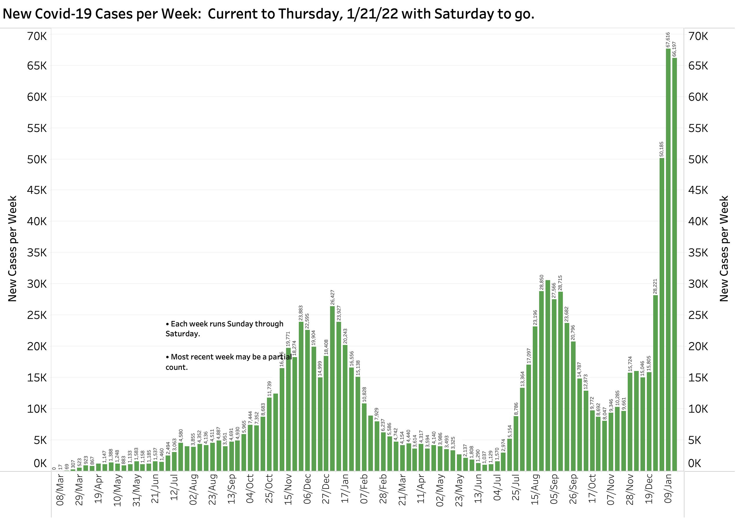
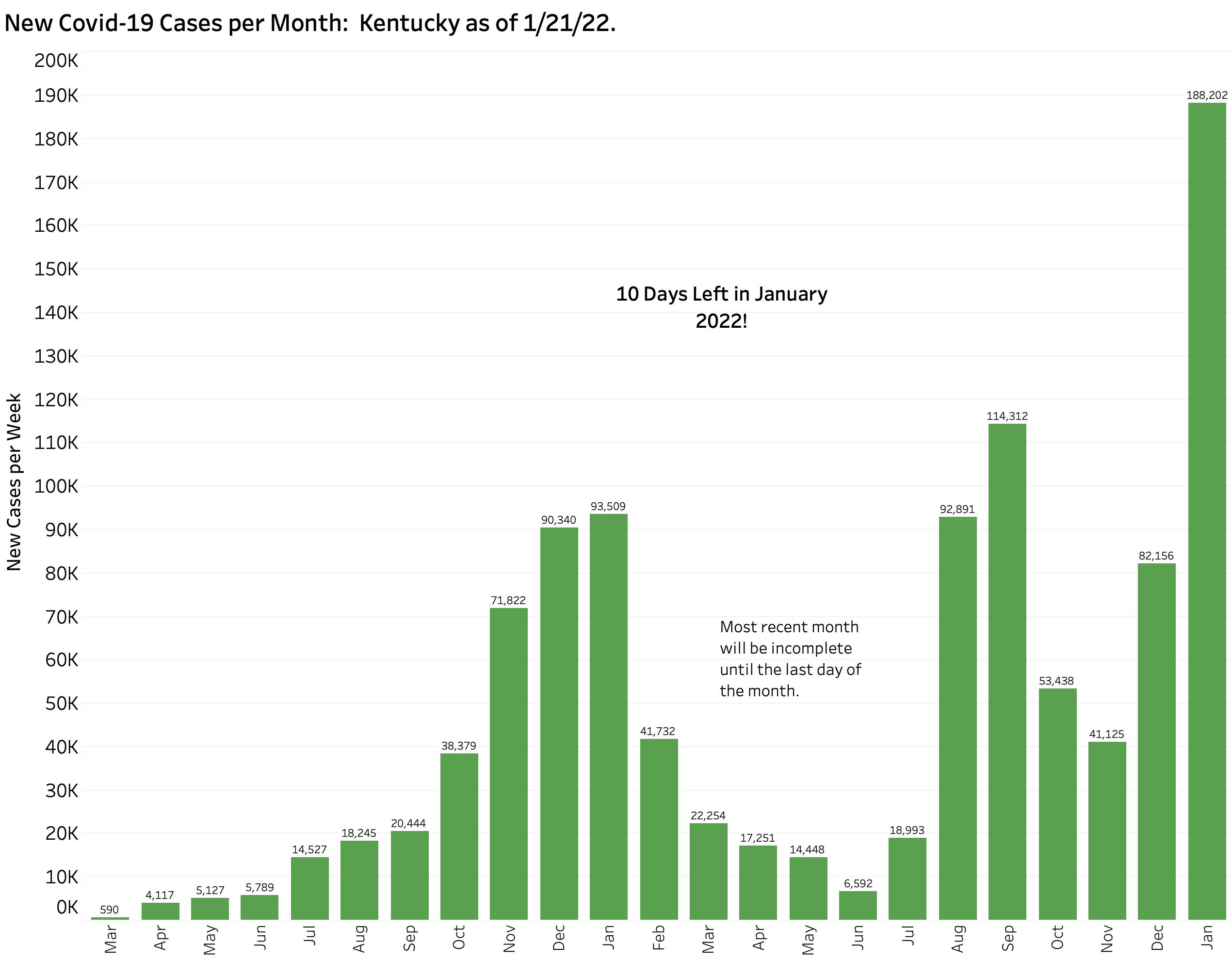
There are several rational ways to “even out’ the daily swings, but all of them diminish the timeliness of the measure. For example, below are plots of new cases by week and month. Given that there is one more day in this week and 10 more days in January, it is clear that Omicron is already a major player in this epidemic.
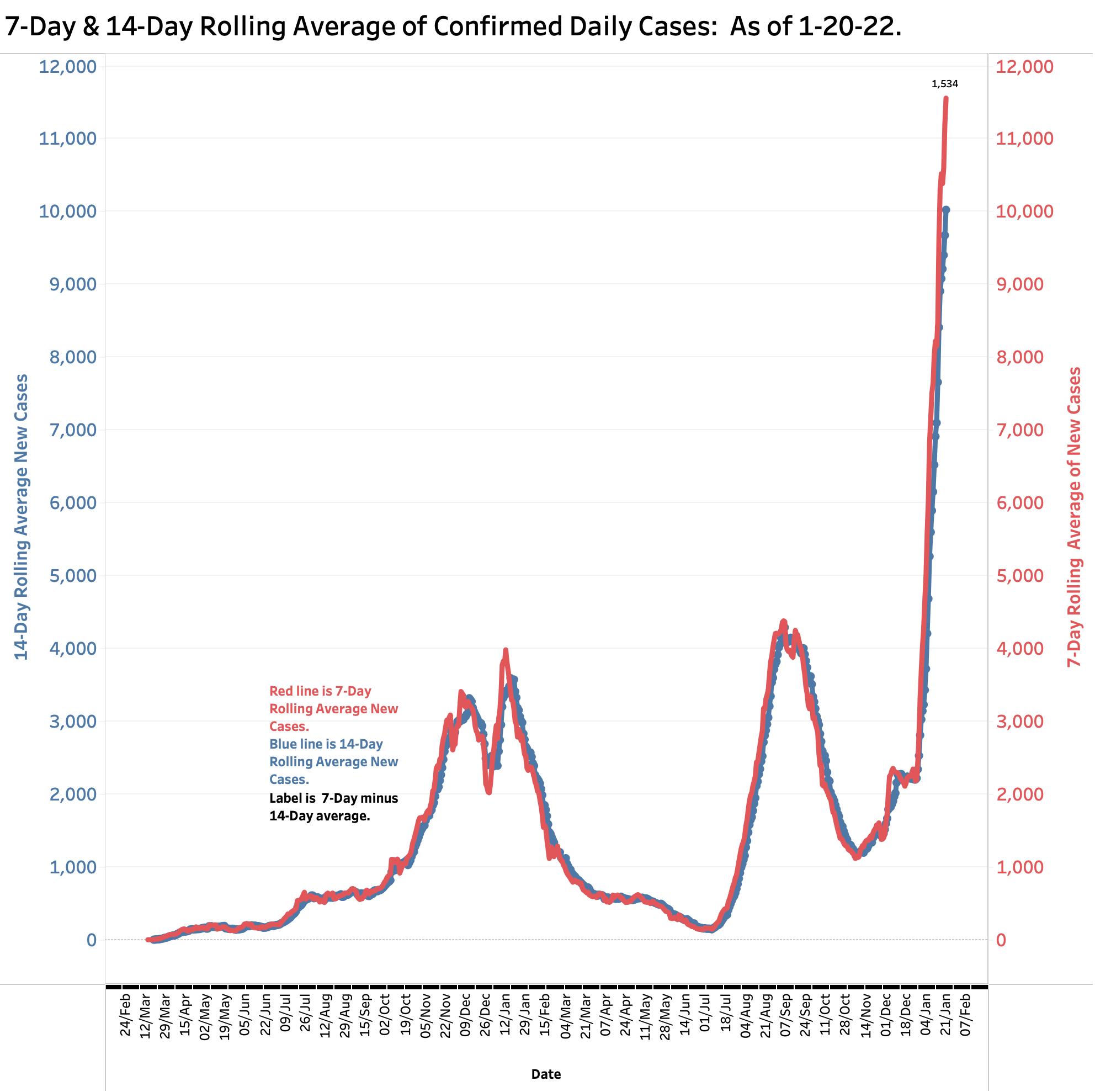
One universally used way to smooth out dally variation is to report the average of the last 7 days’ worth of data, or even the previous 14 days. When the 7-Day average is higher than the 14-Day average, it can be said that the epidemic is expanding. Since Christmas, when the Omicron surge became more apparent, there was no appreciable difference between the two averages. Since then, the 7-Day average of new cases rose with progressive rapidity currently standing at 1534 cases, as high as it has ever been in this epidemic. This rapid change is consistent with the near-vertical assent of both measures.
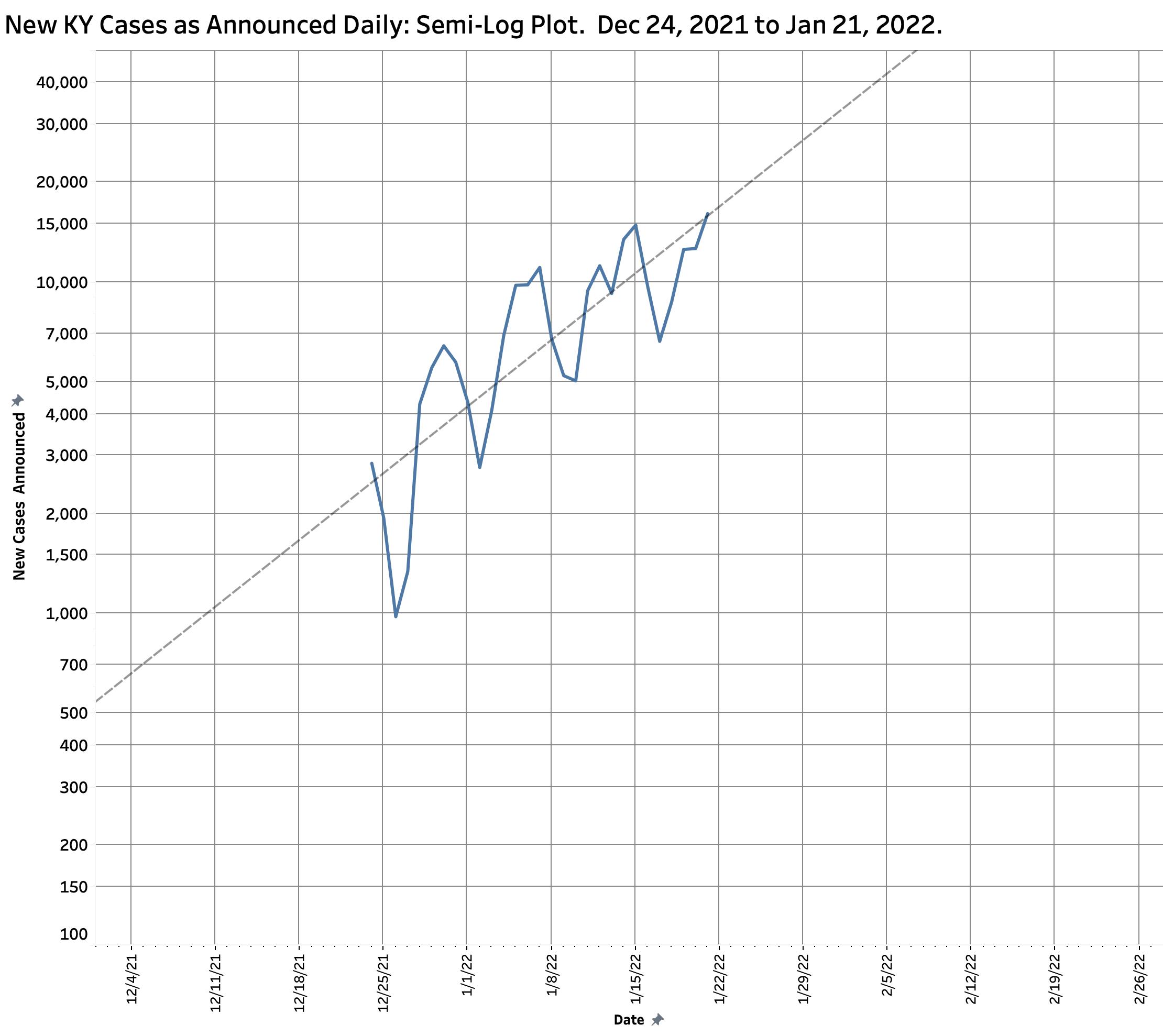
We would all like to think that the current surge in case numbers is slowing down, but we need more definitive evidence that is the case. As described in earlier articles in this series, if case counts are plotted on semi-log paper against time, the liner trendline allows an estimation of future impact. It is a truism that this peak will turn eventually, even if it is because there is no one left to infect. To illustrate the theoretical danger of exponential growth, if the rate of epidemic expansion remains unchanged from December 24th, we could see 20,000 new cases per day by July 25th, and 50,000 cases by February 8th! Simple inspection of the trend line yields an estimated doubling time of only 11 days. Recall that yesterday’s case count was a record high of 16,130. We are still on track!
Hospital Utilization.
The great triumph of the medical response to Coronavirus so far has been the effectiveness of several vaccines that became available at the very end of 2020. It was a disappointment to learn that vaccinated individuals could still become infected and transmit the disease, but it is clear from many valid studies that being fully vaccinated (and now boosted) protects most individuals from the serious morbidity of hospitalization and death. It appears that much the same can be said of Omicron. Is the current variant more infections but less deadly? What is happening in Kentucky where all current cases can be assumed to be due to Omicron? Below are plots of both hospital and ICU bed utilization since the beginning of the epidemic. In one graph, I selected the vertical scales so such that the two peaks in last year’s Delta surge overlapped. In the early days, reporting standards and lines were still being worked out and the curves jump around. Because ICU bed days are included in total hospital bed days, one expects to see close correlation. It is possible to interpret that in the Omicron phase, ICU utilization may not be tracking overall hospitalization as closely as in earlier surges. I believe a few more days of data are needed to solidify this conclusion. Remember too that there are only so many ICU beds and people to staff them to go around! Some structural rationing may be a reality.
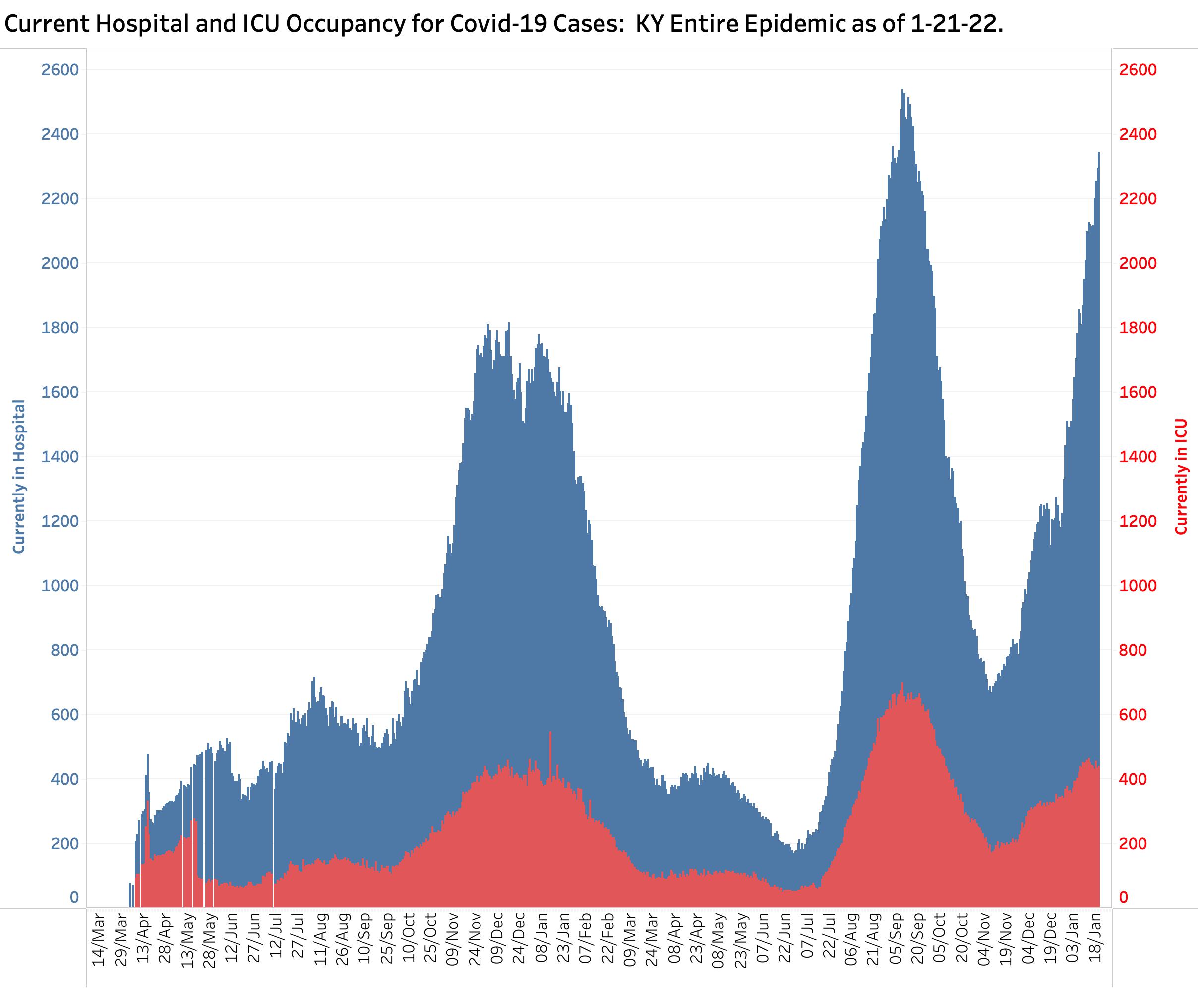
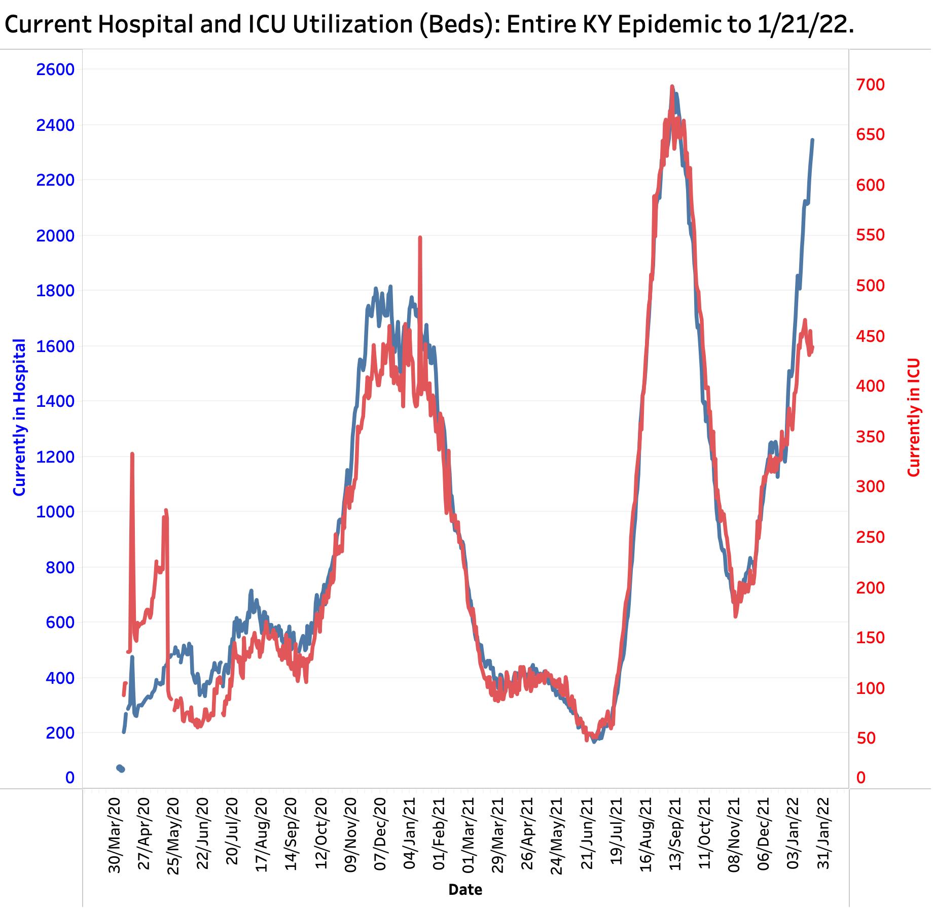
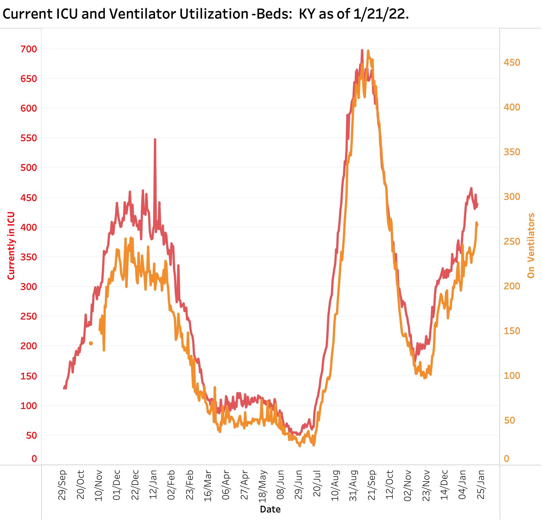
The sickest of hospitalized patients and those with the most dreaded and lethal consequence of Codid-19 are those placed on a ventilator. Not surprisingly, ventilator utilization has tracked ICU admission rather closely. The relation of the two curves during the Omicron phase looks more like the Alpha surge than the Delta one. I would conclude however that Omicron patients who need ICU care are still pretty sick indeed.
Much is being made currently about a distinction between being admitted to hospital because of COVID or with an asymptomatic COVID infection who admitted for other reasons. Testing is probably universal in the hospitalized population, and one might expect that the positivity rates would be similar to those of the community– which is pretty high right now! This distinction seems to be raised mostly by folks seeking to minimize the impact of Coronavirus or who object to public health measures to manage it. In my view, the virus takes victims as they find them. Individuals with chronic illnesses (whether they live in nursing homes or not) do not need a lot of help from viruses to turn corners. It does not take much to put many of these folks in the hospital. Influenza or any respiratory infection may be enough to require hospitalization. Of course there will be people admitted for hernia who unexpectedly test positive! Feeling sick or not, they must be assumed to be contagious with the attendant increase in the complexity of their hospital care and the personal risk they add to hospital staff and patients.
Test Positivity Rate.
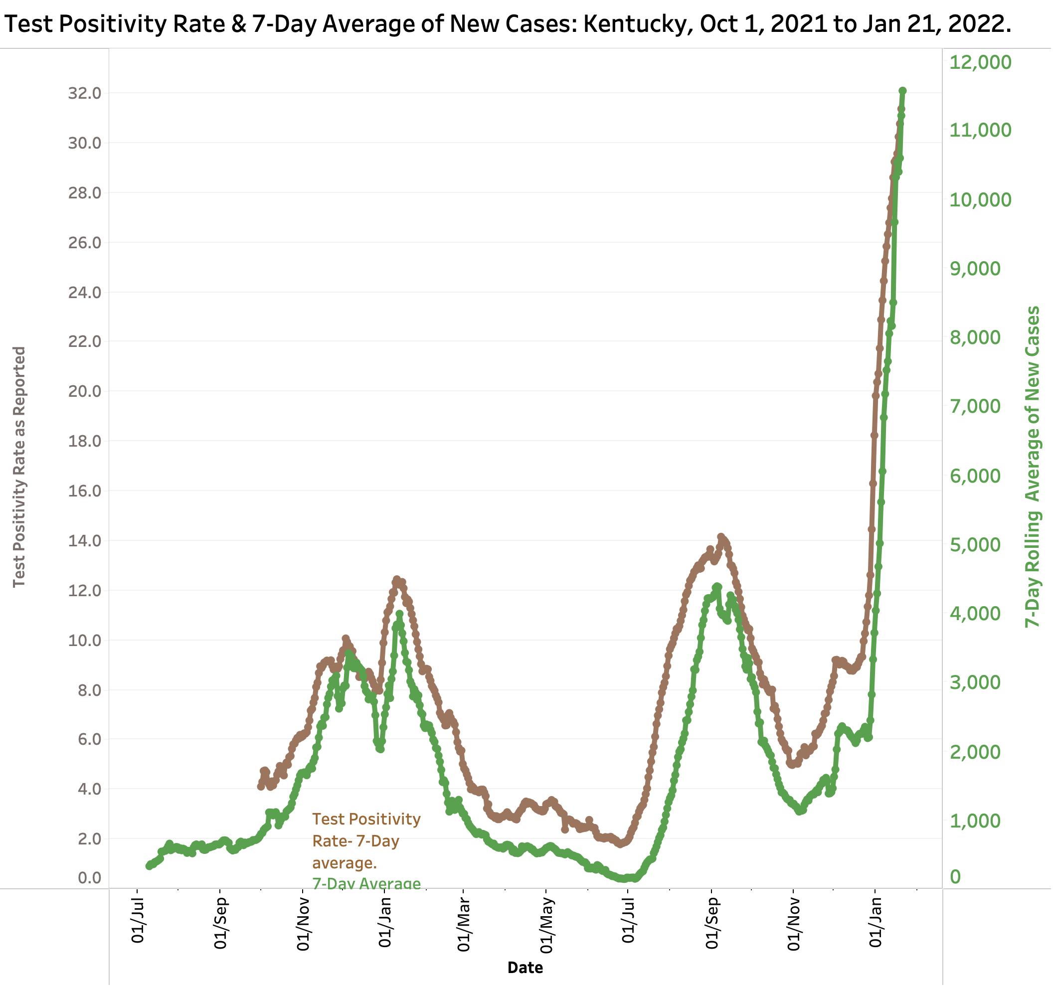
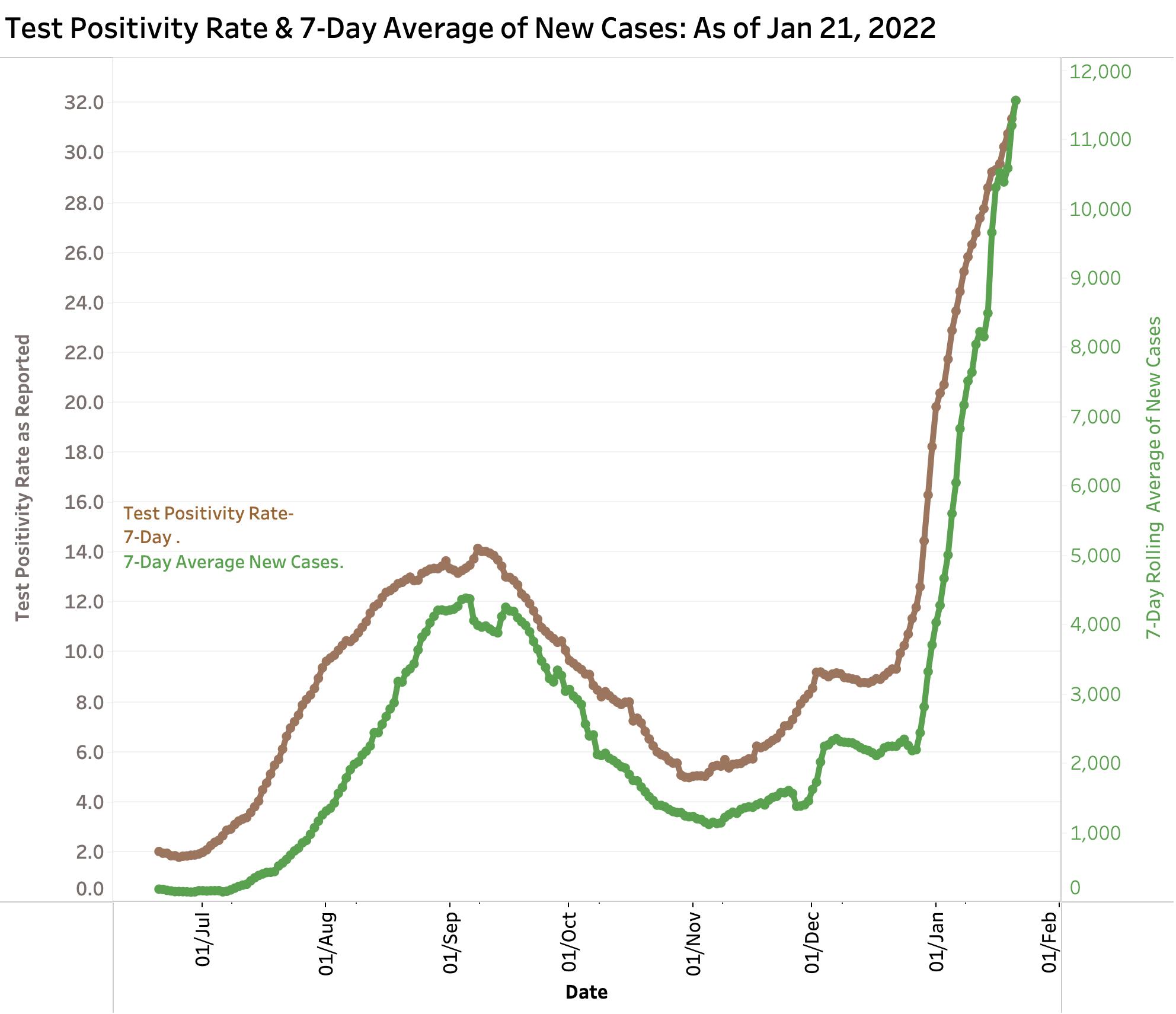
The percent of tests reported electronically to the KDPH that is positive for the virus has become one of the most emphasized metrics by the KDPH. However, it depends greatly on who is being tested and why. If only the sickest people are prioritized to be tested, the TPR will approach 100% accordingly. Because people chose to or are required to be tested may not be actively ill, in a rough sense, the TPR tracks the prevalence of infection in the community. A rise in TPR has been thought be a prelude to a rise in new cases and a warning of increased trouble to come. The plot below shows the close correlation between the KDPH version of TPR and the 7-Day average of new cases for the Delta and Omicron Variants. (Recall that the TPR as calculated by the state also incorporates a 7-Day average.) Currently the TPR stands at 32.1 which is the highest by far in Kentucky’s epidemic experience and is still going sharply up. In this more limited range of dates one can see a gentle bending of the TPR curve! Fingers crossed!
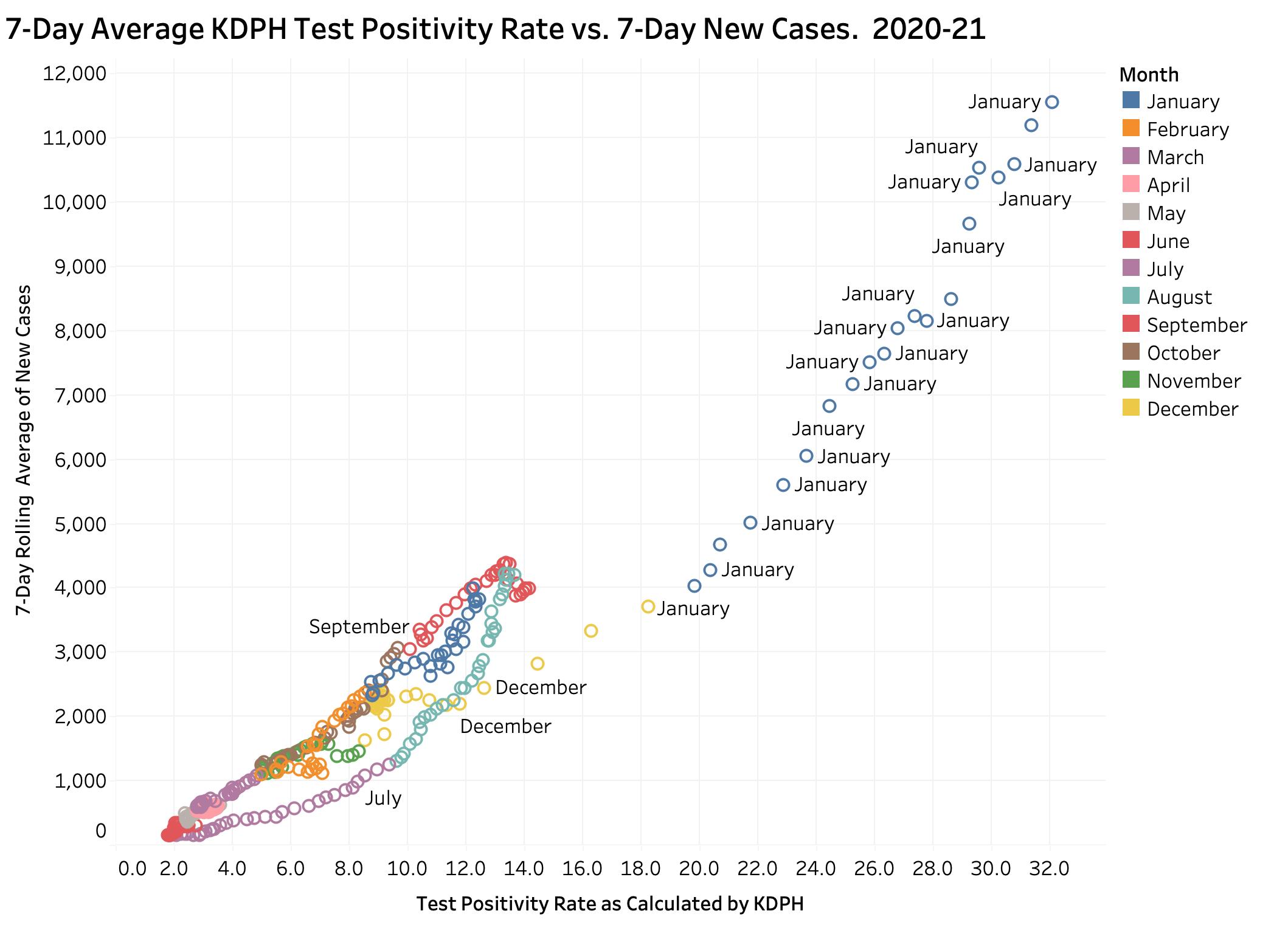
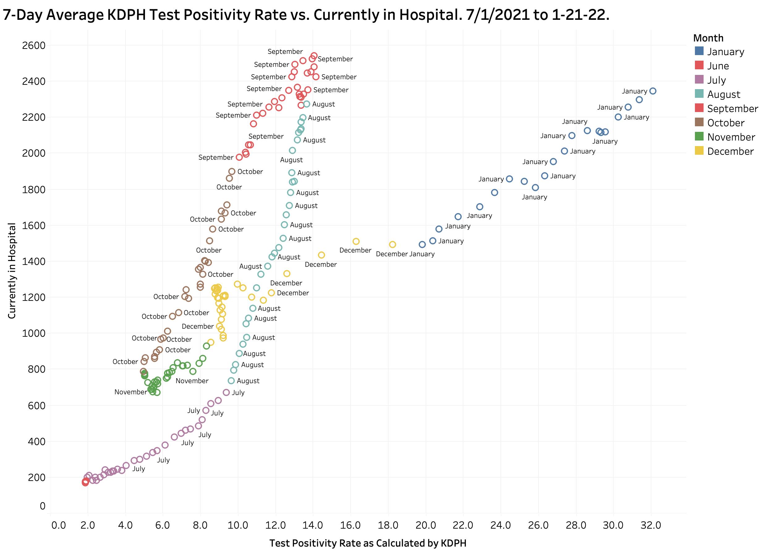
Plotted in a different way, an interesting relationship exists between Test Positivity Rate and new cases. In the figures below, a scattergram plot of each day’s 7-Day Case rate and TPR is presented for dates including both Delta and Omicron. On the right side of the plot, an curve of both measures ascends from July 2021 through September as the Delta epidemic swelled. Case counts and DPH both began to fall as the Peak passed, but on a different path. Beginning in late November 2021 and continuing to the present, the curve of data points rises dramatically along a very different path to its present record values of 11,200 and 31.4. I do not pretend to be able to explain all the reasons for the differences at this time. I assume there are differences in the virus itself, in the population it infects, and in the factors behind who is being tested and why. This change in relationship path can be seen as early as last November, perhaps the earliest manifestation in these data that something was about to happen for the worse!
A similar relationship exists between Test Positivity Rate and the number of individuals in-hospital with Covid-19. Again, beginning in November, first with the TPR and then with hospitalizations, both metrics progressively rose continuing to the present day. The rise in hospitalizations has not yet exceeded the Delta peaks of last September the way that new cases has. I need to ponder further what these two plots are telling us, but I suspect they support the belief that Omicron is more contagious but less deadly that Delta. Surely vaccination and other medical or social differences currently exist among Kentuckians in this current Omicron surge, but the potential significance of the observations above are currently obscure to me.
Deaths.
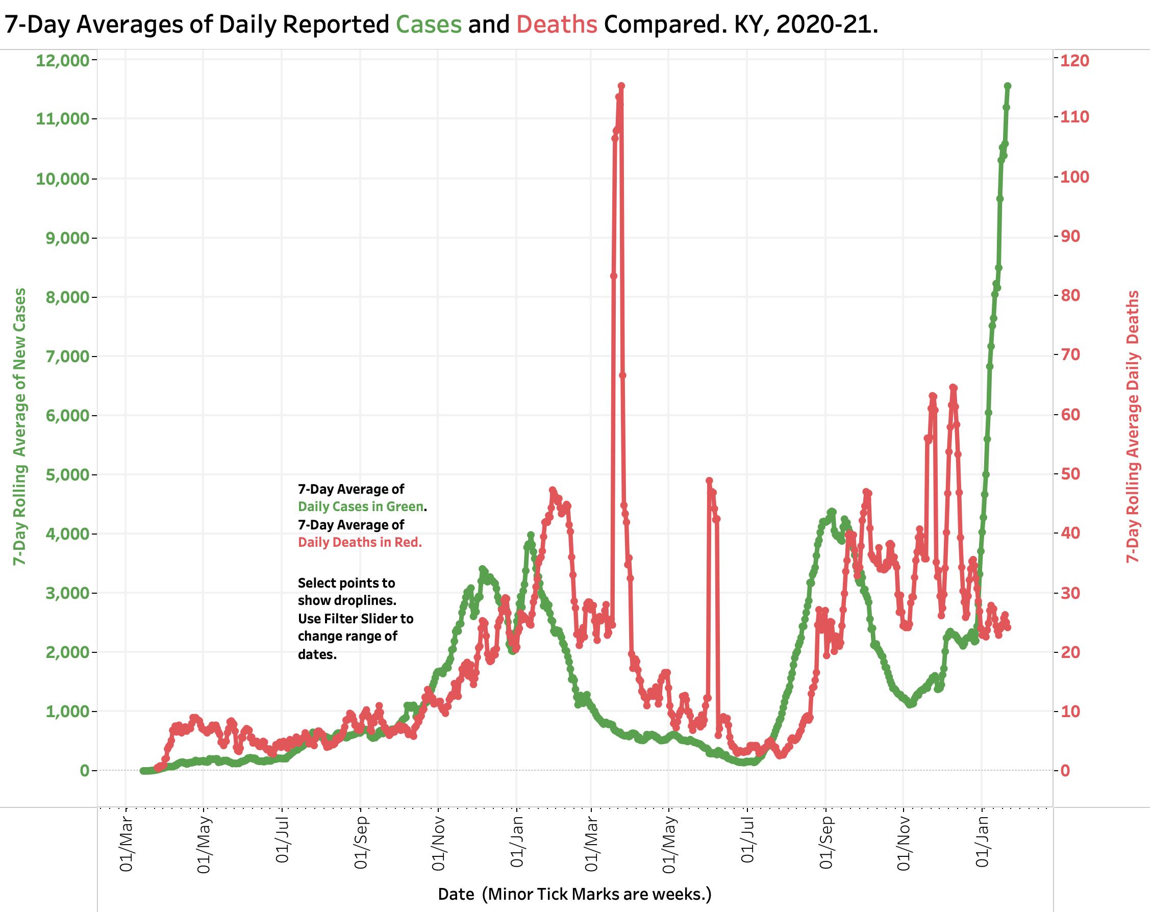
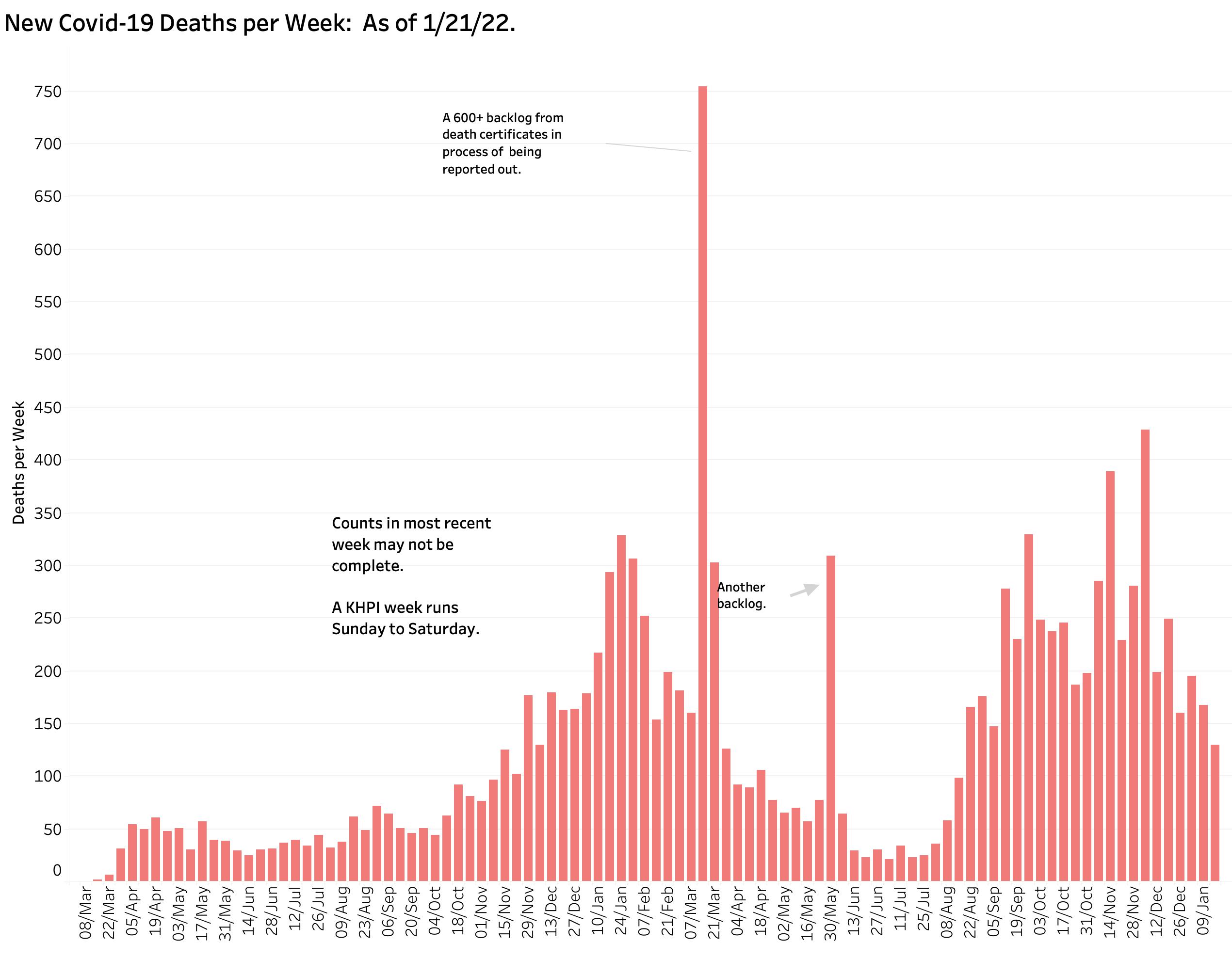
Contemporary death rates are difficult to interpret. As the New York Times reported recently, in the nation, deaths followed cases consistently by three weeks. I think we see something approaching that in Kentucky’s data. For a variety of reasons discussed in these pages and by the KDPH, it is difficult to get timely, complete, or accurate death rates. The large red spikes of 7-Day average of deaths in the figure below represent catch up counts as individual death certificates and other reports were back-filled. Cases from the Delta surge were still being counted last December. It would be presumptive at best to predict what Omicron’s rates will look like. They will in any event have some correlation with ICU and ventilator utilization. Long-term impact on excessive deaths or effect on individual longevity remain to be seen for any of the COVID variants!
Tests.
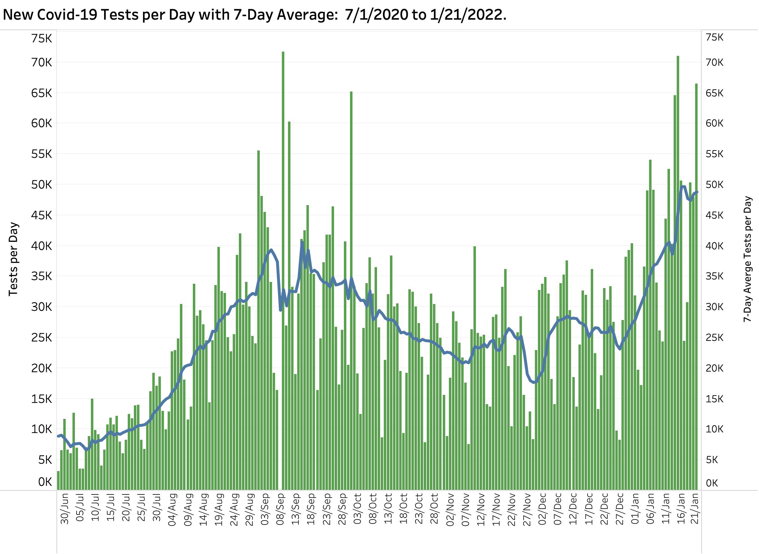
Identifying a case is intrinsically tied to the finding of a positive test of some sort, but some 30% of cases so far were “probable” meaning they were identified by clinical findings alone. So far over a million “cases” have been reported. Ignoring the possibility that the same individual is counted as a case more than once (duplicate tests, reinfected, or breakthrough?) that means 21.6% of every man, woman, and child Kentuckian has been infected! The actual number is likely much larger than that. It is a truism that the more tests that are done, the more cases will appear. However, people get tested for reasons including that they feel sick, that the disease is circulating broadly around them, or that they are for some reason required to. The number of tests done has roughly tracked the social and clinical impact of the epidemic. The actual mechanics and reporting of testing are complicated. I see testing numbers to largely reflect the state of the epidemic rather than to exaggerate its severity.
Younger individuals with COVID infections.
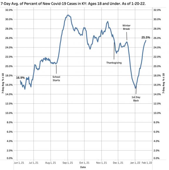
It is being said that Omicron is affecting more younger individuals than previous variants. Some children’s hospitals do report that more children are being admitted. Time and formal examination will eventually tell us what has happened. Kentucky has for some time been reporting the number of new cases that are 18 years old or younger. The figure below shows the proportion of new cases 18 or under. Not surprisingly, the daily counts and 7-Day average seems to follow the school calendars. Up to 30% of all new cases occur in this age range. There are undoubtedly many factors in play determining how these cases are identified. What is clear is that community controversy about when, where, and how to teach our children is not an abstract academic exercise. Many lives are in play both at school, in workplaces, and in homes. Schools, just like nursing homes and prisons, have been mixing bowls and conduits out for Omicron and its ancestors. If students are tested, infections will be found regardless of symptoms or exposures. Public policy about masking, vaccination, and the rest for both students and staff must be guided by the large number of individuals at risk.
Wrap up.
I am sure you will agree that this is enough for now. There is lots to write about. I should try to do it in smaller bites. All these data visualizations are available for your interactive inspection on KHPI’s Tableau Pubic Website. Changing the range of dates or days in the visualization will reveal useful details. Your corrections or differing interpretations are welcome. My goal in this article is to show what I believe will be most useful to answer the question of whether what we are doing is working to decrease the burdens of this phase of the epidemic, or whether we need to bite the bullet harder and do more. I have some opinions about what might be included in the latter!
Thank you for your reading,
Peter Hasselbacher, MD
Emeritus Professor of Medicine, UofL
Kentucky Health Policy Institute
22 January 2022