
No change in rate of increase in new cases since July 1st. Simple projections are disturbing.
Yesterday’s (Saturday) release of Covid-19 tracking data by the Governor’s office capped off what is by far the largest addition to total weekly cases of Covid-19 since the first case was documented 141 days ago. The 4580 new cases marked the third week in a row with record numbers of new cases, dwarfing the 1460 new cases for the week beginning June 28. The rate of increase of the 7-Day rolling average of daily cases has been going up at the same rate since July 1st. Graphic projections of daily new cases based either on the absolute numbers of new cases or their 7-Day rolling averages agree. Both predict the same near-future estimates of 1000 new cases per day by August 3; and 2000 new cases by August 18. Based on current data alone, both would have us at 5000 new cases per day by the first week of September. The New York Times this morning rates Kentucky as having one of the most rapidly expanding epidemics in the nation. I would like to wish away such a future, but at this time I am unable to do so.
Below are some of the data visualizations that lead me to these projections and concerns. Updated interactive versions which allow different time-frames to be chosen and which include all my data are available here.
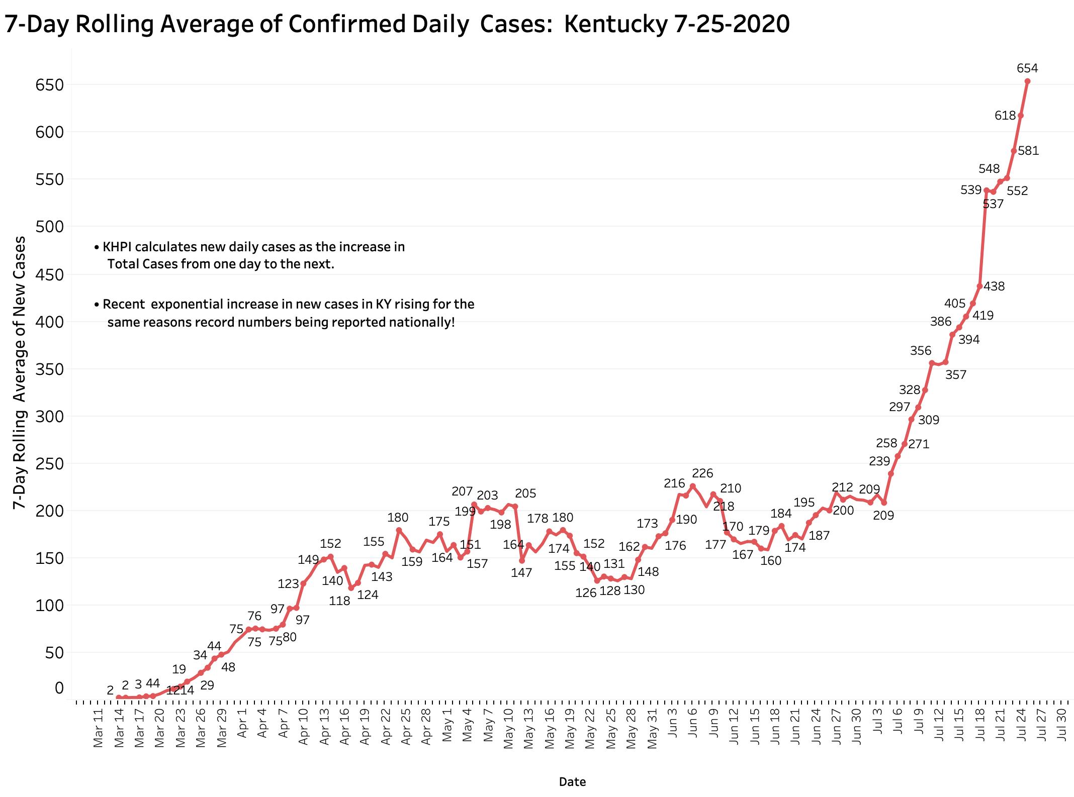
This first graphic shows the 7-Day rolling average of new cases added daily to Kentucky’s announced total. KHPI defines New Cases as the increment in aggregate total cases from the previous day. As described elsewhere, this number is usually a handful of cases fewer than announced from Frankfort or by the national Covid-data aggregators which use Frankfort’s numbers. It is impossible to ignore the abrupt shift towards the vertical beginning around July 4th with 209 cases to yesterday’s 654. With small deviations reflecting weekend delays in reporting, the plot-line is ascending relentlessly.
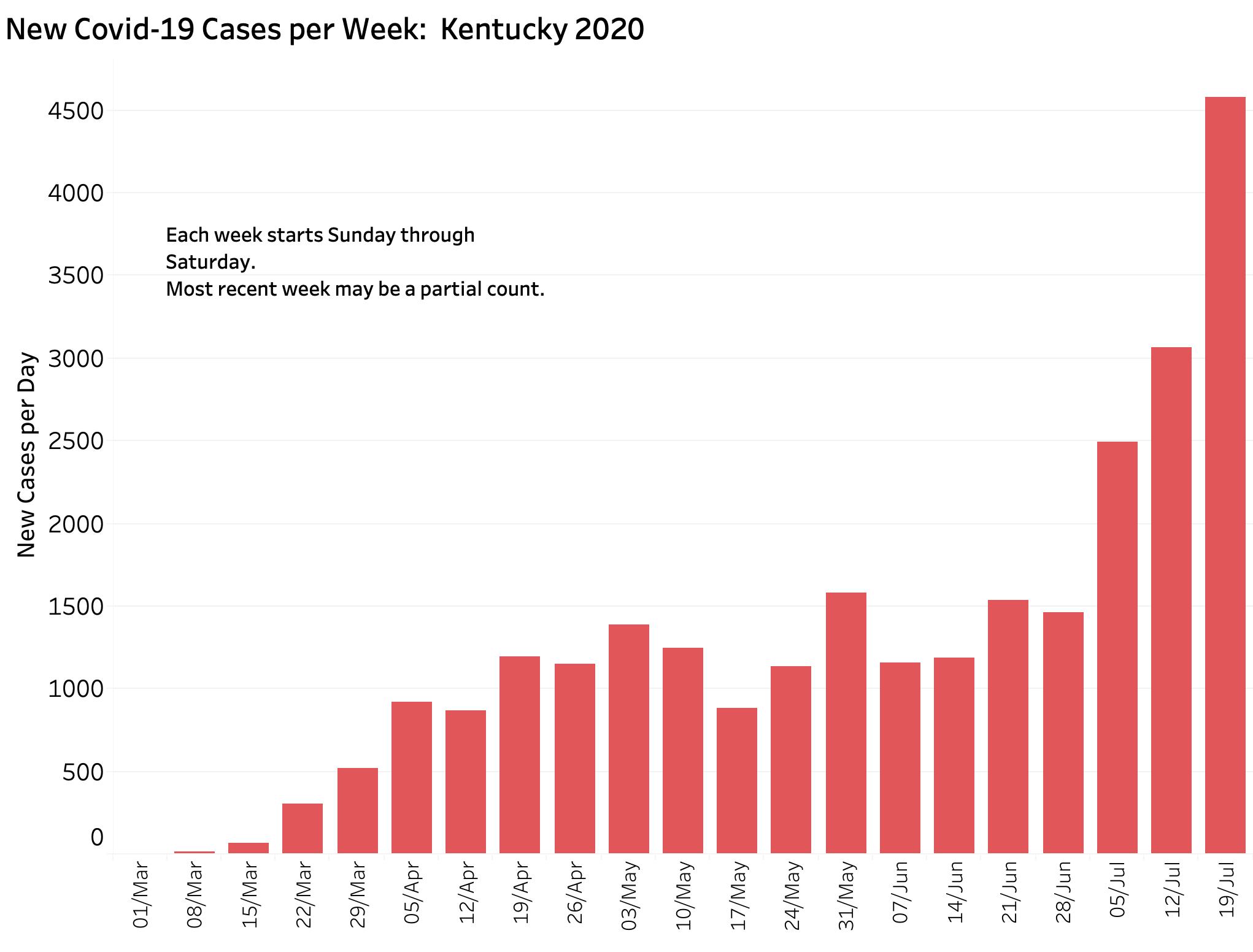
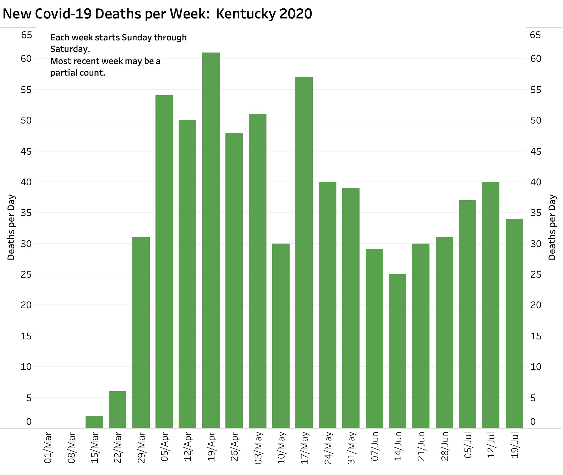
Another way to demonstrate the increase is to count the number of new cases in a given calendar week. Since much of the volatility in daily counts stems from weekend artifact, calendar-week counts are another way to smooth out and standardize the numbers, albeit with a built-in delay. The chart below fills out the week ending Saturday the 25th. Pretty dramatic increase!
Plotting the rolling-average numbers using a semi-log axis yields a nearly-perfect straight line indicating that the daily numbers are rising exponentially– think compound interest or credit-card debt. (You get rich or over your head in debt before you know it!) Plotting the raw daily counts yields essentially the same result. I estimate graphically that cases are doubling approximately every two weeks.
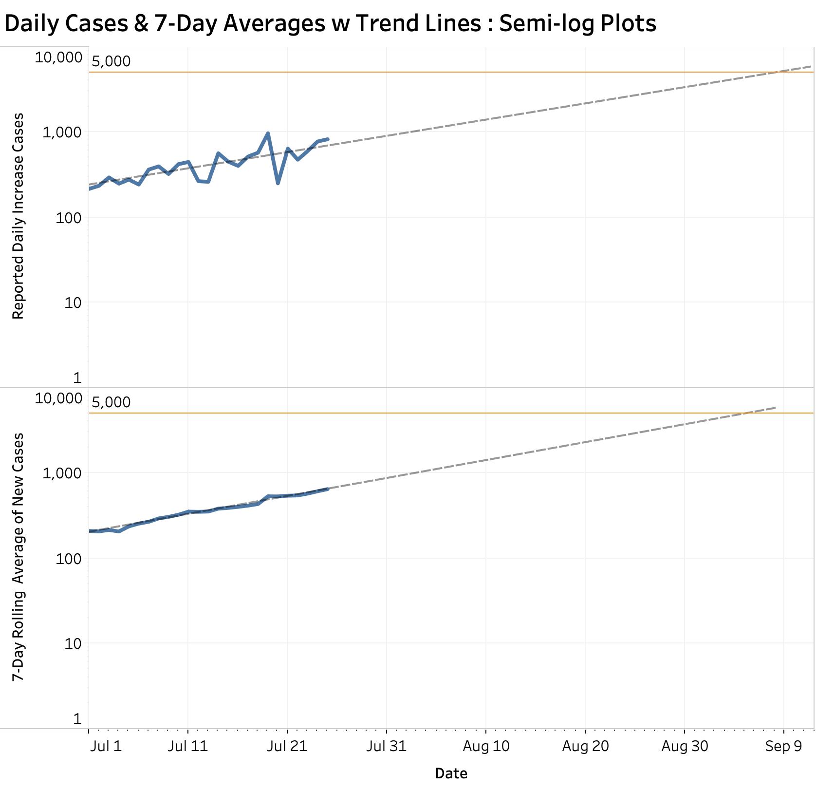
The dashed lines are computer-generated linear projections based entirely on July numbers to date. They do not, and cannot, take into account the effect of changes in public behavior for better or worse, or the impact of public health measures employed or withdrawn to mitigate the damage of rising cases. This is what we have to work with as of today. As noted in the introduction above, both plots project that we will have 1000 new cases by August 3; 2000 daily new cases by Aug 18; and will approach 5000 cases by early September.
Numerous projections offered by other groups or individuals these past few months (including one by a high-profile official that the epidemic would fade away quickly) have proven to be inaccurate. Mine presented above, based on less than a month’s worth of data, may also come a cropper. I would like to think that this simple objective approach is free of any inappropriate bias. It is, however, subject to the same inherent properties of the Pensieve bowls featured in the Lord of the Rings or the Harry Potter movie series in that they may only foretell what the future might be.
Not just numbers.
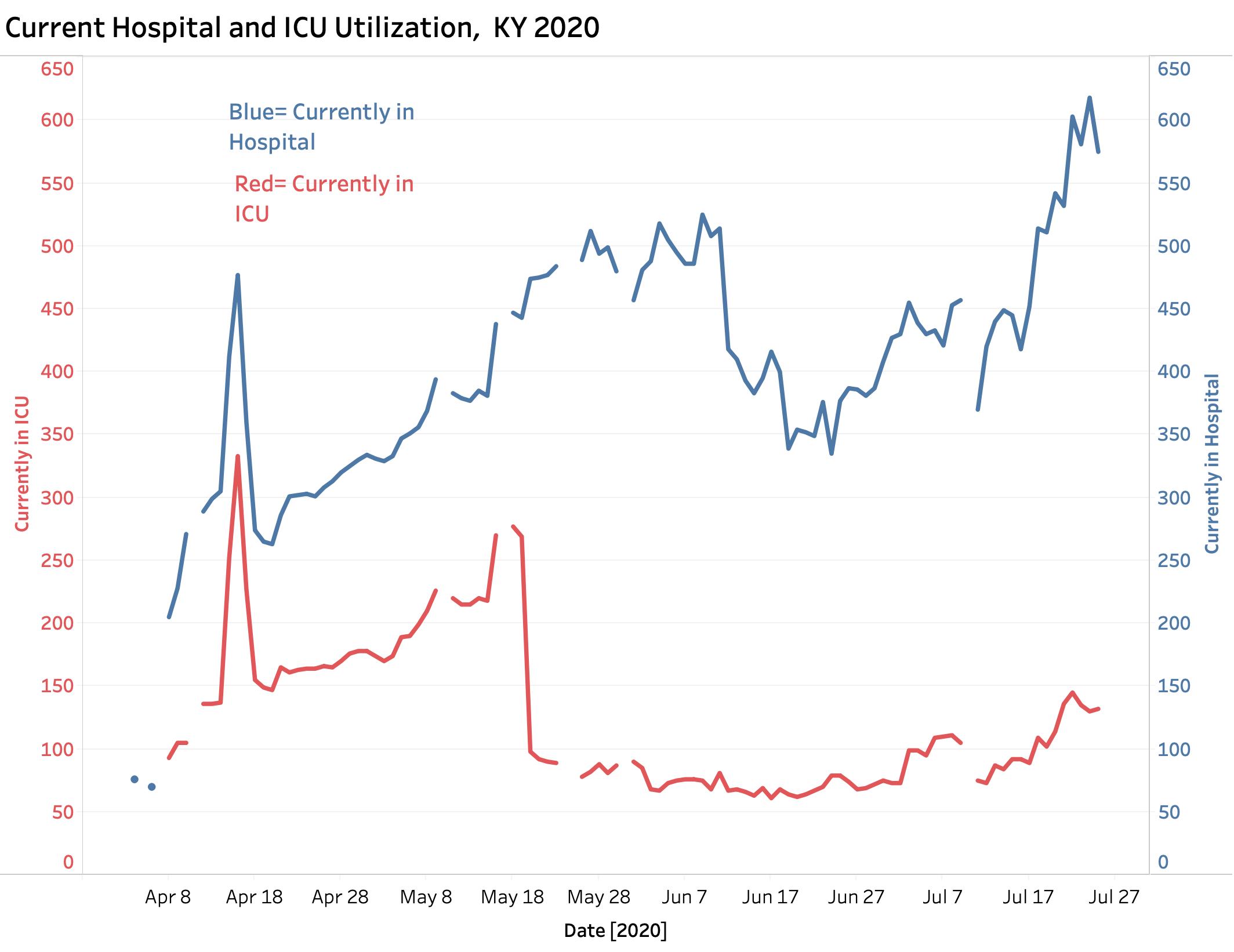
By accounts, I believe the rise in our cases represents real sickness. Hospital and ICU utilization are rising– although I do not have great confidence in the collection and reporting of hospital data yet. New deaths have not taken a definitive turn upwards, but they can be expected to do so. Other morbidities of this new disease remain to be defined.
Are increased cases due to increased testing?
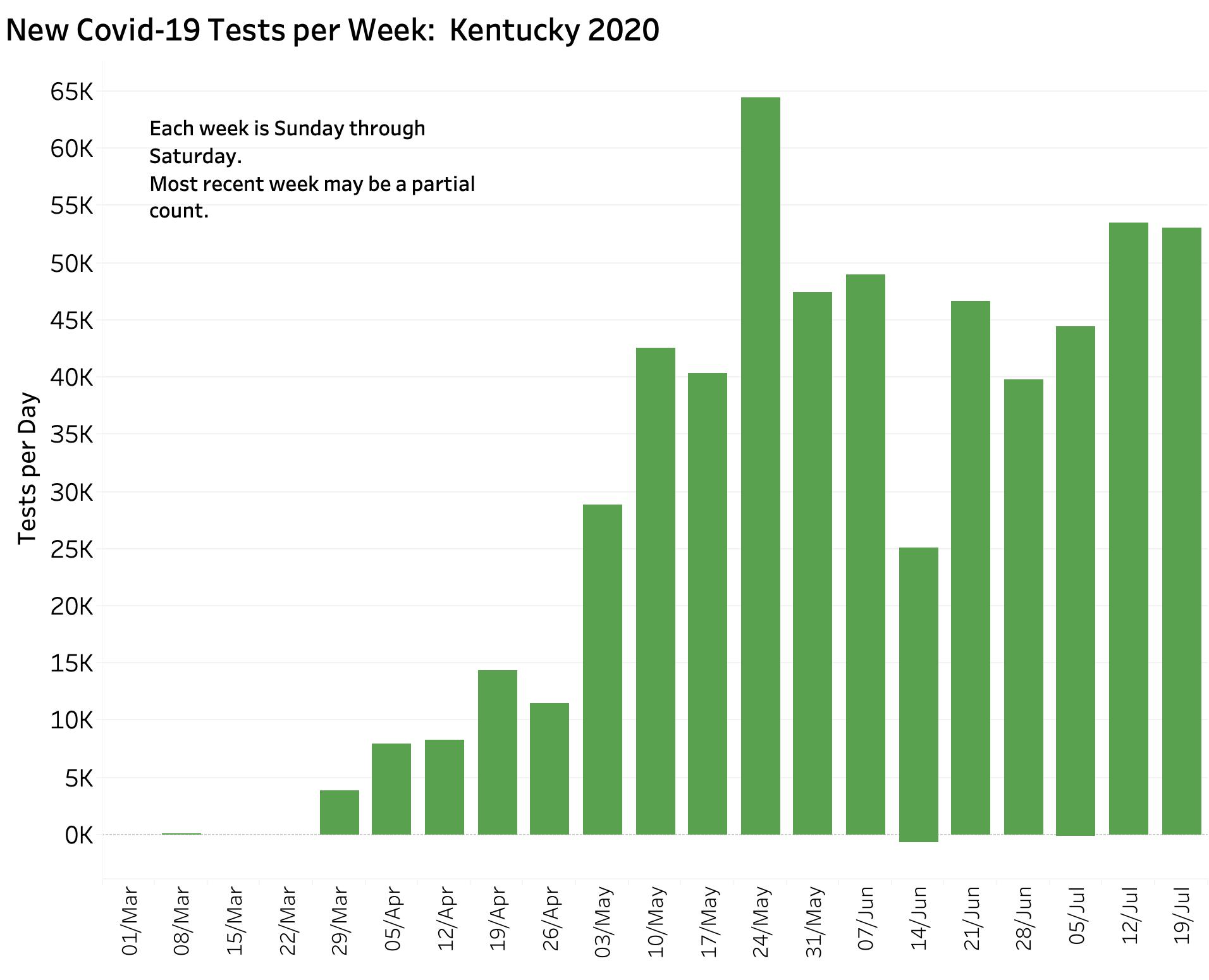
What has not been tracking upwards are new tests. Below is the companion graphic showing new tests per calendar week. By reported numbers, they have not been going up at anywhere near the case rate. Testing centers, especially the big commercial ones, have been getting clobbered nationally. Supplies for testing remain limited. Delay in reporting is occurring again. Of all the data elements being reported, numbers related to tests are the ones that I least understand or have confidence in. The current rise in new cases is absolutely not explainable by increased testing. Only die-hard disease-deniers are still saying so. Ignore them.
How about Percent Test Positives? (PTP)
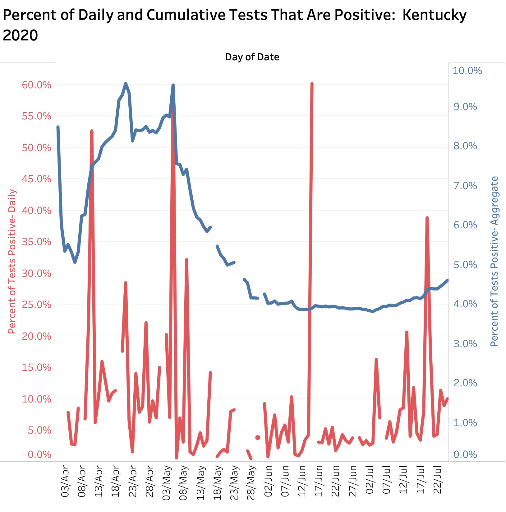
Another testing-related metric is getting attention in media reports and policy decisions, including in Kentucky. This is the Percent Tests Positive ratio now being announced daily from Frankfort. As discussed in my article of July 23, this ratio is the percent of all tests done in a given interval and place that are positive. It is assumed that this number provides information about the prevalence of disease in a given population. That seemingly obvious assumption is totally dependent on accurate and timely testing data, and only works if the people being tested are comparable day-to-day and place-to-place. This is demonstrably not true in our instance or elsewhere. In the beginning of the Kentucky epidemic we were testing only sick people and those at highest risk. We canvased nursing homes and prisons. The aggregate state PTP on those days was as high a 9%. This fell to a plateau of around 4% by early June and has risen lately to a little more 4.5%. (KHPI necessarily uses 7-Day rolling averages.) Given that we are still facing testing issues, and that at least some communities are preferentially testing high-risk populations again, I remain to be convinced that the PTP is a metric we should be hanging our hats on. More important in my mind would be identifying geographic hotspots where cases are rising more rapidly as a proportion of their population. I have no access to the necessary historical location data in a usable form to investigate the utility of identifying localized hotspots. I must assume the state Public Health Department has such data and I urge them again to share with other interested and qualified individuals and institutions (like me!). If the New York Times has such data, why cannot Kentuckians?
Can we “suggest” our way out ot this epidemic?
There may be limits to the practically or fairness of applying the same Public Health approaches to every county or community in Kentucky. According today’s New York Time analysis, the per capita distribution of Covid-19 cases ranges widely in Kentucky. Hot spot counties where new cases are popping up rapidly is not the same list as that of total county cases. I am at present not fully versed in the pros and cons in the application of universal vs. selective public health mandates. I believe that we ultimately are going to need to apply rapid case finding and contact tracking at the most granular local level possible in a surgical manner. I do not know how of this is working in Kentucky. We had a slow start-up and very little is being said about it. I would like to think that showing important positive results from case finding and tracking would be good for us to hear. (I do not mean outing people personally.) If a big soccer game (or God forbid a church service or a school) was known to spin off many new cases, perhaps we would be more willing as a community to accept stricter limits or even postponement of events! How can we say that such events are “safe” without a way to prove it? To be successful, we need enough public health investigators, a public willing to work with them, sufficient testing with rapid reporting, and a willingness of community leaders to take public health seriously. Yes, there are such things as public health laws!
What should we do today?
Waiting for Sunday’s reports seems to me to be unnecessary. Sundays are artefactually low-count days as are Mondays. We would just have to stall until next Wednesday to see if the big numbers persist. In my opinion, and based on the public information available to me, we need now to be taking positive, enforceable, evidence-based steps, or at the very least requiring commonsense efforts to mitigate the conjoined health and economic damage that this virus is doing to us. We are told we are working towards a “new normal.” I applaud the honesty of this challenge. Just as the medieval Bubonic plague changed its world in fundamental ways, from the breakdown of serfdom to opening the door for the Protestant reformation, so will our contemporary plague deliver us to a much changed world. We should not be afraid of that.
Peter Hasselbacher, MD
President, KHPI
Professor Emeritus of Medicine, UofL
American Political Science Association Congressional Fellow 1997
July 26, 2020
One thought on “Kentucky Added 4580 New Covid-19 Cases Last Week. New Record.”
Comments are closed.