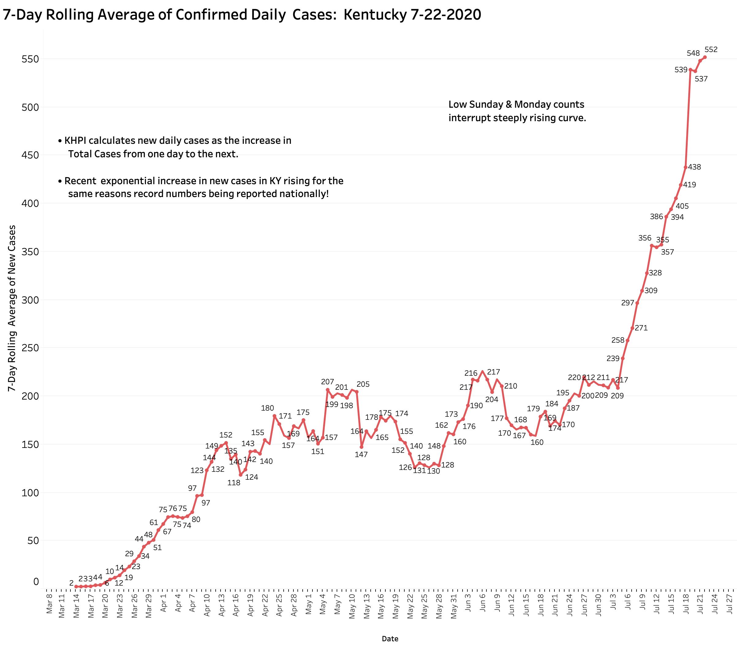
Yesterday’s (Wednesday) evening Covid-19 update from Frankfort told of 518 new cases but from which there were an unusually high number of 38 removed as duplicates or perhaps for other reasons. KHPI reports new cases as the day-to-day difference in total cases which yields a smaller number of 480 additional new cases. This number, while higher than any new case number earlier than July 7, is less than the several 500s, 646, or 977 counts of the previous 7 days. The rise in the 7-Day average to a new high of 552 was at least temporarily blunted– but it has not begun to fall either. Time will tell us in which direction our case trend is headed. It has only been since July 9 that mandatory mask use was required in Kentucky, but its implementation was challenged in the courts and compliance has been spotty in any event. I suspect it is too early to expect a major effect on spread at this early time. End-of-week Fridays and Saturdays have historically given us higher counts in the past. The monstrously high count of 977 was reported just last Sunday. Three reporting days of the week remain just ahead of us.
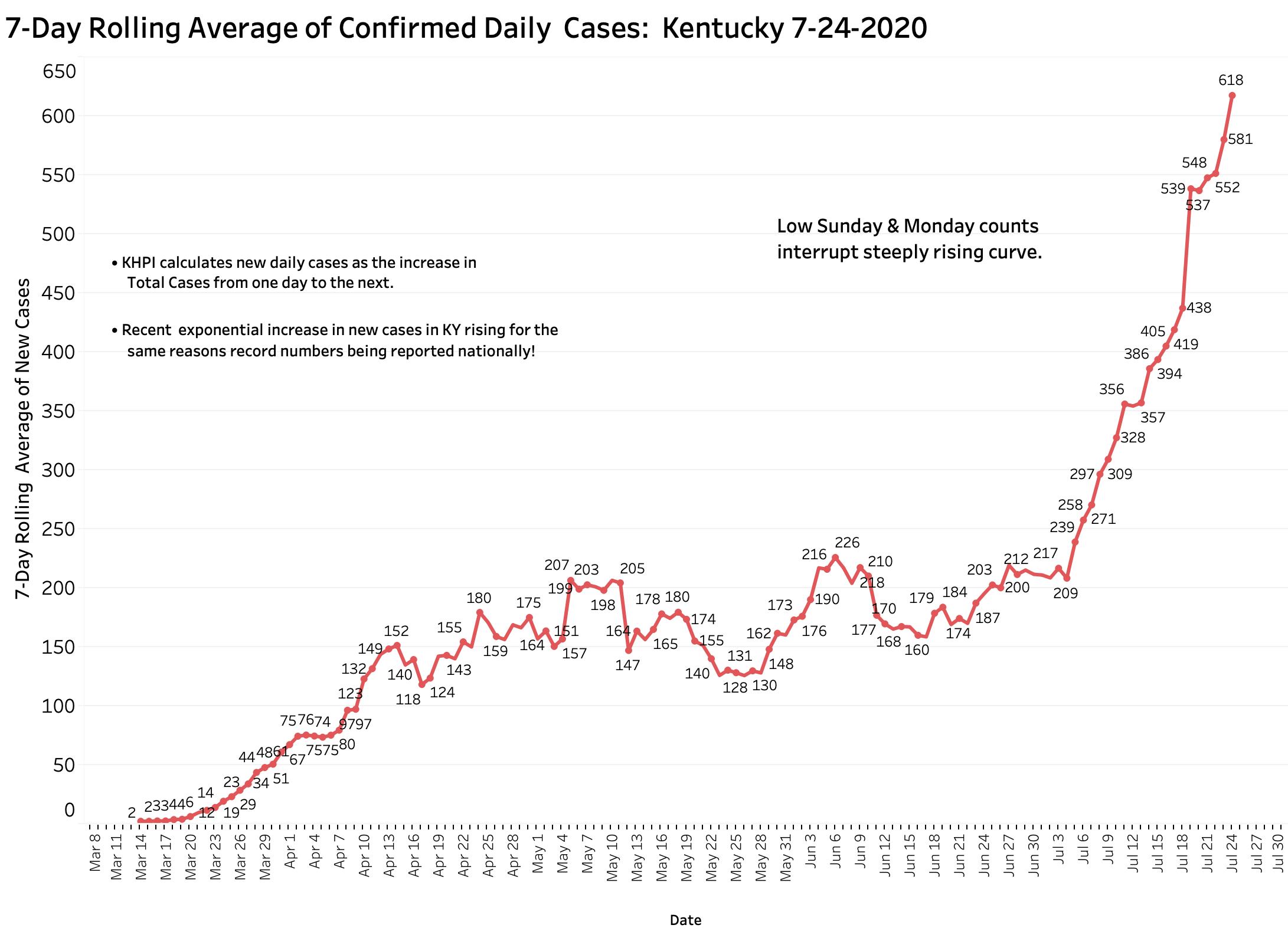
[Addendum 7-24-20: Yesterday evening’s data report confirmed ongoing rapid expansion of the epidemic. KHPI noted 607 additions to total cases and 7 new deaths. With two days to go in this calendar week, the number of new cases is already nearly as many as last week. Based on the current rate of increase of the 7-Day average, new cases are doubling by at least every 12-13 days. Hospital and ICU utilization continue to trend upwards. In all this, Kentucky is mirroring the nation overall. We are all in trouble! The full panel of visualizations on-line have been updated.]
[Addendum 7-24 4:30 pm: todays new case reports adds 744 to the total. This is bad news. Even without Saturday’s report tomorrow, the number of new cases has jumped well ahead of last weeks total. At this rate, unless something changes or happens, we will be at 1000 cases per day by August 3d. Deaths in today’s report added 7 new ones. I will elaborate on the weeks finding s tomorrow evening. I place an updated graphic of 7-Day New Cases at the end of this article.]
Increased cases not the only bad omen.
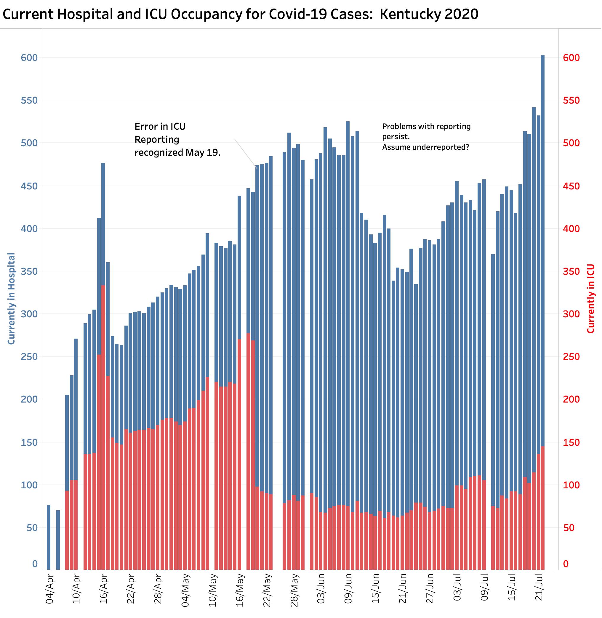
If new cases of recognized infection are truly occurring, we would expect to see an increase in hospital utilization and that is exactly what is happening to both current hospital and ICU bed utilization. There have been issues in the past with how hospital utilization was being reported to Frankfort. On May 20, ICU utilization fell from 269 to 98 beds in a single day as corrections to a faulty reporting system were made. (The original erroneous numbers remain in the databases of the national data aggregators.) I understand that some issues remained to be sorted out, but it appears that hospital reporting has gotten much better. Yesterday’s 603 patients currently in Kentucky’s hospitals is now more than at any time since the epidemic began. Current ICU utilization of 145 beds is higher now than at any time since May 18. People are getting objectively sick again. This is not explainable by increased testing!
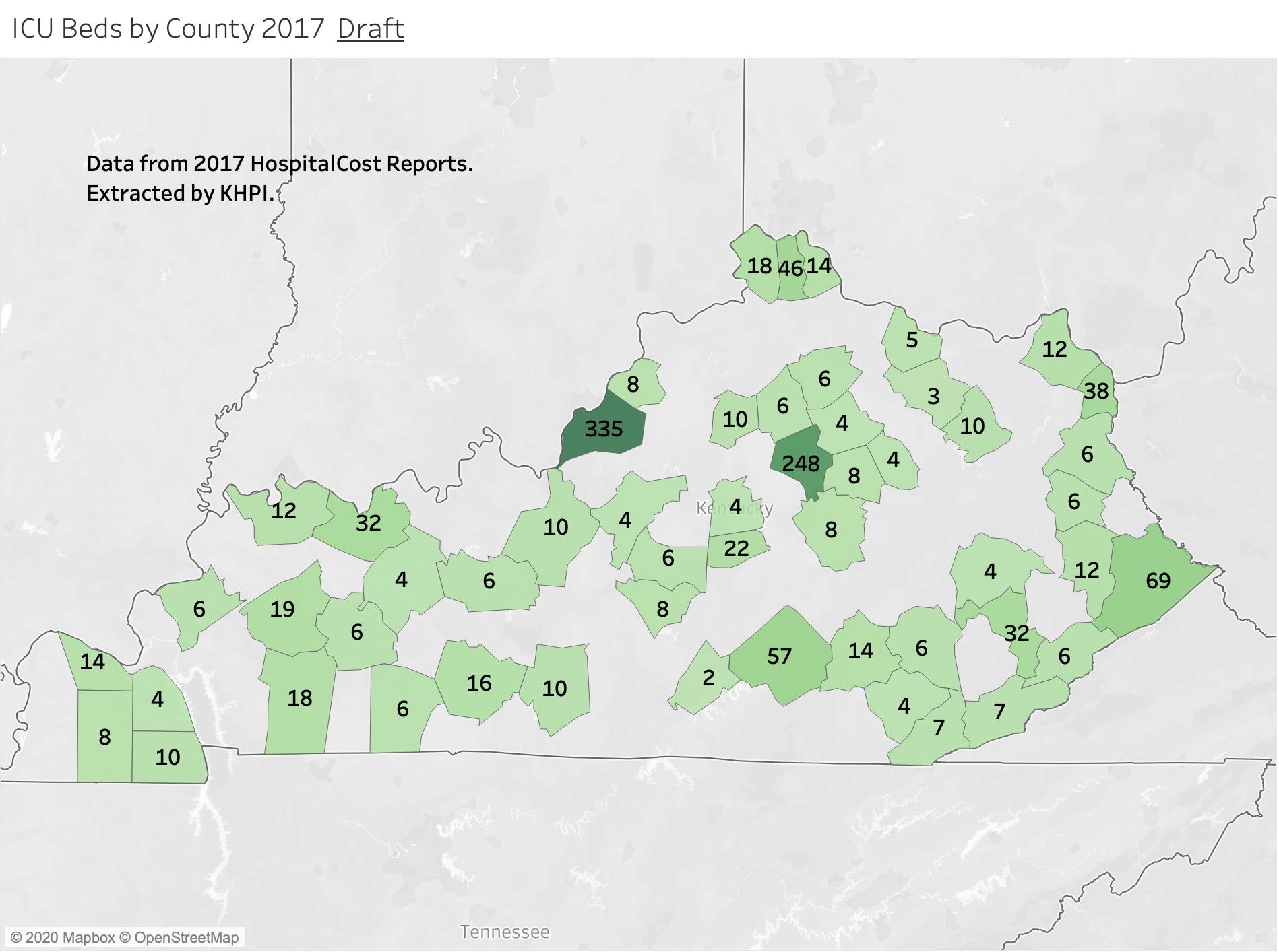
Can our hospitals handle more cases? Transfers from other states?
Although we are reassured that we still have adequate ICU and hospital capability, those beds are not distributed evenly around the state. Hospitals servicing counties with higher numbers of cases per capita may become hard pressed to handle their own local cases. Moreover, it was reported yesterday that national chains with hospitals in both overwhelmed states and Kentucky are offloading patients to Kentucky. Can we handle the load?
Back in early April, I made an attempt to determine how many ICU beds were available in Kentucky and where they were. The task was harder than I expected. Extracting information from the massive Medicare Hospital Cost Reports was the most challenging data-management task I have ever undertaken. Arguably the gold standard of information about Medicare Provider Hospitals, it contains thousands of different indicators. Unfortunately, it is out of date by the time it becomes available– the most recent version available to me was for 2017! Below is my first attempt to count and locate where Kentucky’s ICU beds were in 2017. (We should recognize that hospitals can convert other beds to ICU equivalents for emergency purposes.) Not surprisingly large majority of beds are collocated where the most people and the biggest hospitals are. Seems to me however that there is a mismatch in some clusters of non-urban counties such as the county hotspots of Western Kentucky with their relatively fewer ICU beds. I will try to refine this analysis if I can get access to historic county data.
Deaths. Are they rising too?
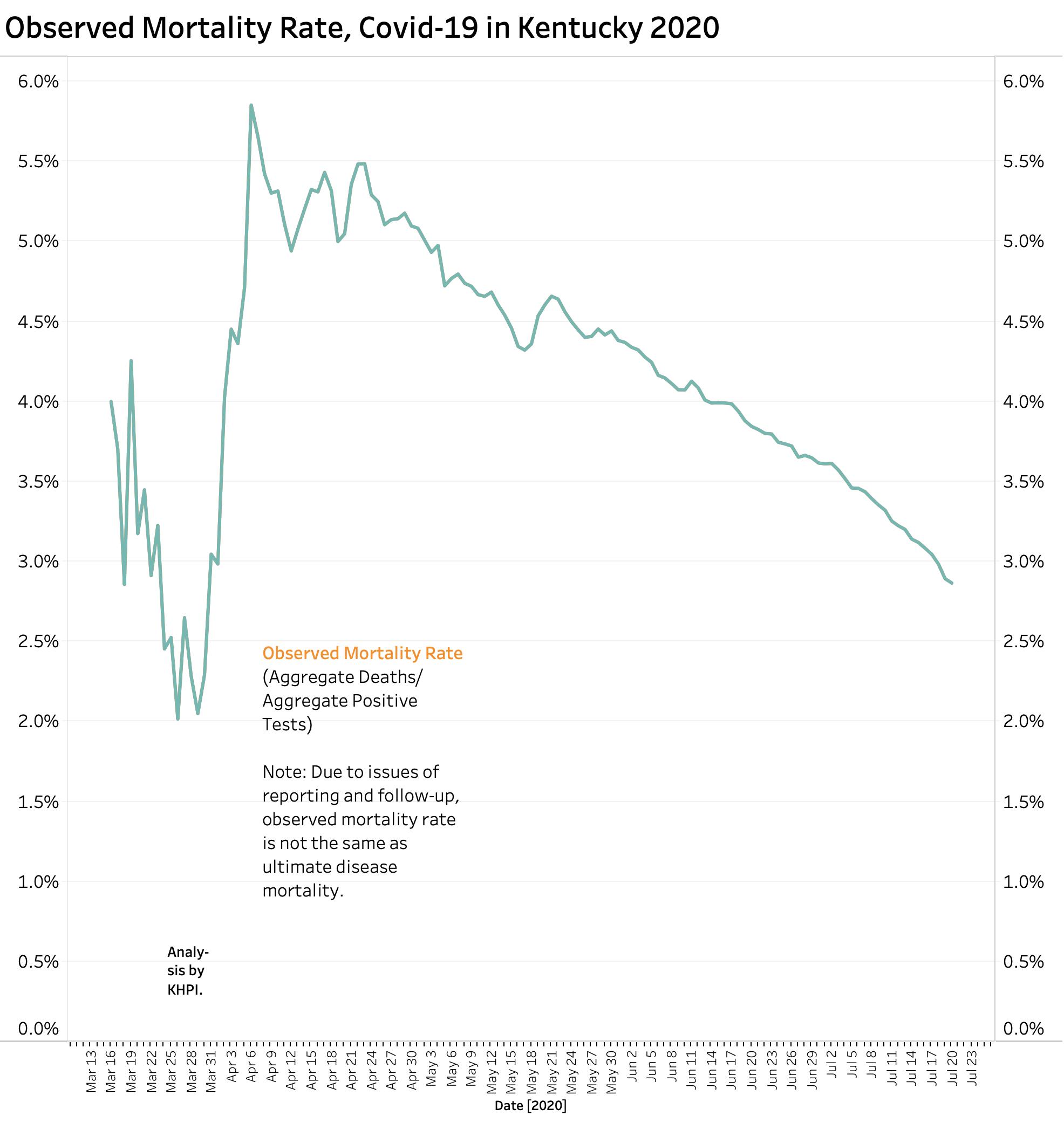
It is too soon to predict what is going to happen with deaths. We should anticipate that as more people get really sick that more people will inevitably die. A recent report in the Wall Street Journal summarized 31 separate worldwide studies of mortality rates of recognized Covid-19 infections. These difficult-to-compare studies were done early in the pandemic using different definitions or inclusion criteria. The best overall rate of mortality was that about 0.68% percent of people estimated to have had Covid-19 infection will die of their disease but with a wide variation among studies. We will not know the true risk until the pandemic is over. Furthermore, dying is not the only bad outcome of this previously unknown disease that affects small blood vessels widely through the body including the brain. Why is it for example, that the sense of smell goes early? Brain scans have suggested early involvement of the olfactory part of the brain and in other places. Neurologic consequences are said to be the most common reason for consultations following recovery from the more typical pulmonary presentation. The long-term sequela of Covid-19 infection in adults and children are completely unknown. (As an example, microcephaly was the most obvious serious consequence of Zika virus infection in infants, but long-term developmental problems in children were much more frequent.) Having said all this, of the 24,540 Kentuckians who contracted Coviid-19 as of July22, the 677 who have died so far represent 2.8% of the total. As testing capability has expanded, this observed mortality rate has progressively fallen from more than 5% at the beginning of the epidemic when only really sick people were being tested. It would be nice to believe that the overall mortality rate was also being affected by more informed and effective medical care of the sick. There are reasons other than obviating the need for ventilators or death to tackle our current flair of new Covid-19 infections.
Death rates vary considerably by race, age, preexisting disease, residence, and likely by additional non-medical determinants of health and social status. For example, as of July 22, while residents and employees of long term care facilities made up 14.3% of all cases, they comprised 66.7% of all deaths- almost all among residents rather than the numerous employee cases.
Percent Test Positive Calculation: How can we use it?
We are hearing much more now about the so called “Percent Tests Positive (PTP)” which is the percent of all tests done that are positive. Some would explain away the national and local rise in new cases as a simple result of more testing being done. The motivation of some of these disease-minimizers is not necessarily wholesome. On the other hand, if testing is done on a representative sample of people in a community– say a cruise ship or long-term-care facility– the percent positive rate reflects the prevalence of the disease in that population and is an important epidemiologic number. Given the fragmented nature of our public health and medical care systems and the limited availability of testing materials to date, there are not many community surveys available. Nonetheless, the Percent Positive Metric is currently being used to guide policy implementation. Here in is what PTP looks like when calculated on a daily basis (red) and on the aggregate totals (blue) since the beginning of the epidemic in Kentucky.
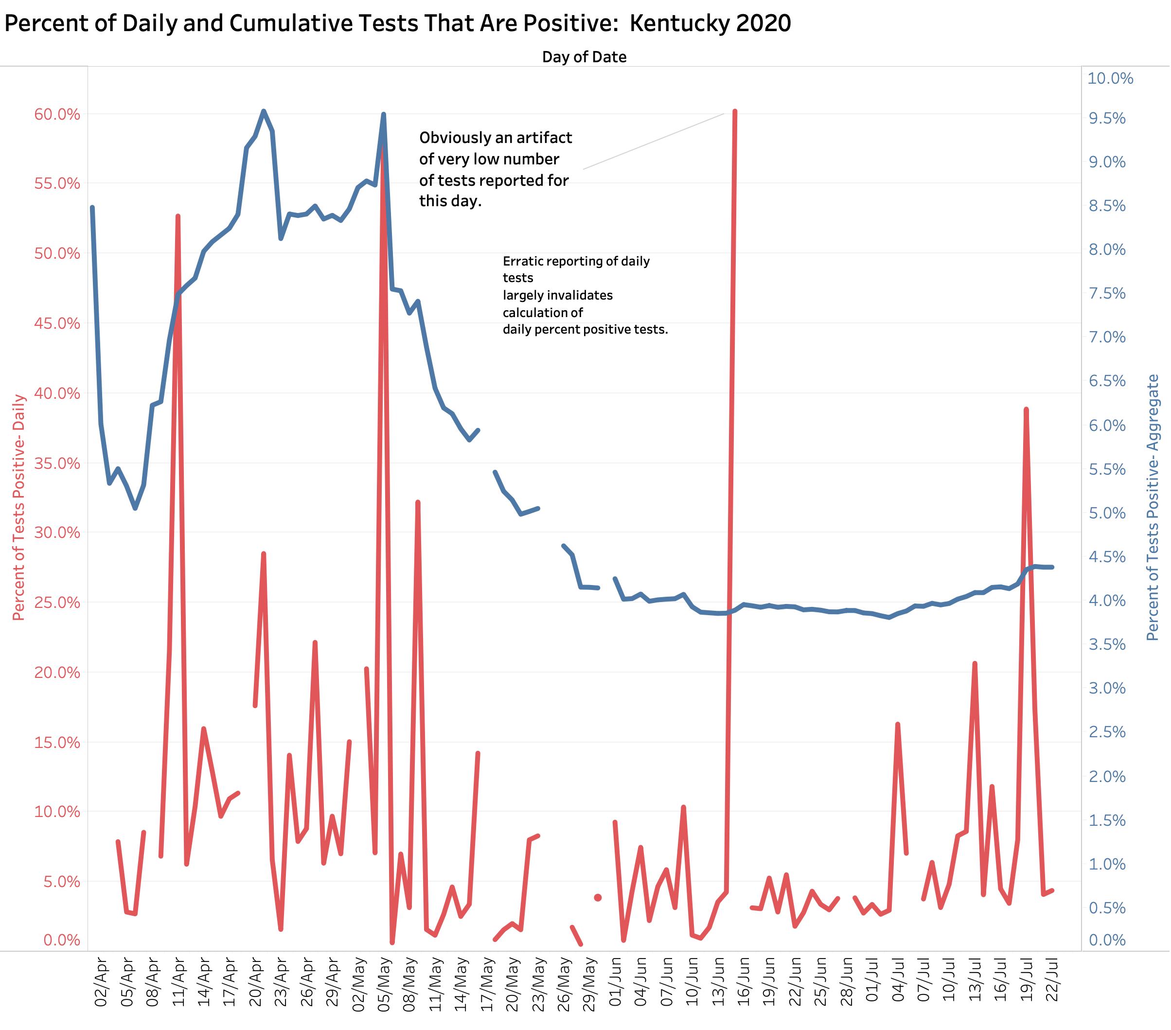
Kentucky is currently using the PTP in policy decisions such as to where people can travel, and when and who needs to be quarantined when they have been in a no-go zone. My belief is that an accurate version of this metric is difficult one to calculate, at least with respect to disease prevalence in a given population. When our state epidemic began and we were testing only the sick, daily PTPs were dancing around wildly. When the calculation is based on the aggregate to date, the PTP fell gradually from a high of around 9% to around 4% in recent weeks as testing opportunities became more numerous and were opened to the general worried public. Sadly, nationally we are once again, because of increased demand and lack of test reagents, having to discourage asymptomatic people from being tested. Test reporting times are increasing, even in Kentucky, which diminishes the utility of knowing whether or not you are sick. Kentucky’s daily PTP calculations vary widely day-to day because of big jumps in tests reported daily that are disconnected in time from the number of new cases reported on the same or even nearby days. There are other concerns nationally about the data that underly the PTP calculation that are relevant for Kentucky. Increasing numbers of people are being tested more than once. Indeed, a negative test is part of the usual definition of “Recovered” in many and perhaps all states. In the early days of the epidemic, negative tests were not being reported. Data aggregators have had to wrestle with changing national reporting requirements. A positive test often includes both the viral DNA test of active Covid-19 virus presence, and serology antibody tests that demonstrate that a given patient has responded to their infection and which remains positive well after the infected individual has recovered. Despite such concerns about reliability or applicability, if confounding factors are taken into consideration, the PTP may offer another rough estimate of where local epidemics are going.
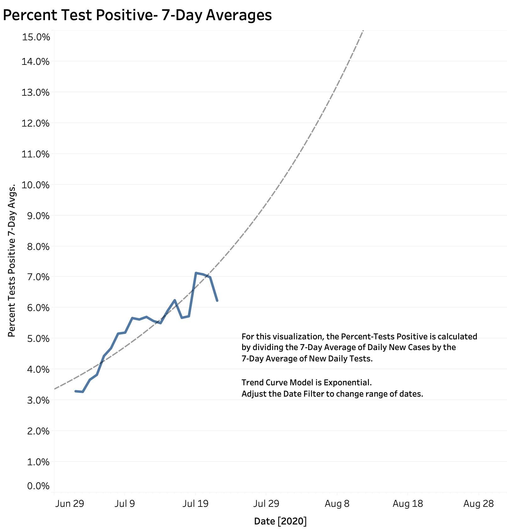
Using rolling averages helps smooth out some of the wildness unavoidability present in daily reports. Using Kentucky’s homegrown numbers, KHPI has calculated a 7-Day running average of the Percent Tests Positive for a given day by dividing the 7-Day Average of new cases by the 7-Day Average of tests done. Using this metric, Kentucky’s Percent Test Positive has risen gradually from 3.3% on July 2d to as high as 7% on the 21st. [The 7-day rolling average for a given numerical measure takes the sum of that number for a given day and the 6 preceding days, and divides that 7-Day total by 7.] Here is what Kentucky’s 7-Day Rolling Average of Percent Tests Positive looks like.
What if our daily new cases continue at the same rate?
We have good reason to be worried given the expanding number of new cases in July. To simplify the panels of interactive data visualizations available on KHPI’s Tableau Public Website, I have removed some of the admittedly over-numerous visualizations and changed the name of the portfolio from “Early Covid-19 In KY” to “Covid-19 Tracking in KY.” (It’s not early anymore!) To allow me to continue to explore local and national data, I also prepared a new portfolio for investigational analysis named “KY Covid-19 Developmental.” The link provided here is to an early figure from this latter panel that make an estimate of how bad things might be if new cases in Kentucky continued to rise at the same 7-Day average rate as they have so far in July. Plots using both linear and semi-log axes yield similar projections. If we continue at the same exponential rate of growth, by August 1st we could be seeing as many as 1000 new cases per day, and by the end of August we could be seeing as many as 2000 or more new cases per day. These projections assume that the present allows prediction the future. It assumes that we do nothing and just let ‘er rip. We can wait passively to see if magical wishful thinking comes true, or we can act with purpose to mitigate the damage. Folks smarter than I and those with better access to information recommend the latter. I vote with them.
Interactive versions of the figures above are available at the new Tableau Public link to Covid-19 Tracking in KY.
I will add to this article as the counts of the rest of the week are reported. I would appreciate your advice, corrections, or comments.
Peter Hasselbacher, MD
President, KHPI
Robert Wood Johnson Health Policy Fellow, 1998
Professor Emeritus of Medicine, UofL;
July 23, 2020