Presence of holiday weekend with big-time concerts and decreasing reporting protocols make forecasting iffy.
On May 31, the staff of the Kentucky Department of Public Health gave an online update to practitioners. Since there are no longer any weekly, let alone daily updates from the Governor’s Office, this well-done authoritative session, combined with the published weekly online updates from the KYDPH are now my best sources of information about Kentucky’s Covid-19 epidemic. Following are some of the highpoints from Tuesday’s presentations.
Cases: The 7-Day total of new cases ending May 30 was 7140, the first decrease since the incremental current surge began 5 weeks before. I am not sure what to make of this as previous long holiday weekends were often followed by a period of lower testing and reporting. The number of PCR tests performed last week was essentially the same as the week before. The bulk of new cases reported has increasingly come from this subset of PCR tests reported electronically to the state. For the past 5 weeks, more than 60% of new cases presented to us and to the CDC came from PCR tests. Last week, the figure was 78%. This increasing representation from reported positive PCR tests is compatible with the large and increasing number of antigen office or self-tests that are not reported one way or the other to anyone.
I assume that at least some of the reported PCR tests originate from hospitals. In recent weeks, Kentucky hospitals are no longer required to report “suspected” cases of Covid-19, presumably to cull out individuals who come to a hospital for non-Covid reasons and are found to be positive. The actual number of new cases is surely several multiples of what is reported above. While it would be nice to be sure that a Derby wave of cases is passing, it remains to be seen what happens following the Memorial Day holiday with its large-scale music festivals and other public activities.
New cases Covid-19 up sharply in May. Hospital utilization and deaths not so much –at this time.
Following the first Saturday in May, reported weekly new cases of Covid-19 are taking giant steps upwards. Jefferson County leads the state by far in new cases. Jefferson County’s current incidence rate reported on 5/24/22 was 52.1 per 100K population compared to 23.4 for the state as a whole. Although the test positivity ratio had been creeping up for several weeks before, it is impossible to ignore the likelihood that Kentucky Derby activities fueled a smoldering fire.
Current hospital and ICU utilization, or deaths have not yet followed in the same direction. Hopefully because of our at least partial degree of vaccine protection and personal choices made by many, these adverse outcomes will not rise as much. In my view, the CDC’s “Community Levels by County” graphic of 5/20/22 that accompanied Monday’s state report is two weeks out of date and 1000 miles distant in the rear view mirror. It does not inform me personally in any meaningful way and seems to understate what is happening locally where meaningful response can be focused. Covid-19 is blossoming worldwide and in the United States in large measure from spread of the Omicron Jr. variants and spotty use of public health precautions. Why would it not get worse here as well?
COVID variants on the rise globally in an environment where public health interventions are being withdrawn, rejected, or otherwise unavailable – what could go wrong?
Recent data indeterminant as to direction of epidemic spread in KY. Yesterday evening, Kentucky Department of Public Health published its Covid data for the week ending Sunday, April 24. The CDC published its most recent community level map as of last Thursday April 21. I confess I have no idea how to compare or interpret the data either within or between these two entities. The CDC’s map has all 120 of Kentucky’s counties in the green “Covid-19 Low Community Level,” as is indeed most of the rest of the country. Today’s CDC’s county map of actual disease incidence in Kentucky contains much missing data and is uninterpretable.
Kentucky’s home-grown report publishes data which; based on my understanding on how the data are collected, interpreted, and reported; seems internally contradictory. On the one hand, the number of new cases for the week has roughly plateaued at about 3000, but the test positivity rate has risen rather dramatically to 4.35 which is the highest since the first week of March! Please refer to the figures below for this and the remaining discussion.
Disease Incidence rates. A different indicator of epidemic expansion in Kentucky is suggested by the overall state incidence rate published on the state’s own weekly incidence rate maps. I do not know exactly how the state calculates this result, but it has risen from a low of 4.09 cases per 100K on the report of April 11, rising over the next two weeks to 6.49 yesterday. Using the same definitions it has always used for Kentucky’s own county-specific maps; only 25 of our 120 counties are in the “Low” range, 87 are scored as “Moderate” (1 – 10 per 100K), and the remaining 8 rated as “Substantial” (10-20 per 100K).
The CDC website reports a state-wide incidence rate over the last 7 days of 65.8 per 100K. (Is this an error?) The New York Times, which still has access to county-specific data, calculates an incidence rate over the last 7 days of 10 per 100K of state population. According to the Times, over the past few weeks, some of Kentucky’s counties have been among those nationally with the highest new case incidence rates.
I do not know how to reconcile the differences in the national and state reports. What is perhaps the most transmittable human disease ever experienced in modern history, Covid-19 is expanding in the United States and worldwide. It appears to be expanding again in Kentucky. The test positivity rate, which in my experience has been a reliable and predictive indicator of epidemic expansion in Kentucky, is on the way up again.
We were winning for a while, but we have been in this place before.
The last time I posted a Kentucky Covid update in the series was on February 26. Shortly afterwards, both the Kentucky Department of Public Health (KDPH) and the CDC dramatically changed their practices on data collection and reporting. Instead of focusing on the daily counts of new cases, deaths, tests, and hospitalizations, these major public agencies shifted to reporting only weekly summaries an emphasis on hospital utilization. Counting the number of new cases is considered a “back-up” process. Governor Beshear has “paused” giving Covid-19 updates in person to the public. Suffice it to say for now, I no longer have data available or compatible to enter my data analytic and visualization software. It is fair to say that public health experts have expressed considerable concern about the shift in data collection and policy making. I agree and perhaps will have more to say about this later. Last week, based on the KDPH weekly report of April 11, I started preparing this update
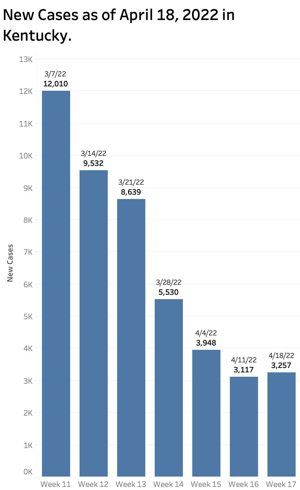
The good news was that over the previous six weeks of reported state data, there had been strong sustained trends downward in the number of recognized new cases of Covid-19 infection and hospitalizations. The number of new weekly cases dropped progressively from 12,010 in the report of March to 3117 reported on April 11. Compare this to the peak Omicron weekly count of over 80,000 at the end of January which was itself more than double the highest count of any previous week of our two-year Kentucky epidemic! Nonetheless, with an average daily count last week of 445 new cases, we were still well above the 7-Day rolling average of 142 in June of 2021 in the interval before the Delta surge when we thought we were finally in the clear!
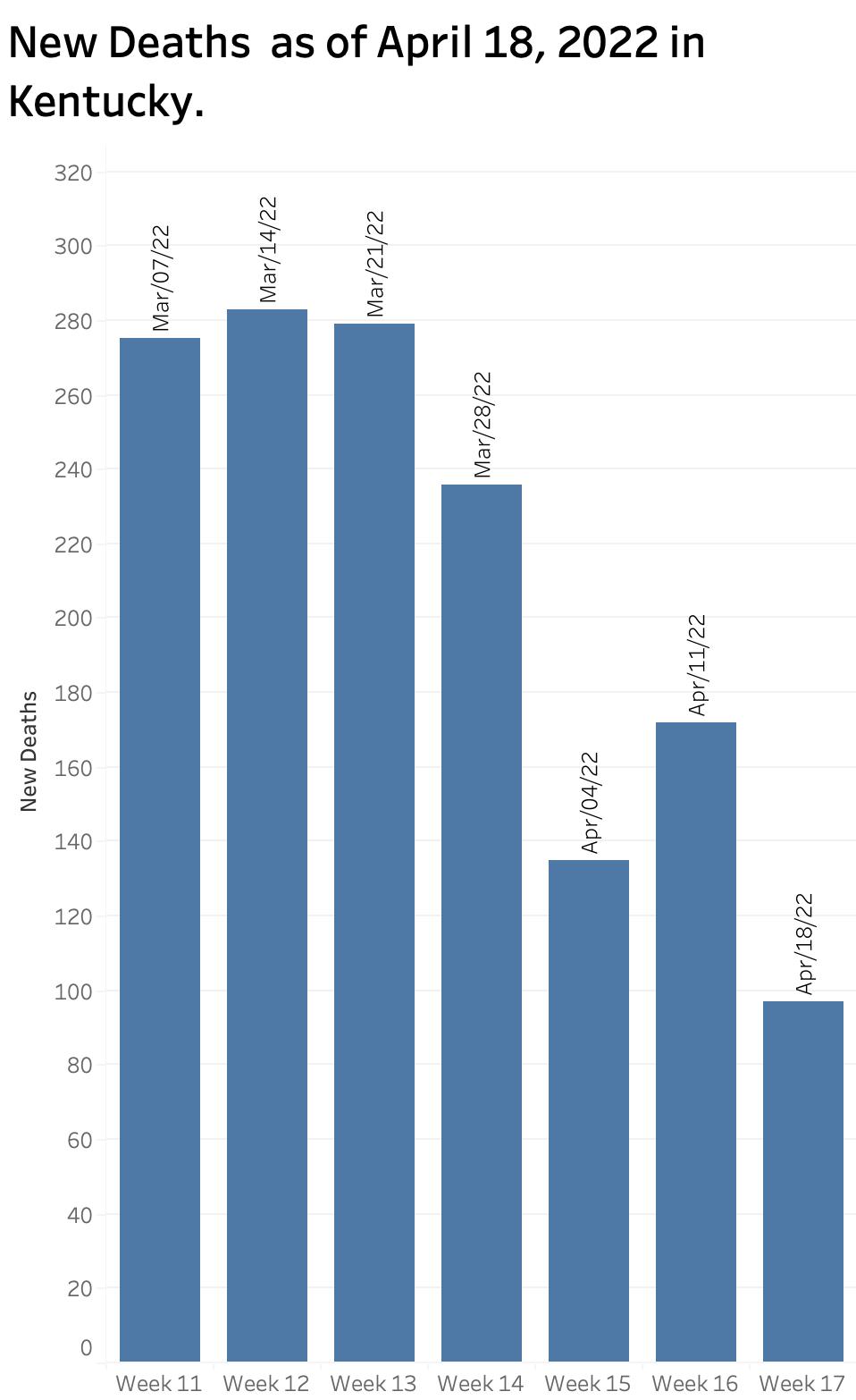
Weekly deaths decreased from 275 in early March to 135 reported April 4 but took a turn upwards to 172 last week. Counts of deaths have always been both erratic and delayed.
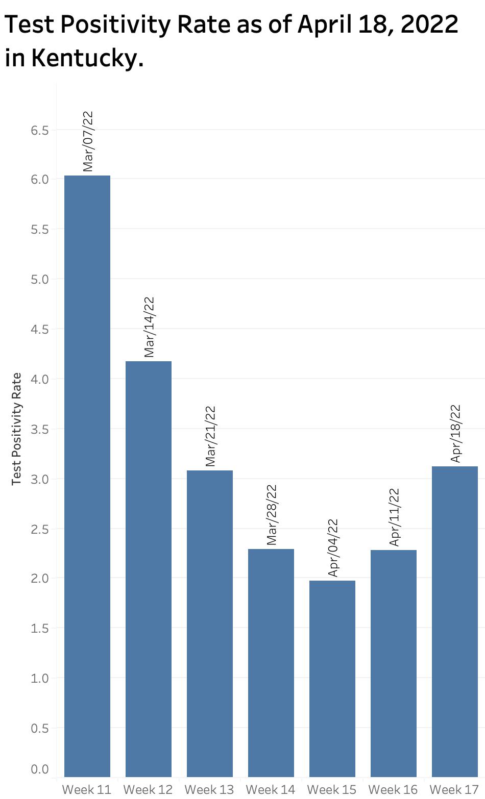
Kentucky’s Test positivity Rate had continued to fall since the March 7 report but took a turn upwards that week from 1.97 to 2.28. The number of PCR tests performed over the last 6 reported weeks also was continuing to fall from 73,786 to 43,773. It must be assumed that a substantial portion of the fall in new cases was due to less traditional laboratory testing and the increasing use of unreported home or office test kits. The proportion of new cases in individuals 18 years old and under continued to hover between 22% and 25% over the 6 weeks of reports.
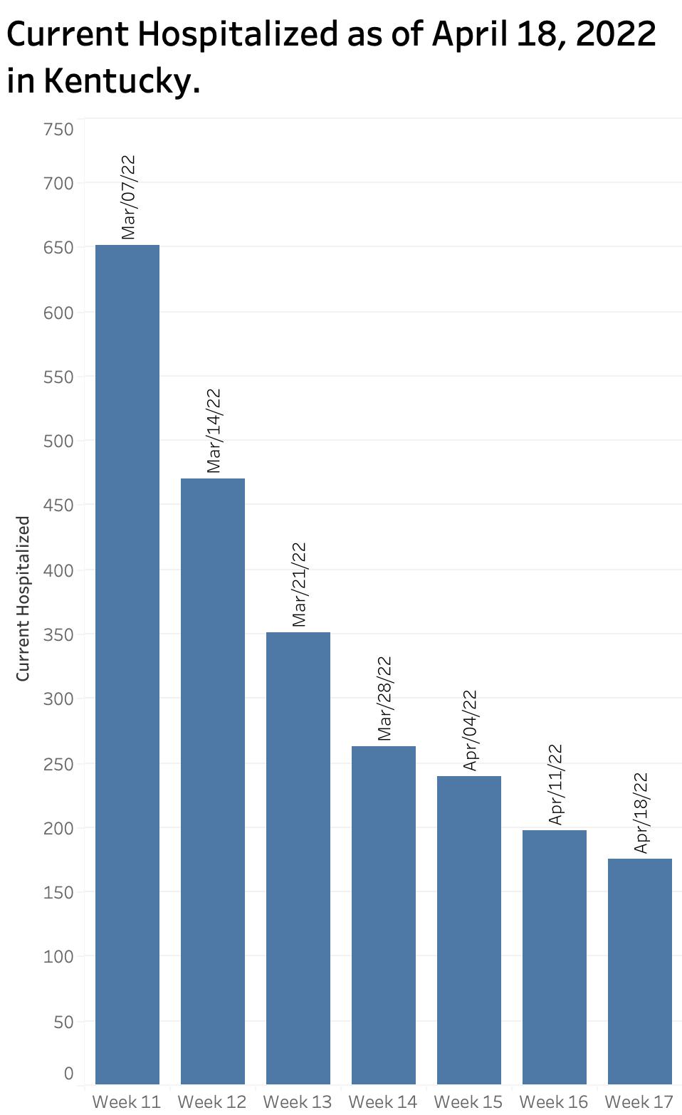
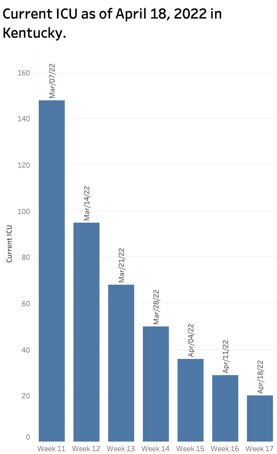
Hospitalization Utilization: In its once-a-week reports to the public, the KDPH now reports a “Current Covid-19 Hospital Census” for a single day, presumably as of the day of the report. In the report of April 11, the census for Hospitalized, ICU, and “On Ventilator” were 198, 29, and 14 respectively and declining steadily. These numbers were well down from those of the last daily report on March 4 which were 782, 155, and 14.
The discussion above I would have emphasized that the weekly reports reflected the average of 120 individual Kentucky counties and obscured the wide range of the actual distribution of new infections statewide.
Two Different Maps. Kentucky now offers on its Covid-19 website a map displaying “Kentucky COVID-19 Community Levels by County” produced by the CDC. This stratification is based largely if not entirely on hospital censuses of Covid-19 patients and the availability of beds to care for them. The map last week showed only a single county in the green “low level.” However, when the actual “Incidence Rate” of the number of new cases per 100,000 population is calculated, a very different and more troublesome picture emerges. For example, in last week’s report of the New York Times, of the top 20 counties in the nation with the highest incidence rates, 7 were in Kentucky! Kentucky’s own Current Incidence Rate map had 4 counties with substantial rates, and many more counties with moderate as opposed to low rates. In “hot spot” maps of Covid-19 activity, Kentucky has popped out nationally as a sore toe over the past few weeks!
Weekly report of Monday April 18. In the busy holiday season that was last week, I never got around to posting the update. I would have summarized our statewide status as being on average in a relatively good place, but would caution that we had been in similar places before over the last two years only to face a rebound of the virus as we relaxed our public health initiatives both personally and collectively. I would have expressed some concern that new Omicron variants were spreading at an ever-faster rates around the world and in in our nation and were quite likely to do so in Kentucky. I would have pointed out that the Test Positivity Rate for Kentucky had begun to rise. Yesterday’s report reinforces my concern that we are on the rebound again. Cases are up in an environment that favors under-reporting. The test positivity rate is higher than it has been in the 4 weeks. I summarize yesterday’s data in the figures below. (KHPI’s data visualization is still online but is current only to March 4, 2022.)
Cases taking a turn upwards. Test Positivity Rate has been a reliable predictor of increased cases to come.
If it seems to my readers that I am unsure what to make of the new national and public reporting initiatives, you would be right. Many things have changed at once and the CDC and the Commonwealth do not always agree in their definitions and methods. What is clear to me is that the parameters I have been tracking daily for the last two years and which allowed credible and timely predictions in the directions we were going are no longer available to me. One of my paths forward is to allow larger and better resourced entities (which somehow still have access to county-specific daily numbers) to carry the ball. I highly recommend the New York Times operation in this regard. The CDC website is also becoming more useful and provides some limited historical data. I anticipate some wrap-up of my Covid experience and concerns going forward with occasional ad-hoc commentaries when I feel I have something to offer. I plan to return to writing about some of other themes of this series which I have neglected but which have not gone away such as opioid abuse and the cost of medical and pharmaceutical utilization.
I wish to thank my readers who have encouraged my efforts.
Peter Hasselbacher, MD Kentucky Health Policy Institute April 19, 2022