
I should be no surprise to readers that Covid-19 has entered a new and rapidly expanding phase of its presence in Kentucky. It is no longer (and never has been) solely a threat to the larger urban centers of the Commonwealth. Lack of a national strategy, conflicting advice, and poor example from some political leaders has made matters much worse than they had to be. I have been updating KHPI’s Covid-19 tracking page daily and will close out the past week of new record highs with additional commentary Saturday evening.
Watch Covid-19 spread ‘live.’
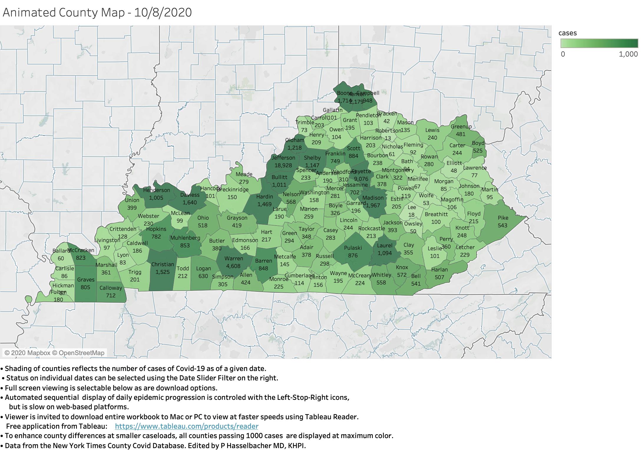
I want to take this occasion to augment yesterday’s offering to test a newly learned capability of the Tableau software I have been using for its powerful database, statistical, and data visualization capabilities. Using the New York Times Covid-19 County Database, I previously offered static maps that displayed the aggregate number of cases and deaths in each of Kentucky’s 120 counties at a single point in time.
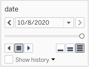
What I have now been able to do is assemble a “filmstrip” of daily maps with a map for each of the 216 days since Covid-19 was first recognized in the state. The result is posted on the KHPI Tableau Public website. Using the date slider control in the panel on the right, the viewer can select any date interactively. There are also buttons (Back-Stop-Forward) to automatically transition one way or the other, but unfortunately on this browser-based platform, the rate of change is rather slow. (The image below is for illustration purposes only. Not a link.)
An alternate way to view the workbook is available for those with Macs or PCs. At the bottom of the on-line workbook visualization are buttons for full-screen viewing, but also a ‘download’ option that I have enabled allowing the user to download the entire workbook both as it stands now and also after I add some additional tables to it. To view the packaged Tableau Workbook, the user will need to install the free application, Tableau Reader. (Tableau is a major international platform widely used by business, journalism, government, academia, and folks like me.) This will show additional buttons that allow the speed of transitions to be adjusted and offers the capability to investigate the underlying data more closely. I can use this download function to share this and other information of interest to Kentuckians more widely.
Let me know how this works for you. It is an experiment that I hope will be useful.
Resectfully,
Peter Hasselbacher, MD
Kentucky Health Policy Institute
9 October 2020