
Short Answer: From every single county and at similar rates!
From the first recognized case of Covid-19 disease in Kentucky on March 6 in Fayette County, our epidemic was most easily recognized in larger population centers where there were both more people and access. However, as early as April 1st, 69 of Kentucky’s 120 counties had at least 1 diagnosed case among its people. Only in 35 of those counties were there more than 2 cases. Only in 11 counties were there more than 10 cases. In one short month later on May 1st, there were only 6 counties without a recognized and reported case! By June 2d, only tiny Robertson County was officially reported as free of the disease. By July 1st, the disease was recognized in every county. The last holdouts were centered in the central/eastern part of the state. Of course, just as is true today, unrecognized cases of Covid-19 infection walked among us well before their presence was documented with a specific lab test.
The reader is invited to interactively explore for themself the tables, graphs, and maps that serve as the source of the material presented below. Filters in some of the visualizations allow the user to select a specific county, date, or range of dates to view the data. I will continue to tinker with and add additional visualizations in the online version.
Epidemiology curves display the spread graphically.
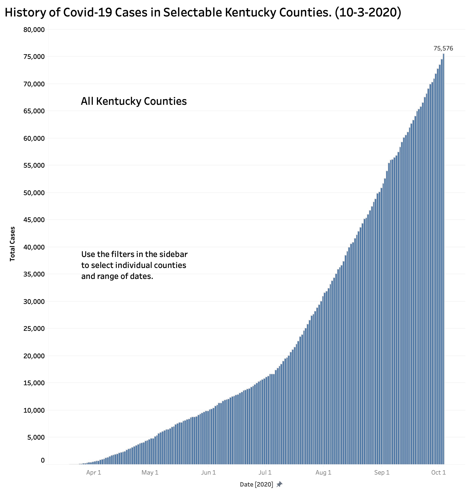
The first graph below depicts the total number of “cases” as of a given date for the Commonwealth as a whole. From numbers too small to show up on the plot, total cases rose at a very gradually increasing rate until an inflection point around the July 4th holiday when counts took off at a rate that shows no sign of stabilizing. Indeed, the rate may well be at a new and steeper inflection point as I write this. (See the footnote at the end regarding to the definitions of “Case”)
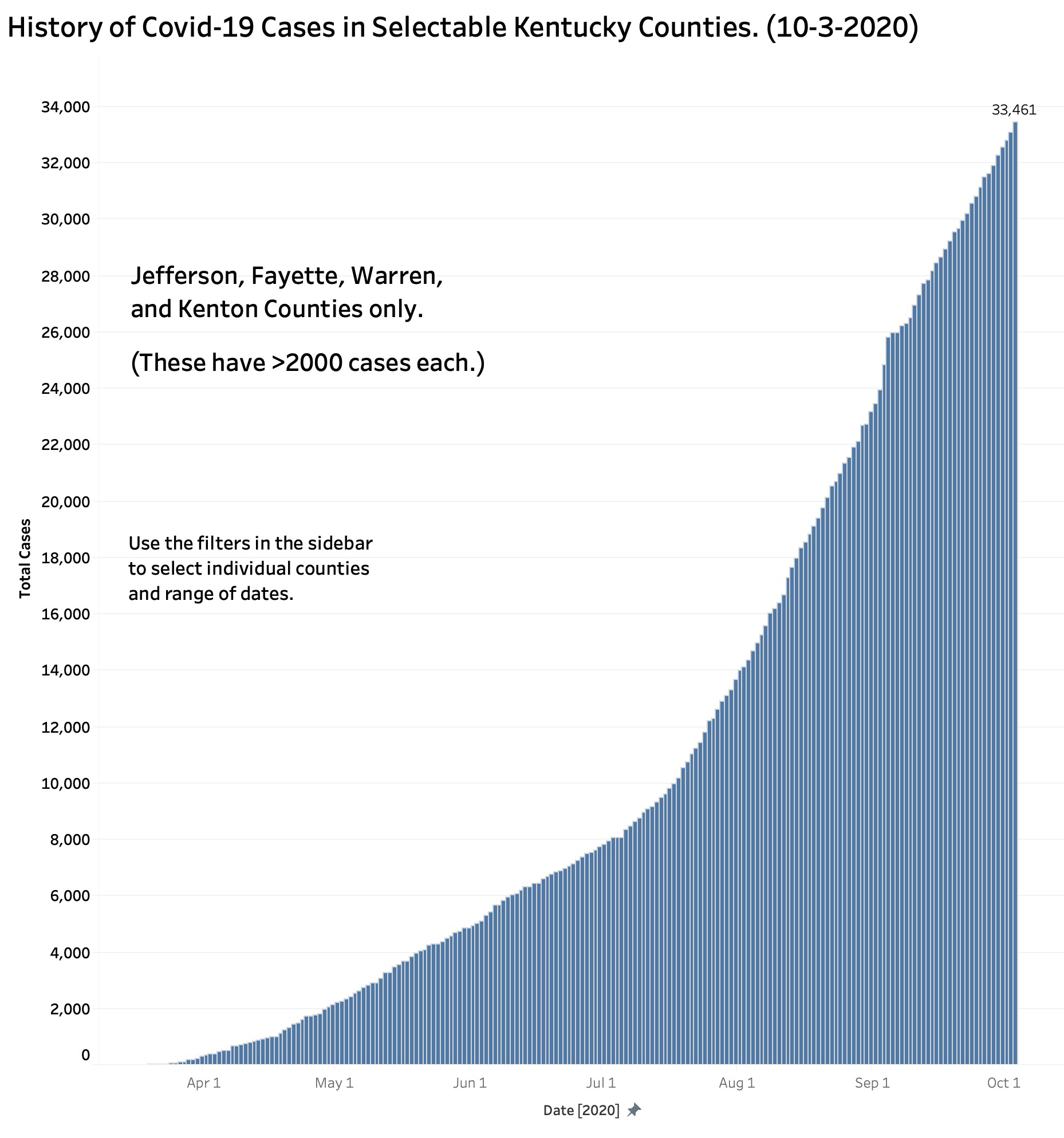
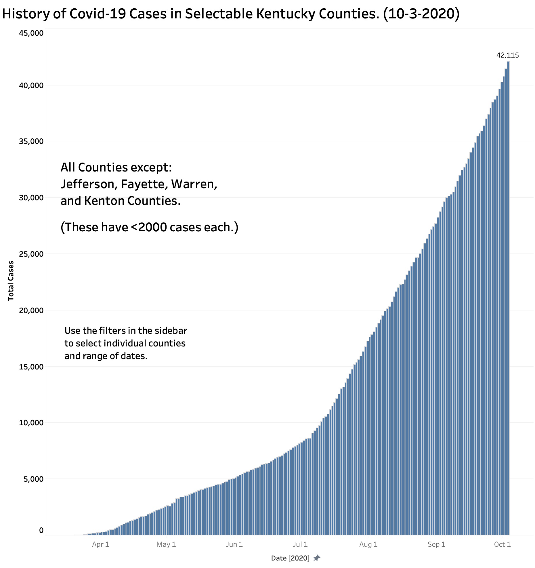
Because there are currently 12 counties with more than 1000 cases (at least one of which was recently said to be “on fire” with Covid-19) it might be possible that those counties obscured what was happening elsewhere. The following figure shows the epidemiology curve of the four counties with the largest number of cases. The next after that displays the other 116 counties by themselves. The curves are of similar shape with an inflection point in early July. (The curve of the 108 counties with less than 1000 cases is essentially identical to this latter.)
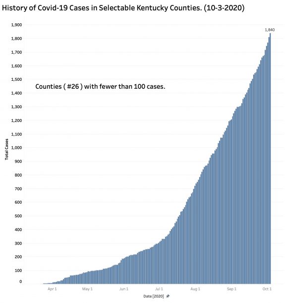
Dialing back the counties to include only those 26 counties with fewer than 100 cases as of 10/3/2020 yields a curve essentially the same as the others above, albeit with a somewhat more gradual inflection point in June and July.
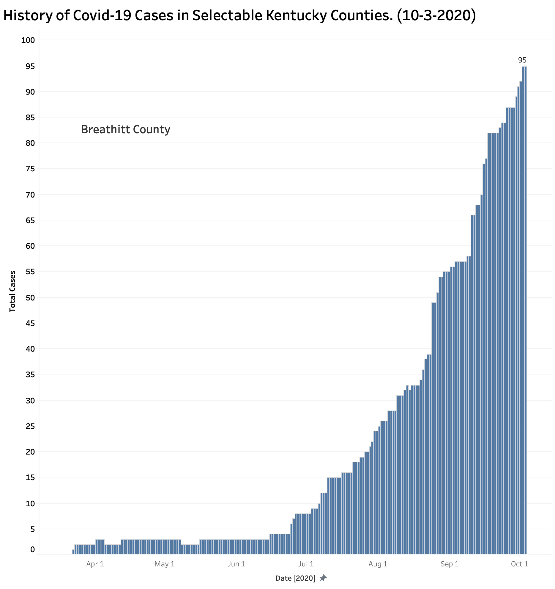
That is not to say that the reported experience of every county was the same. For example, the plot for Breathitt County with its 95 current cases shows a dramatic onset of disease in early July that has not yet regressed.
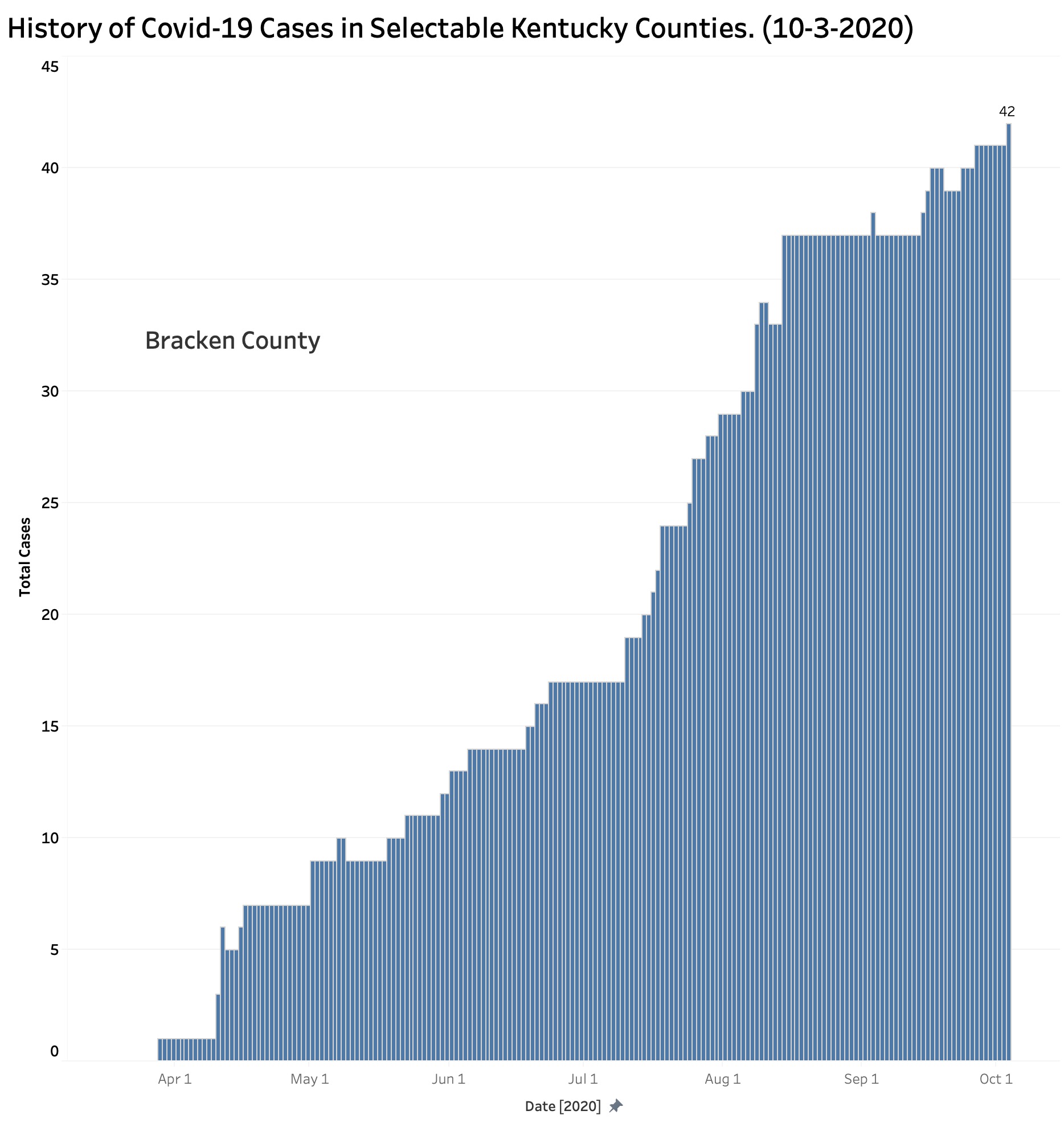
Bracken County with is 42 current reported cases has been chugging along at the same approximate rate of growth since early April.
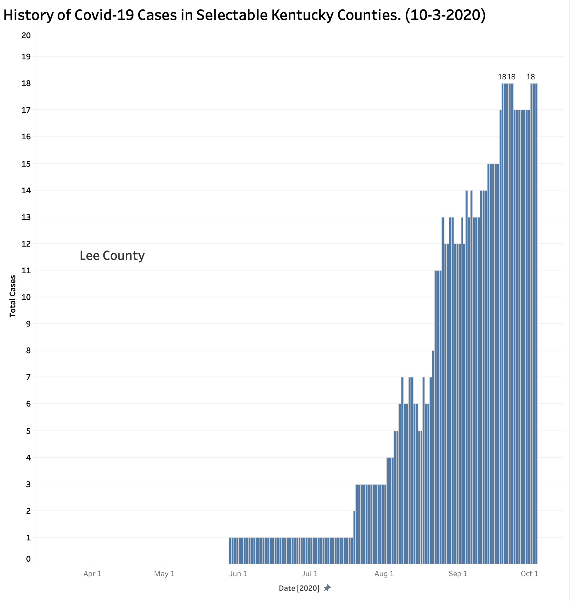
Little Lee County with its 18 cases scattered among its 7,403 population began its climb later than all the other counties, and with Robertson County still has the fewest reported cases and by far the lowest prevalence of cases at 2.4 per 1000 people. Where Lee and Robertson Counties go from here remains to be seen, but the vigilance and resolve of its citizens to follow sound public health practices seems likely to be the most important factor.
What is happening in Warren County (or Fulton for that matter)?
Warren County is an outlier with its 33.8 cases per 1000 topping the list of prevalence rates. Cases there appeared early and charged ahead steadily. By comparison, Jefferson County with the most people and cases in the state has a prevalence rate of 23.6 per 1000. There are 8 counties with higher prevalence rates than Jefferson, including Fayette at 27.0 per 1000. A map displaying prevalence rates can be seen here. [For purposes of this discussion, KHPI defines the prevalence rate for Covid-19 as the aggregate number of all confirmed cases as of a specified date per 1000 population of a defined area.]
Final Comments.
These results reinforce my belief that control of our epidemic needs to be focused at the local level. Who knows its people better than their individual communities? Counting heads by state or nation, while essential, is not as important as being able to pinpoint where cases are coming from, how, and why. Nonetheless, knowing from where Covid-19 is coming will not matter at all unless individuals and their communities are committed to doing something about it. This includes supporting the individuals and families who get sick and those taking care of them. In this epidemic, as in all of public and individual healthcare, it is more true than ever that we are as a community no healthier than the sickest among us.
My most discrete takeaway conclusion is that our Kentucky epidemic problem is not limited to our big and moderately big cities. Our feel-good state motto of “United We Stand, Divided We Fall” has particular poignancy in this regard because we are currently more divided than we are united and are falling hard. Powerful political and social forces, whether they be intentional or not, keep us apart. We seem to have staked out positions that are self-defeating for us collectively. In the case of our current epidemic, no county is going to fix itself by itself. Each of the 120 counties has lessons to teach the rest of us. We are too dependent on each other not to give it our best collective and cooperative shot.
Peter Hasselbacher, MD
Kentucky Health Policy Institute
Emeritus Professor of Medicine, UofL
6 October 2020
Footnote:
How a “Case” has been defined or used in various national forums varies and has led to confusion or ambiguity. Is a “case” a positive test, or a unique patient? For example, the distributed daily reports from Kentucky’s Department of Public Health lists “Total New Cases Today” which is then adjudicated to remove “duplicates and patients not meeting case definition for confirmed cases.” It is this adjusted and presumed confirmed number that is aggregated and brought forward as “Total Cases” elsewhere on the report in the same data block as “Total Deaths.” I believe these uses of the term “Cases” permits confusion here and elsewhere between positive tests and unique individual persons with disease.
I raise this issue here because the total number of cases reported in the New York Times county database is greater at every date from the aggregated “Total Cases” in Kentucky’s reported aggregate. (There is no such discrepancy in the reported numbers of deaths.) Other national aggregators such as the Covid-19 Tracking Project of the Atlantic, or that from Johns Hopkins line up with Kentucky’s aggregate total. I use the New York Times data, which I believe to be representative, because it is the one practical source available to me that links the Covid-19 case and death data to specific counties. I would much rather have been able to access a historic database from my own state. I am not aware of how Kentucky reports its results to the CDC or other entity. I will ask the Times for clarification. My requests for clarification from Frankfort have been unanswered.
5 thoughts on “Where Have Kentucky’s Covid-19 Cases Been Coming From?”
Comments are closed.