
In a technical test-posting last week, I reworked the dataset used by Medicare to show where prescriptions of opioids to Part-D Medicare patients were written in Kentucky in 2013 by five-digit Zip Code. I reworked the data to add the average number of opioid prescriptions written by an opioid prescriber in that zip code. This supplements Medicare’s own calculation of the percent of all prescriptions that are for opioids in a given area. Both these indices provide insight into the intensity of opioid prescribing in a given area. In today’s posting, I add a map of the same data broken down by Kentucky county. Not surprisingly, significant geographic variation exists in both maps that is compatible both with public perception of places where prescription drug abuse is prevalent, and locations where individual prescriber outliers practice. This particular dataset is based on the principal business address of the prescriber, but I have shown that prescribing of opioids to Medicare patients correlates strongly with prescribing to all patients, and that not unexpectedly, the location of the prescriber predicts were the patients live. Descriptions of the underlying data and caveats for its use are discussed in earlier articles.
Mapping by county:
Below is a map of opioid prescribing to Medicare patients by county. The maps are fully interactive. The viewer can use the legend to switch from one measured index to another, or to zoom in on various areas. Clicking on a shaded area displays the underlying data for that county.
View a larger version of CMS Opioids KY Counties 2013 created with eSpatial mapping software.
Mapping by zip code:
Here is the original map of opioid prescribing by five-digit zip codes. Data is mapped for 329 Zip codes. For 38 of these, the number of prescriptions written is below the minimum reported by CMS to protect patient confidentiality. On the map, these show up as uncolored areas. Recall that the zip code is that of the prescriber and not the patient.
View a larger version of CMS Opioids KY Zip Codes 2013 created with eSpatial mapping software.
Much more analysis is possible.
As the map creator, I have the ability to filter the data or change the shaded category cutoffs displayed to better identify geographic outliers. Here are two screen-shots demonstrating the ability to isolate the areas of highest opioid prescribing intensity.
Map of Kentucky Zip Codes where the average number of prescriptions per prescriber for opioids was greater than 200.

Map of Kentucky counties were opioid prescriptions exceeded 6% of all prescriptions to Medicare patients.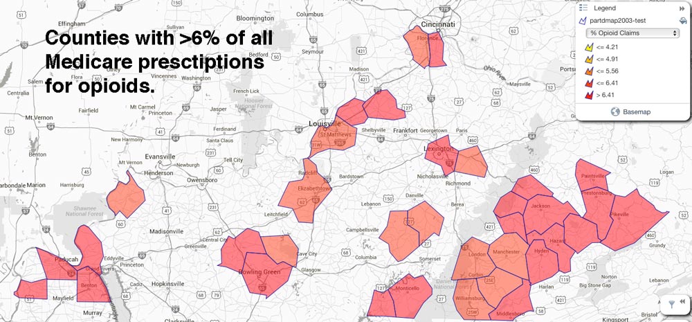
Please help me learn how to use these and the related maps I hope to present. What do these maps tell you? I believe I have the ability to superimpose markers for the location of individual prescriber outliers, but I have only a few days more in my trial to learn how to do so. If this approach is as useful as I think is should be, I may ask for your financial help to purchase a year’s subscription to the software application for the Institute.
Peter Hasselbacher, MD
President, KHPI